移动web:转盘抽奖(幸运大转盘)
为了获取客户、回馈客户,平台一般会推出抽奖活动类的营销页。因此web页面中,有各式各样的抽奖效果。
格子式(九宫格),背景滚动式(数字/文字/图案),旋转式(转盘),游戏式(砸蛋/拼图...)......
这里来讲解下转盘抽奖效果。
当用户进入这个抽奖页面时,一般会“华丽”的设计所吸引,虽然明知中奖几率几乎等于0,图个运气,都会去点“开始抽奖”,于是“折腾”开始了。
你还没有登录,请登录后再来
你还没有抽奖资格,请做做“什么”后再来
你的抽奖机会用完了,请明天再来
很抱歉,你没有中奖
。。。
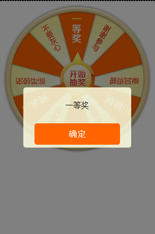
来看下效果:
在BKY预览效果无语了,弹出插件都不弹出了。
实际是这样的:
贴上代码,仅供参考:
页面代码:


<!doctype html>
<html>
<head>
    <meta charset="utf-8">
    <meta name="viewport" content="width=device-width, initial-scale=1.0, user-scalable=no"/>
    <title>旋转-转盘-抽奖</title>

    <style type="text/css">
    *{margin: 0; padding: 0;}
    #ww_page{ overflow:hidden; width:100%;}
    #ww_rotate{position: relative; margin: 0 auto; width:640px; height:640px; }
    #ww_plate{position:absolute; top:0; left:0;width:640px; height:640px; background:url(http://i13.tietuku.com/416f769edc909de0.png) center no-repeat;background-size: 100% 100%; transition: none;}
    #ww_arrow{position:absolute; top:205px; left:50%; z-index: 10;margin-left: -75px;width:150px;height:190px; background:url(http://i13.tietuku.com/0e0b1c875d346f4d.png) center no-repeat; }
    </style>

</head>
<body>

<div id="ww_page">
    <div id="ww_box">
        <div id="ww_rotate">
            <div id="ww_plate"></div>
            <div id="ww_arrow"></div>
        </div>
    </div>
</div>

<link rel="stylesheet" type="text/css" href="js/Tips/mTips.css" />
<script type="text/javascript" src="js/Tips/mTips.min.js"></script>
<script type="text/javascript" src="js/utils.js"></script>
<script type="text/javascript" src="mRotate.js"></script>

<script type="text/javascript">
//缩放
scalePage('#ww_box');

// 奖品数据
var prizeData = [
    {
        id: 1,
        prize: "一等奖",
        angle: 3600
    }, {
        id: 2,
        prize: "二等奖",
        angle: 3720
    }, {
        id: 3,
        prize: "三等奖",
        angle: 3840
    }, {
        id: 4,
        prize: "再接再厉",
        angle: 3750
    }, {
        id: 5,
        prize: "要加油哦",
        angle: 3865
    }, {
        id: 6,
        prize: "谢谢参与",
        angle: 3930
    }
];

//旋转
var arrow = document.getElementById('ww_arrow'),
    plate = document.getElementById('ww_plate'),
    isRotate = false;
arrow.onclick = function() {
    if (isRotate) return;
    isRotate = true;

    var num = (Math.random() * prizeData.length) >> 0,
        data = prizeData[num];

    // console.log(num);
    // console.time('计时');
    new Rotate({
        el: plate,
        //angle: 90,
        animateTo: data.angle,
        duration: 5000,
        easeing: 'easeInOutCirc',
        end: function() {
            // console.timeEnd('计时');
            isRotate = false;
            Tips.alert(data.prize);
        }
    });
};
</script>

</body>
</html>
旋转主程序mRotate.js
/**
 * LBS Rotate
 * Date: 2014-12-20
 * ==================================
 * opts.el 旋转对象(一个字符串的CSS选择器或者元素对象)
 * opts.angle 初始角度 默认0
 * opts.animateTo 目标角度
 * opts.duration 持续时间 默认1000(毫秒)
 * opts.easing 动画效果 (easeOutSine默认 easeInOutSine easeInOutCirc)
 * opts.end 旋转完成 执行函数
 * ==================================
 **/
var Rotate = function(opts) {
    opts = opts || {};
    if (typeof opts.el === undefined) return;
    this.el = typeof opts.el === 'string' ? document.querySelector(opts.el) : opts.el;
    this.angle = opts.angle || 0;
    this.animateTo = opts.animateTo || this.angle + 360;
    this.duration = opts.duration || 1000;
    this.easing = (opts.easing && this.tween[opts.easing]) || this.tween.easeOutSine;
    this.end = opts.end || function() {};
    this.animated = false;
    this.init();
};
Rotate.prototype = {
    init: function() {
        this.rotate(this.angle);
        this.start();
    },
    start: function() {
        this.animate();
    },
    animate: function() {
        if (this.animated) return;
        var start = this.angle,
            end = this.animateTo,
            change = end - start,
            duration = this.duration,
            startTime = +new Date(),
            ease = this.easing,
            _this = this;
        if (start == end) {
            this.end && this.end();
            return;
        }
        this.animated = true;
        ! function animate() {
            var nowTime = +new Date(),
                timestamp = nowTime - startTime,
                delta = ease(timestamp / duration);
            _this.rotate(start + delta * change);
            if (duration <= timestamp) {
                _this.rotate(end);
                _this.animated = false;
                _this.end && _this.end();
            } else {
                setTimeout(animate, 17);
            }
        }();
    },
    rotate: function(angle) {
        this.setTransform(angle % 360);
    },
    setTransform: function(v) {
        v = v || 0;
        this.setStyle(this.el, 'transform', 'rotate(' + v + 'deg)');
    },
    setStyle: function(el, p, v) {
        !this.cache && (this.cache = {});
        !this.cache[el] && (this.cache[el] = {});
        !this.cache[el][p] && (this.cache[el][p] = this.prefix(p));
        el.style[this.cache[el][p] || this.prefix(p)] = v;
    },
    prefix: function(p) {
        var style = document.createElement('div').style;
        if (p in style) return p;
        var prefix = ['webkit', 'Moz', 'ms', 'O'],
            i = 0,
            l = prefix.length,
            s = '';
        for (; i < l; i++) {
            s = prefix[i] + '-' + p;
            s = s.replace(/-\D/g, function(match) {
                return match.charAt(1).toUpperCase();
            });
            if (s in style) return s;
        }
    },
    tween: {
        easeOutSine: function(pos) {
            return Math.sin(pos * (Math.PI / 2));
        },
        easeInOutSine: function(pos) {
            return (-.5 * (Math.cos(Math.PI * pos) - 1));
        },
        easeInOutCirc: function(pos) {
            if ((pos /= 0.5) < 1) return -0.5 * (Math.sqrt(1 - pos * pos) - 1);
            return 0.5 * (Math.sqrt(1 - (pos -= 2) * pos) + 1);
        }
    }
};
很简单的代码,就是一个动画函数,改变元素的旋转rotate属性。
CSS3 transform 属性:http://www.w3school.com.cn/cssref/pr_transform.asp
动画函数如下,获得元素的初始角度(起点),目标角度(终点),要多久(持续的时间),动画效果(缓动公式)
animate: function() {
    if (this.animated) return;
    var start = this.angle, //起点
        end = this.animateTo, //目的地
        change = end - start, //距离
        duration = this.duration, //持续时间
        startTime = +new Date(),
        ease = this.easing, //运动效果
        _this = this;
    if (start == end) {
        this.end && this.end();
        return;
    }
    this.animated = true;
    !function animate() {
        var nowTime = +new Date(),
            timestamp = nowTime - startTime,
            delta = ease(timestamp / duration);
        _this.rotate(start + delta * change);
        if (duration <= timestamp) {
            _this.rotate(end);
            _this.animated = false;
            _this.end && _this.end();
        } else {
            setTimeout(animate, 17);
        }
    }();
}
设置旋转属性
rotate: function(angle) {
    this.setTransform(angle % 360);
},
setTransform: function(v) {
    v = v || 0;
    this.setStyle(this.el, 'transform', 'rotate(' + v + 'deg)');
},
setStyle: function(el, p, v) {
    !this.cache && (this.cache = {});
    !this.cache[el] && (this.cache[el] = {});
    !this.cache[el][p] && (this.cache[el][p] = this.prefix(p));
    el.style[this.cache[el][p] || this.prefix(p)] = v;
},
prefix: function(p) {
    var style = document.createElement('div').style;
    if (p in style) return p;
    var prefix = ['webkit', 'Moz', 'ms', 'O'],
        i = 0,
        l = prefix.length,
        s = '';
    for (; i < l; i++) {
        s = prefix[i] + '-' + p;
        s = s.replace(/-\D/g, function(match) {
            return match.charAt(1).toUpperCase();
        });
        if (s in style) return s;
    }
}
实际抽奖流程:点击抽奖按钮,发送ajax,得到一个结果数据,执行抽奖程序,显示结果。
了解动画函数,结合缓动公式,是做出各种炫酷的效果的基础。

 浙公网安备 33010602011771号