CSS布局(六) 对齐方式
一、水平居中:
(1). 行内元素的水平居中?
如果被设置元素为文本、图片等行内元素时,在父元素中设置text-align:center实现行内元素水平居中,将子元素的display设置为inline-block,使子元素变成行内元素
<div class="parent" style="background-color: gray;">
  <div class="child" style="background-color: lightblue;">DEMO</div>
</div>
<style>
.parent{text-align: center;}
.child{display: inline-block;}
</style>
(2)块状元素的水平居中(定宽)
当被设置元素为定宽块级元素时用 text-align:center 就不起作用了。可以通过设置“左右margin”值为“auto”来实现居中的。
<div class="parent" style="background-color: gray;">
  <div class="child" style="background-color: lightblue;">DEMO</div>
</div>
        .child{
            width: 200px;
            margin: 0 auto;
        }
(3)块状元素的水平居中(不定定宽)
在实际工作中我们会遇到需要为“不定宽度的块级元素”设置居中,比如网页上的分页导航,因为分页的数量是不确定的,所以我们不能通过设置宽度来限制它的弹性。
可以直接给不定宽的块级元素设置text-align:center来实现,也可以给父元素加text-align:center 来实现居中效果。
当不定宽块级元素的宽度不要占一行时,可以设置display 为 inline 类型或inline-block(设置为 行内元素 显示或行内块元素)

<div class="container">
    <ul>
        <li><a href="#">1</a></li>
        <li><a href="#">2</a></li>
        <li><a href="#">3</a></li>
    </ul>
</div>
.container{text-align:center;background: beige}
.container ul{list-style:none;margin:0;padding:0;display:inline-block;}
.container li{margin-right:8px;display:inline-block;}
二、垂直居中:
和水平居中一样,这里要讲垂直居中,首先设定两个条件即父元素是盒子容器且高度已经设定
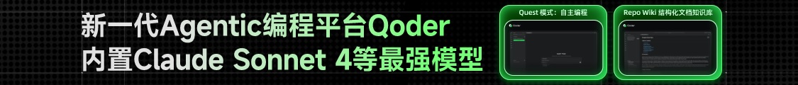
场景1:子元素是行内元素,高度是由其内容撑开的
这种情况下,需要通过设定父元素的line-height为其高度来使得子元素垂直居中
<div class="wrap line-height">
    <span class="span">111111</span>
</div>
 .wrap{
            width:200px ;
            height: 300px;
            line-height: 300px;
            border: 2px solid #ccc;
        }
.span{
            background: red;
        }
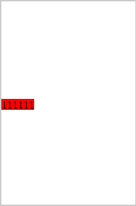
场景2:子元素是块级元素但是子元素高度没有设定,在这种情况下实际上是不知道子元素的高度的,无法通过计算得到padding或margin来调整,但是还是存在一些解法。
通过给父元素设定display:table-cell;vertical-align:middle来解决
<div class="wrap">
    <div class="non-height ">11111</div>
</div>
.wrap{
       width:200px ;
       height: 300px;
       border: 2px solid #ccc;
    display: table-cell;
    vertical-align: middle;
}
 .non-height{
       background: green;
        }
结果
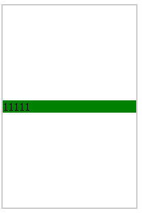
场景3:子元素是块级元素且高度已经设定
计算子元素的margin-top或margin-bottom,计算方法为父(元素高度-子元素高度)/2
<div class="wrap ">
    <div class="div1">111111</div>
</div>
  .wrap{
            width:200px ;
            height: 300px;
            border: 2px solid #ccc;
        }
.div1{
            width:100px ;
            height: 100px;
            margin-top: 100px;
            background: darkblue;
        }
结果
三、水平垂直居中:
3.1水平对齐+行高
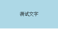
text-align + line-height实现单行文本水平垂直居中
<style>
.test{
    text-align: center;
    line-height: 100px;
}
</style>
<div class="test" style="background-color: lightblue;width: 200px;">测试文字</div>
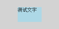
3.2水平+垂直对齐
1. text-align + vertical-align 在父元素设置text-align和vertical-align,并将父元素设置为table-cell元素,子元素设置为inline-block元素
<style>
.parent{
    display: table-cell;
    text-align: center;
    vertical-align: middle;
}
.child{
    display: inline-block;
}
</style>
<div class="parent" style="background-color: gray; width:200px; height:100px;">
  <div class="child" style="background-color: lightblue;">测试文字</div>
</div>

2.若子元素是图像,可不使用table-cell,而是其父元素用行高替代高度,且字体大小设为0。子元素本身设置vertical-align:middle
<div class="parent" style="background-color: gray; width:200px; ">
  <img class="child" src="http://sandbox.runjs.cn/uploads/rs/26/ddzmgynp/img1.gif" width="50%" alt="test">
</div>
<style>
.parent{
    text-align: center;
    line-height: 100px;
    font-size: 0;
}
.child{
    vertical-align: middle;
}
</style>
3.3相对+绝对定位
使用absolute,利用绝对定位元素的盒模型特性,在偏移属性为确定值的基础上,设置margin:auto
<style>
.parent{
    position: relative;
}
.child{
    position: absolute;
    top: 0;
    left: 0;
    right: 0;
    bottom: 0;
    height: 50px;
    width: 80px;
    margin: auto;
}
</style>
<div class="parent" style="background-color: lightgray; width:200px; height:100px; ">
  <div class="child" style="background-color: lightblue;">测试文字</div>
</div>

 浙公网安备 33010602011771号