
水平居中、垂直居中、水平垂直居中
参考:https://www.w3cplus.com/css/centering-css-complete-guide.html
一.水平居中
1.行内元素:
text-align:center即可
2.块级元素【固定宽度】:
(1).一个固定宽度的块级元素,使用margin:0 auto即可
css:
.has_width_block {
  width: 200px;
  background: deeppink;
  margin: 0 auto;
}
html:
<div class="has_width_block">
  我是有宽度的块级元素
</div>
(2).多个固定宽度的块级元素
(a).将子元素设置为inline-block,再用text-align:center即可
css:
.container {
  background: yellowgreen;
  width: 1024px;
  height: 200px;
  text-align: center;
}

.has_width_block {
  width: 250px;
  background: deeppink;
  display: inline-block;
}
html:
<div class="container">
  <div class="has_width_block">
    我是有宽度的inline-block元素1
  </div>
  <div class="has_width_block">
    我是有宽度的inline-block元素2
  </div>
  <div class="has_width_block">
    我是有宽度的inline-block元素3
  </div>
</div>
(b).使用flex,设置justify-content:center即可
css:
.container {
  background: yellowgreen;
  width: 1024px;
  height: 200px;
  display: flex;
  justify-content: center;
}

.item {
  width: 250px;
  height: 50px;
  background: deeppink;
}
html:
<div class="container">
  <div class="item">
    我是有宽度和高度的元素1
  </div>
  <div class="item">
    我是有宽度和高度的元素2
  </div>
  <div class="item">
    我是有宽度和高度的元素3
  </div>
</div>
3.块级元素【不定宽度】:
(1).单个不定宽元素。将元素设置为inline-block,再设置text-align:center即可
css:
.container {
  text-align: center;
}

.thumbnail {
  border: 1px solid #000;
  display: inline-block;
  padding: 5px;
}
html:
<div class="container">
  <div class="thumbnail">
    <img src="https://ss1.bdstatic.com/5eN1bjq8AAUYm2zgoY3K/r/www/cache/static/protocol/https/home/img/qrcode/zbios_efde696.png"
    />
    <p>描述</p>
  </div>
</div>
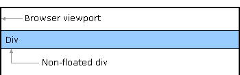
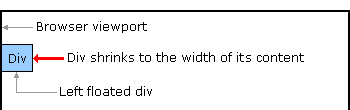
(2).多个不定宽的元素。使用float:left,配合position:relative+left:50%或right:50%完成居中效果
css:
.pagination {
  width: 100%;
  overflow: hidden;
}

.pagination>ul {
  float: left;
  position: relative;
  left: 50%;
}

.pagination>ul>li {
  float: left;
  margin: 0 2px;
  padding: 3px 5px;
  background: yellowgreen;
  position: relative;
  right: 50%;
}
html:
<div class="pagination">
  <ul>
    <li>上一页</li>
    <li>1</li>
    <li>2</li>
    <li>3</li>
    <li>4</li>
    <li>5</li>
    <li>下一页</li>
  </ul>
</div>
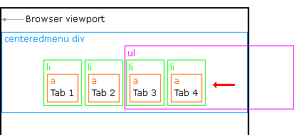
实现思路如下:
参考http://matthewjamestaylor.com/blog/beautiful-css-centered-menus-no-hacks-full-cross-browser-support
- 没有浮动的div,其宽度为父元素的100%:
- 向左浮动的div,其宽度为内容的大小。这是实现居中的关键点。
- 把ul和li都调整成了向左浮动,那么li的宽度就是内容的宽度,ul的宽度是li宽度的总和

- 将ul设置为position:relative,left:50%。至此,ul元素会相对于外层元素(蓝色边框的“centeredmenu div”)向右偏移50%的宽度
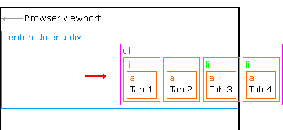
- 最后一步,将li元素设置为position:relative,right:50%。至此,每一个li元素都会相对于ul元素向左偏移50%的宽度。最终达到水平居中的效果
二.垂直居中
1.行内元素:
line-height和height一致即可
2.块级元素:
(1).固定高度
(a).要求元素有固定的高度。
(b).设置父元素position:relative
(c).设置元素position:absolute、top:50%、margin-top:-height/2。实现思路是先绝对定位元素,然后top:50%将元素的起始点拉到父元素的中心点,最后利用负边距,将元素垂直居中。
css:
.container {
  position: relative;
  width: 100%;
  height: 500px;
  background: gray;
}

.item {
  height: 50px;
  position: absolute;
  top: 50%;
  margin-top: -25px;
  background: deeppink;
}
html:
<div class="container">
  <div class="item">
    固定高度的元素
  </div>
</div>
(2).不定高度
(a).设置父元素display:table
(b).设置元素display:table-cell、vertical-align:middle
css:
.container {
  display: table;
  width: 100%;
  height: 500px;
  background: gray;
}

.item {
  display: table-cell;
  vertical-align: middle;
  background: deeppink;
}
html:
<div class="container">
  <div class="item">
    <img src="https://ss1.bdstatic.com/5eN1bjq8AAUYm2zgoY3K/r/www/cache/static/protocol/https/home/img/qrcode/zbios_efde696.png"
      alt="">
  </div>
</div>
(3).flex
(a).align-item:center
css:
.container {
  display:flex;
  align-items: center;
  width: 100%;
  height: 500px;
  background: gray;
}

.item {
  background: deeppink;
}
html:
<div class="container">
  <div class="item">
    <img src="https://ss1.bdstatic.com/5eN1bjq8AAUYm2zgoY3K/r/www/cache/static/protocol/https/home/img/qrcode/zbios_efde696.png"
      alt="">
  </div>
</div>
三.水平居中+垂直居中
1.宽高固定或不固定都可
(1).flex
(a).align-items:center
(b).justify-content:center
css:
.container {
  display: flex;
  align-items: center;
  justify-content: center;
  width: 100%;
  height: 500px;
  background: gray;
}

.item {
  background: deeppink;
}
html:
<div class="container">
  <div class="item">
    <img src="https://ss1.bdstatic.com/5eN1bjq8AAUYm2zgoY3K/r/www/cache/static/protocol/https/home/img/qrcode/zbios_efde696.png"
      alt="">
  </div>
</div>
2.宽高固定
(1).margin:auto
(a).position:absolute
(b).top、right、bottom、left设置为0
(c).margin:auto
css:
.container {
  position: relative;
  width: 100%;
  height: 500px;
  background: gray;
}

.item {
  position: absolute;
  top: 0;
  right: 0;
  bottom: 0;
  left: 0;
  width: 100px;
  height: 100px;
  margin:auto;
  background: deeppink;
}
html:
<div class="container">
  <div class="item">
    width:100px
    <br>
    height:100px;
  </div>
</div>
(2).position+负边距
css:
.container {
  width: 100%;
  height: 500px;
  position: relative;
  background: gray;
}

.item {
  width: 100px;
  height: 100px;
  position: absolute;
  left: 50%;
  top: 50%;
  margin-left: -50px;
  margin-top: -50px;
  background: deeppink;
}
html:
<div class="container">
  <div class="item">
    width:100px
    <br> height:100px;
  </div>
</div>
3.宽高不定
css:
.container {
  width: 100%;
  height: 500px;
  display: table;
  text-align: center;
  background: gray;
}

.item {
  display: table-cell;
  vertical-align: middle;
  background-clip: content-box;
  background: deeppink;
}
html:
<div class="container">
  <div class="item">
    宽高不定元素
    <br> 宽高不定元素
    <br> 宽高不定元素
    <br> 宽高不定元素
    <br>
  </div>
</div>
