

CSS3高级
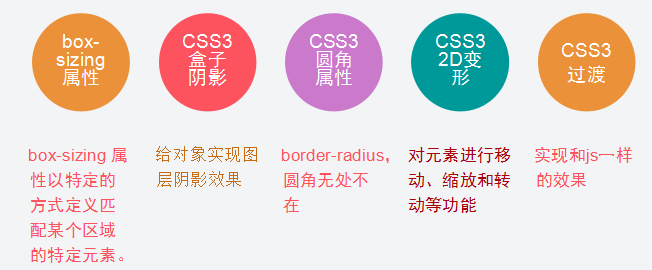
一、学习目标
二、box-sizing属性
语法:box-sizing: content-box|border-box|inherit

box-sizing属性的用法 :
box-sizing属性可以为三个值之一:
content-box(default),border-box,padding-box。
1.content-box,border和padding不计算入width之内
2.padding-box,padding计算入width内
3.border-box,border和padding计算入width之内
<style type="text/css">
	.content-box{
        box-sizing:content-box;
        -moz-box-sizing:content-box;
        width: 100px;
        height: 100px;
        padding: 20px;
        border: 5px solid #E6A43F;
        background: blue;
    }

    .padding-box{
        box-sizing:padding-box;
        -moz-box-sizing:padding-box;
        width: 100px;
        height: 100px;
        padding: 20px;
        border: 5px solid #186645;
        background: red;
    }

    .border-box{
        box-sizing:border-box;
        -moz-box-sizing:border-box;
        width: 100px;
        height: 100px;
        padding: 20px;
        border: 5px solid #3DA3EF;
        background: yellow;
    }

	</style>

  </head>

  <body>
  	<div class="content-box">

    </div>

    <div class="padding-box">

    </div>

    <div class="border-box">

    </div>

  </body>
实现效果:

由于浏览器兼容性问题,可能会出现以下效果:

三、box-shadow(盒子阴影)
语法:box-shadow: h-shadow v-shadow blur spread color inset;
取值如下: <length> <length> <length>? <length>? || <color>:
阴影水平偏移值(可取正负值);
阴影垂直偏移值(可取正负值);
阴影模糊值;阴影颜色
-moz-, -webkit-, -o-这些都是浏览器前缀。
常用前缀和浏览器的对应关系如下:
Firefox: -moz-
Chrome, Safari: -webkit-
Opera: -o-
IE: -ms-

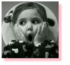
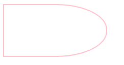
<body>
  	<img src="hh.png"></img>
  </body>
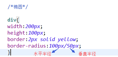
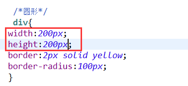
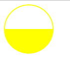
四、圆角属性值
语法: border-radius: 1-4 length|% / 1-4length|%;
注释:按此顺序设置每个 radii 的四个值。
如果省略 bottom-left,则与 top-right 相同。
如果省略 bottom-right,则与 top-left 相同。
如果省略 top-right,则与 top-left 相同。
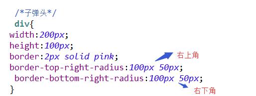
border-top-left-radius 左上角
border-top-right-radius 右上角
border-bottom-right-radius 右下角
border-bottom-left-radius 左下角
案例:
<body>
  <div></div>
  </body>


四、CSS3 2D变形
通过 CSS3 转换,我们能够对元素进行移动、缩放、转动、拉长或拉伸。
2D转换的属性名为transform,使用方法为transform:method(value)。
2D转换方法有translate、scale、rotate、skew、matrix,还有基于这些分支出的translateX、scaleY等
CSS3 2D转换详解:

<style type="text/css">

.wrap  {

	position:absolute;
	left:50%;
	top:50%;
	transition: all 0.5s ease-in-out;
	width: 80px;
	background: red;
	color: pink;
	text-align: center;
	padding: 10px;
	border-radius: 6px;
	font-size: 18px;
}
	/* 平移 */
	.wrap:hover{transform:translate(20px,20px);}

	/* 旋转 */
	.wrap:hover{transform:rotate(90deg);}

	/* 倾斜 */
	.wrap:hover{transform:skew(30deg,10deg);}

	/* 缩放 */
	.wrap:hover{transform:scale(1.2);}

	/* 组合 */
  	.wrap:hover{transform:scale(1.5) rotate(90deg);}

	</style>

  </head>

  <body>

  		<div class="wrap"></div>

  </body>
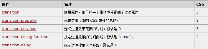
五、css3过渡
CSS3过渡属性:
<!-- 过渡  -->
	<style type="text/css">

	a{
	-webkit-transition:padding 1s ease-out,backgrond-color 2s linear;
	}

	a:hover{
	padding-left: 20px;
	background-color: pink;
}

	</style>

  </head>

  <body>

  	<a href="#">魔鬼中的天使</a><br/>
  	<a href="#">魔鬼中的天使</a><br/>
  	<a href="#">魔鬼中的天使</a><br/>

  </body>

六、css3动画
动画是使元素从一种样式逐渐变化为另一种样式的效果。
您可以改变任意多的样式任意多的次数。 请用百分比来规定变化发生的时间,或用关键词 "from" 和 "to",等同于 0% 和 100%。
0% 是动画的开始,100% 是动画的完成。
css3动画属性:

<style type="text/css">

			div{
				position:absolute;top:50%;
				left:50%;overflow:hidden;
				width:300px;height:150px;
				margin:-75px 0 0 -150px;
				border:3px solid #eee;
				background:#e0e0e0;
			}

			.one{
				 opacity:0;
				 display: block;
				 font-weight: bold;
				 height: 50px;
				 -webkit-animation:ersha 5s ease-out;

			 }

			 .two{
				 opacity:0;
				 display: block;
				 font-weight: bold;
				 height: 50px;
				 -webkit-animation:doubi 5s ease-out 5s forwards;

			 }

			@-webkit-keyframes ersha{

				0%{opacity:0; transform:translate(0px)}
				10%{opacity:0.2; transform:translate(20px) }
				20%{opacity:0.4; transform:translate(40px)}
				100%{opacity:1; transform:translate(100px)}
			}

			@-webkit-keyframes doubi{

				0%{opacity:0; transform:translate(0px)}
				10%{opacity:0.2; transform:translate(20px) }
				20%{opacity:0.4; transform:translate(40px)}
				100%{opacity:1; transform:translate(100px)}
			}


	</style>

  </head>

  <body>

  		<div>
  			<span class="one">我会移动,你信吗,嘻嘻</span>
  			<span class="two">我会移动,你信吗,嘿嘿</span>
  		</div>

  </body>


 浙公网安备 33010602011771号