散点图
attach(mtcars)
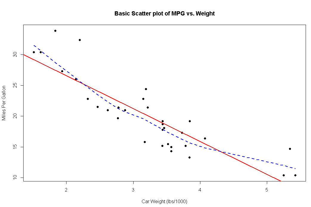
plot(wt,mpg,main="Basic Scatter plot of MPG vs. Weight",
xlab="Car Weight (lbs/1000)",
ylab="Miles Per Gallon",pch=19)
abline(lm(mpg~wt),col="red",lwd=2,lty=1)
lines(lowess(wt,mpg),col="blue",lwd=2,lty=2)
library(car)
scatterplot(mpg~wt|cyl,data=mtcars,lwd=2,span=0.75,main="Scatter Plot of MPG vs. Weight by # Cylinders",
            xlab="Weight of Car(lbs/1000)",ylab="Miles Per Gallon",legend.plot=TRUE,id.method="identify",labels=row.names(mtcars),boxplots="xy")
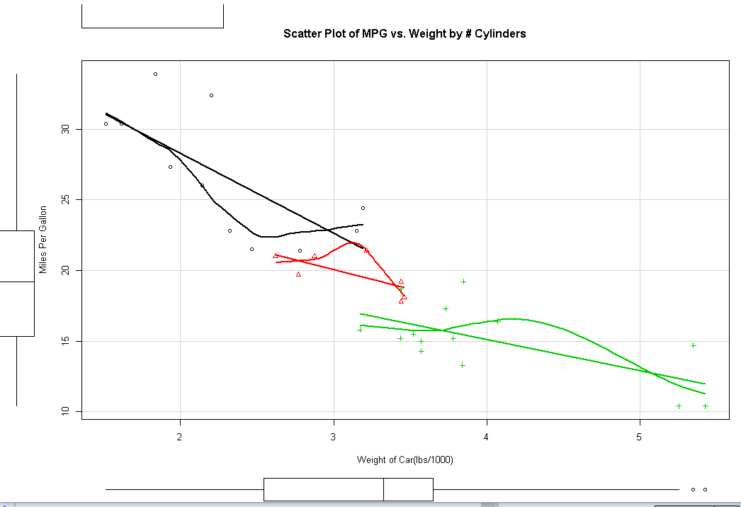
library(car)
scatterplot(mpg~wt|cyl,data=mtcars,lwd=2,span=0.75,main="Scatter Plot of MPG vs. Weight by # Cylinders",
            xlab="Weight of Car(lbs/1000)",ylab="Miles Per Gallon",legend.plot=TRUE,id.method="identify",labels=row.names(mtcars),boxplots="xy")

#散点图矩阵 包含回归线
scatterplotMatrix(~mpg+disp+drat+wt,data=mtcars,sprea=FALSE,smoother.args=list(lty=2),main="Scatter Plot Matrix via car Package")

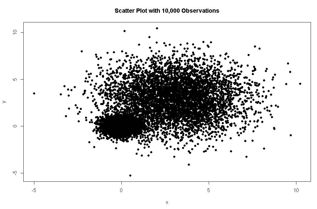
#高密度散点图
set.seed(1234)
n<-10000
c1<-matrix(rnorm(n,mean=0,sd=.5),ncol=2)
c2<-matrix(rnorm(n,mean=3,sd=2),ncol=2)
mydata<-rbind(c1,c2)
mydata<-as.data.frame(mydata)
names(mydata)<-c("x","y")
with(mydata,
     plot(x,y,pch=19,main="Scatter Plot with 10,000 Observations"))
#热点
with(mydata,smoothScatter(x,y,main="Scatter Plot Colored by Smoothed Densities"))

install.packages("hexbin")
library(hexbin)
with(mydata,{
  bin<-hexbin(x,y,xbins=50)
  plot(bin,main="Hexagonal Binning with 10,000 Observations")
})

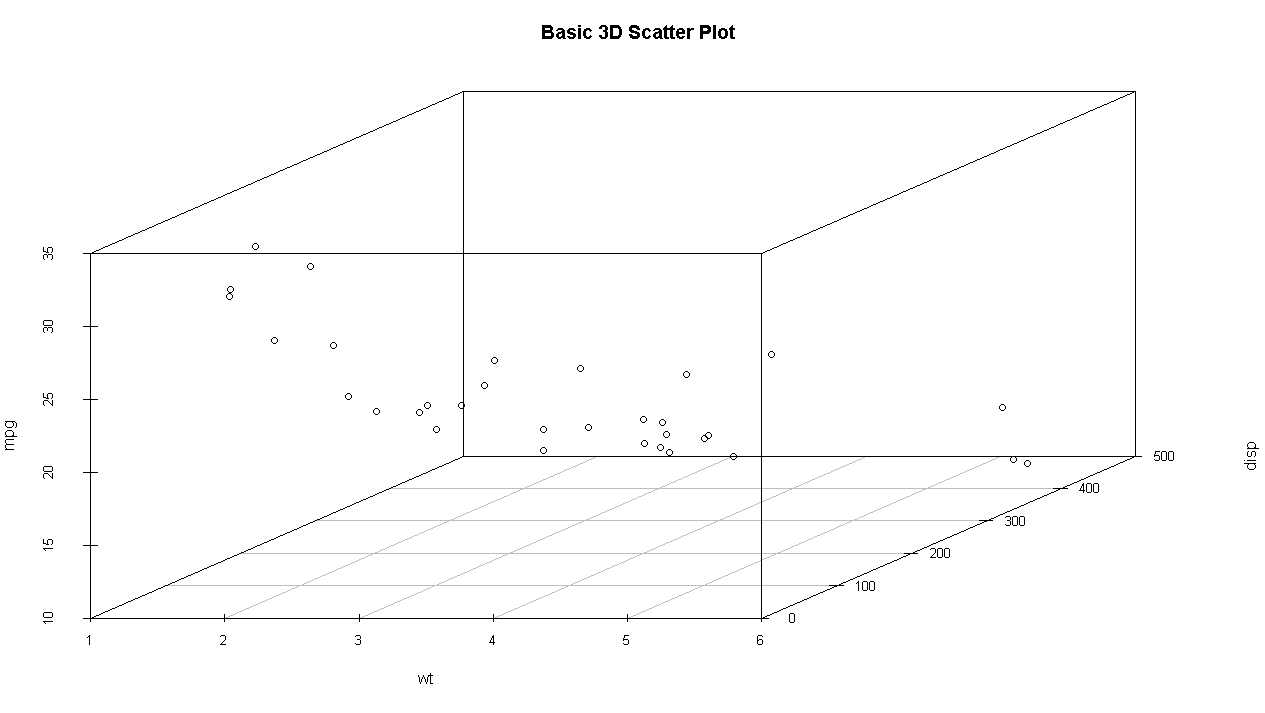
#三维散点
install.packages("scatterplot3d")
library(scatterplot3d)
attach(mtcars)
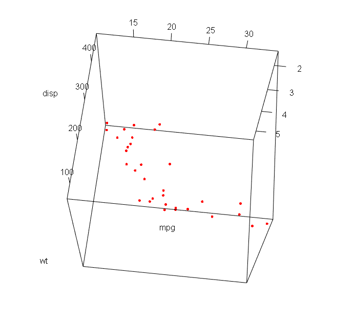
scatterplot3d(wt,disp,mpg,main="Basic 3D Scatter Plot")
scatterplot3d(wt,disp,mpg,pch=16,highlight.3d = TRUE,type="h",main="3D Scatter Plot with Vertical Lines")
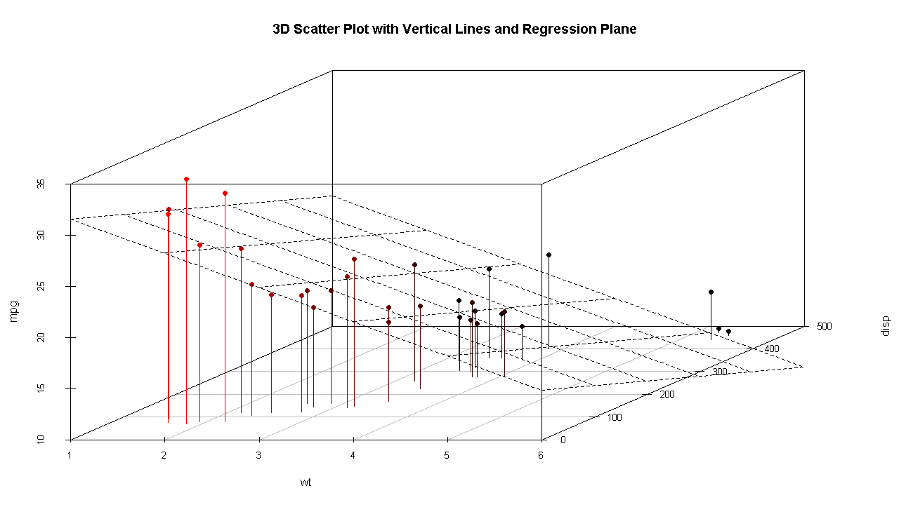
s3d<-scatterplot3d(wt,disp,mpg,pch=16,highlight.3d=TRUE,type="h",main="3D Scatter Plot with Vertical Lines and Regression Plane")
fit<-lm(mpg~wt+disp)
s3d$plane3d(fit)

#旋转三维散点
install.packages("rgl")
library(rgl)
plot3d(wt,disp,mpg,col="red",size=5)

library(car)
with(mtcars,scatter3d(wt,disp,mpg))

#气泡图
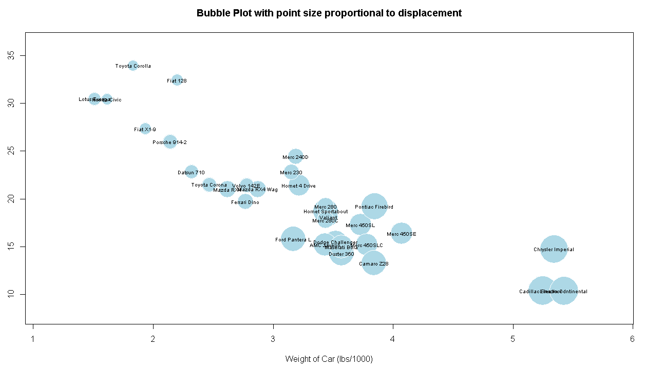
attach(mtcars)
r<-sqrt(disp/pi)
symbols(wt,mpg,circle=r,inches=0.30,fg="white",bg="lightblue",main="Bubble Plot with point size proportional to displacement",ylab="Miles Per Gallon",xlab="Weight of Car (lbs/1000)")
text(wt,mpg,rownames(mtcars),cex=0.6)
#折线图
opar<-par(no.readonly = TRUE)
par(mfrow=c(1,2))
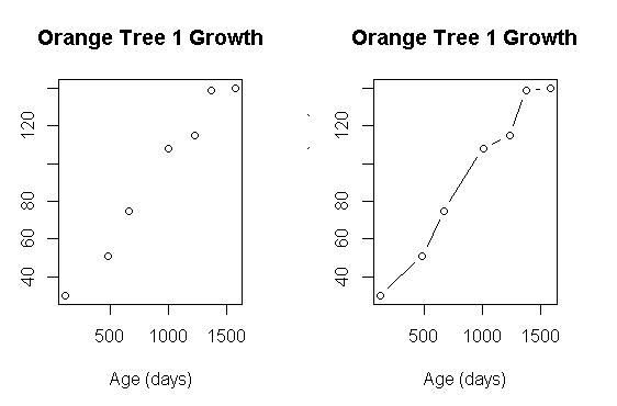
t1<-subset(Orange,Tree==1)
plot(t1$age,t1$circumference,xlab="Age (days)",ylab="Circumference (mm)",main="Orange Tree 1 Growth")
plot(t1$age,t1$circumference,xlab="Age (days)",ylab="Circumference (mm)",main="Orange Tree 1 Growth",type="b")
par(opar)
#折线图汇总
par(mfrow=c(1,1))
Orange$Tree<-as.numeric(Orange$Tree)
ntrees<-max(Orange$Tree)

xrange<-range(Orange$age)
yrange<-range(Orange$circumference)

plot(xrange,yrange,type="n",xlab="Age (days)",ylab="Circumference (mm)")

colors<-rainbow(ntrees)
linetype<-c(1:ntrees)
plotchar<-seq(18,18+ntrees,1)

for(i in 1:ntrees)
{
  tree<-subset(Orange,Tree==i)
  lines(tree$age,tree$circumference,type="b",lwd=2,lty=linetype[i],col=colors[i],pch=plotchar[i])

}

title("Tree Growth","example of line plot")

legend(xrange[1],yrange[2],1:ntrees,cex=.8,col=colors,pch=plotchar,lty=linetype,title="Tree")

#相关图
install.packages("corrgram")
library(corrgram)
corrgram(mtcars,order=TRUE,lower.panel=panel.shade,upper.panel=panel.pie,text.panel=panel.txt,main="Corrgram of mtcars intercorrelations")
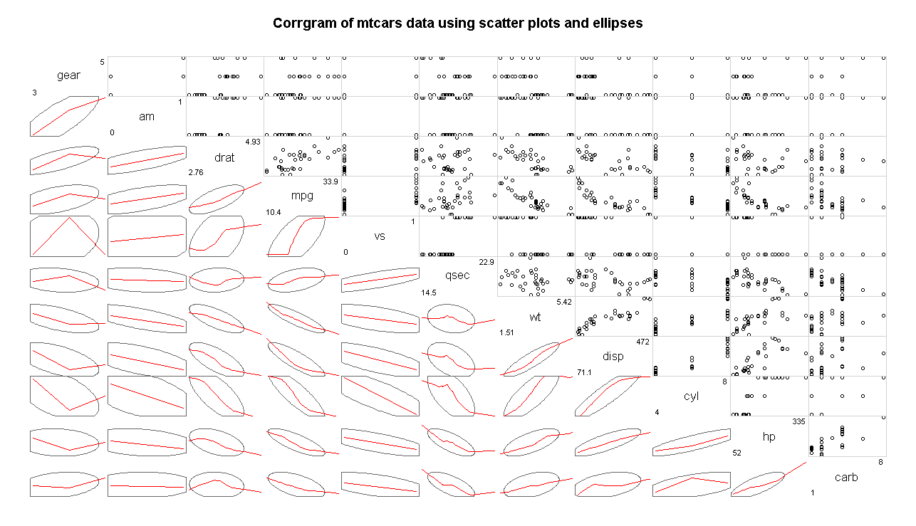
corrgram(mtcars,order=TRUE,lower.panel = panel.ellipse,upper.panel = panel.pts,text.panel = panel.txt,diag.panel = panel.minmax,main="Corrgram of mtcars data using scatter plots and ellipses")
corrgram(mtcars,lower.panel = panel.shade,upper.panel = NULL,text.panel = panel.txt,main="Car Mileage Data (unsorted)")


#马赛克图
library(vcd)
mosaic(Titanic,shade=TRUE,legend=TRUE)

library(vcd)
mosaic(~Class+Sex+Age+Survived,data=Titanic,shade=TRUE,legend=TRUE)


 浙公网安备 33010602011771号