WPF整理-Style
"Consistency in a user interface is an important trait; there are many facets of consistency,
one of which is the consistent look and feel of controls. For example, all buttons should
look roughly the same – similar colors, the same margins, and so on."
UI的风格一致性是应用程序应当关注的重要特性。
“Styles provide a convenient way to group a set of properties (and triggers) under a single
object, and then selectively (or automatically as we'll see later) apply it to elements.”
1.Creating and using styles
用一个Demo,来总结Style。
MainWindow.xaml如下:
<Window x:Class="CreatingAndUsingStyle.MainWindow"
        xmlns="http://schemas.microsoft.com/winfx/2006/xaml/presentation"
        xmlns:x="http://schemas.microsoft.com/winfx/2006/xaml"
        Title="Styled Calculatot" Height="269" Width="180" ResizeMode="CanMinimize">
    <Window.Resources>
        <Style TargetType="Button" x:Key="numericStyle">
            <Setter Property="FontSize" Value="20" />
            <Setter Property="Margin" Value="4" />
            <Setter Property="Padding" Value="6" />
            <Setter Property="Effect">
                <Setter.Value>
                    <DropShadowEffect Color="Blue"/>
                </Setter.Value>
            </Setter>
        </Style>

        <Style TargetType="Button" x:Key="operatorStyle" BasedOn="{StaticResource numericStyle}">
            <Setter Property="FontWeight" Value="ExtraBold" />
            <Setter Property="Effect">
                <Setter.Value>
                    <DropShadowEffect Color="Red" />
                </Setter.Value>
            </Setter>
        </Style>
    </Window.Resources>

    <Grid>
    <Grid.ColumnDefinitions>
        <ColumnDefinition Width="Auto" />
        <ColumnDefinition Width="Auto" />
        <ColumnDefinition Width="Auto" />
        <ColumnDefinition Width="Auto" />
    </Grid.ColumnDefinitions>
    <Grid.RowDefinitions>
        <RowDefinition Height="Auto" />
        <RowDefinition Height="Auto" />
        <RowDefinition Height="Auto" />
        <RowDefinition Height="Auto" />
        <RowDefinition Height="Auto" />
    </Grid.RowDefinitions>
        <TextBox Background="Cyan" IsReadOnly="True"  Grid.ColumnSpan="4"/>
        <Button Content="7" Grid.Row="1" Style="{StaticResource numericStyle}"/>
        <Button Content="8" Grid.Row="1" Grid.Column="1" Style="{StaticResource numericStyle}"/>
        <Button Content="9" Grid.Row="1" Grid.Column="2" Style="{StaticResource numericStyle}"/>
        <Button Content="4" Grid.Row="2" Style="{StaticResource numericStyle}"/>
        <Button Content="5" Grid.Row="2" Grid.Column="1" Style="{StaticResource numericStyle}"/>
        <Button Content="6" Grid.Row="2" Grid.Column="2" Style="{StaticResource numericStyle}"/>
        <Button Content="1" Grid.Row="3" Style="{StaticResource numericStyle}"/>
        <Button Content="2" Grid.Row="3" Grid.Column="1" Style="{StaticResource numericStyle}"/>
        <Button Content="3" Grid.Row="3" Grid.Column="2" Style="{StaticResource numericStyle}"/>
        <Button Content="0" Grid.Row="4" Style="{StaticResource numericStyle}"/>
        <Button Content="=" Grid.Row="4" Grid.Column="1" Grid.ColumnSpan="2" Style="{StaticResource operatorStyle}">
            <Button.Effect>
                <DropShadowEffect Color="Green" />
            </Button.Effect>
        </Button>
        <Button Content="+" Grid.Row="4" Grid.Column="3" Style="{StaticResource operatorStyle}"/>
        <Button Content="-" Grid.Row="3" Grid.Column="3" Style="{StaticResource operatorStyle}"/>
        <Button Content="X" Grid.Row="2" Grid.Column="3" Style="{StaticResource operatorStyle}"/>
        <Button Content="/" Grid.Row="1" Grid.Column="3" Style="{StaticResource operatorStyle}"/>
    </Grid>
</Window>
效果如下:

Point of Interest:
1.“A Style is a container for a bunch of Setter objects (and triggers, as we'll see later). Each
setter indicates which property should have which value; the property must be a dependency
property. The FrameworkElement class exposes a Style property that can be set to such a
Style object. Styles are always built as resources.”
Setter的Property必须是依赖属性;
FrameworkStyle暴露了Style这个属性;
Style一般放在Resources中.
2."The TargetType property of a Style is typically set, which makes the Style applicable to
that particular type (this can be any type, even a type of a custom control) and any derived
types."
TargetType="Button" 指定Style应用的类型。
一般,我们使用Style的时候,我们都会设置这个(In practice ,TargetType is always specified.),想想为什么?
3. x:Key="numericStyle" 可以根据需要进行有或无。
a.当其有的时候,我们需要对需要 Style="{StaticResource numericStyle}" .
b.其不设置的时候,默认所有TargetType使用此Style。 见2.
4. BasedOn="{StaticResource numericStyle}" 这是Style的继承。
Style继承时,可以修改BaseOn Style的Setter。如operatorStyle的 部分所示。
Style继承很好用,但是要注意:基Style的修改会影响子style.
5.“An element that uses a style can change a property that is set explicitly by a Style (a local
value), and this is stronger than a Style property setter.”
对于应用了Style的element,我们可以设置其属性值,且这个优先级更高(覆盖Style设置)。如"="Button的 部分所示。
2.Applying a style automatically
我们移除 x:Key="numericStyle"。让所有Button使用这个style.
MainWindow.xaml修改如下:
<Window x:Class="CreatingAndUsingStyle.MainWindow"
        xmlns="http://schemas.microsoft.com/winfx/2006/xaml/presentation"
        xmlns:x="http://schemas.microsoft.com/winfx/2006/xaml"
        Title="Styled Calculatot" Height="269" Width="180" ResizeMode="CanMinimize">
    <Window.Resources>
        <Style  TargetType="Button">
            <Setter Property="FontSize" Value="20" />
            <Setter Property="Margin" Value="4" />
            <Setter Property="Padding" Value="6" />
            <Setter Property="Effect">
                <Setter.Value>
                    <DropShadowEffect Color="Blue"/>
                </Setter.Value>
            </Setter>
        </Style>

        <Style TargetType="Button" x:Key="operatorStyle" BasedOn="{StaticResource {x:Type Button}}">
            <Setter Property="FontWeight" Value="ExtraBold" />
            <Setter Property="Effect">
                <Setter.Value>
                    <DropShadowEffect Color="Red" />
                </Setter.Value>
            </Setter>
        </Style>
    </Window.Resources>

    <Grid>
    <Grid.ColumnDefinitions>
        <ColumnDefinition Width="Auto" />
        <ColumnDefinition Width="Auto" />
        <ColumnDefinition Width="Auto" />
        <ColumnDefinition Width="Auto" />
    </Grid.ColumnDefinitions>
    <Grid.RowDefinitions>
        <RowDefinition Height="Auto" />
        <RowDefinition Height="Auto" />
        <RowDefinition Height="Auto" />
        <RowDefinition Height="Auto" />
        <RowDefinition Height="Auto" />
    </Grid.RowDefinitions>
        <TextBox Background="Cyan" IsReadOnly="True"  Grid.ColumnSpan="4"/>
        <Button Content="7" Grid.Row="1" />
        <Button Content="8" Grid.Row="1" Grid.Column="1" />
        <Button Content="9" Grid.Row="1" Grid.Column="2" />
        <Button Content="4" Grid.Row="2" />
        <Button Content="5" Grid.Row="2" Grid.Column="1" />
        <Button Content="6" Grid.Row="2" Grid.Column="2" />
        <Button Content="1" Grid.Row="3" />
        <Button Content="2" Grid.Row="3" Grid.Column="1" />
        <Button Content="3" Grid.Row="3" Grid.Column="2" />
        <Button Content="0" Grid.Row="4" Style="{x:Null}"/>
        <Button Content="=" Grid.Row="4" Grid.Column="1" Grid.ColumnSpan="2" Style="{StaticResource operatorStyle}">
            <Button.Effect>
                <DropShadowEffect Color="Green" />
            </Button.Effect>
        </Button>
        <Button Content="+" Grid.Row="4" Grid.Column="3" Style="{StaticResource operatorStyle}"/>
        <Button Content="-" Grid.Row="3" Grid.Column="3" Style="{StaticResource operatorStyle}"/>
        <Button Content="X" Grid.Row="2" Grid.Column="3" Style="{StaticResource operatorStyle}"/>
        <Button Content="/" Grid.Row="1" Grid.Column="3" Style="{StaticResource operatorStyle}"/>
    </Grid>
</Window>
效果如下:

Point of Interest
1.“Automatic styles are created as resources without a key. This does not mean there is no key,
because it's still a dictionary. The key becomes the actual type to apply the style to defined by
the TargetType property.”
不为Style指定x:key,这个Style将应用于所有的x:Tyle element;
没有指定x:key,不代表其没有key,其key由x:Tyle定义,就本例而言是{x:Type Button}},从Style继承中(xaml中绿色高亮代码),可见一斑。
2.如果,这样的Style被Set在Window的Resource,则影响这个Window上的所有x:Type类型的element;
如果被set在application's resources,则影响所有window。
3.“The Style is applied to all elements of the target type, but not derived types.
Any element that does not set its style explicitly obtains that style automatically. If an element
wishes to revert to its default style, it can set its Style property to null ( {x:Null} in XAML)
or set its Style to another named style.”
如果,我们希望某个element不应用这个style,我们可以设置它的Style属性为其他style;
如果想让它保持默认的样子,我们可以设置其Style="{x:Null}",如Button “0”。
3.动态更换Style
“Automatic styles are a great way to create a consistent look and feel without burdening the
developer (or the designer) with the details of the various visual properties. It can also be
used as a quick way to implement skinning."
在Skin文件夹中添加两个Resource Dictionary,如下:


<ResourceDictionary xmlns="http://schemas.microsoft.com/winfx/2006/xaml/presentation"
                    xmlns:x="http://schemas.microsoft.com/winfx/2006/xaml">
    <Style TargetType="TextBox">
        <Setter Property="Background" Value="LightBlue" />
        <Setter Property="Foreground" Value="Black" />
        <Setter Property="BorderThickness" Value="2" />
        <Setter Property="BorderBrush" Value="DarkBlue" />
        <Style.Triggers>
            <Trigger Property="IsReadOnly" Value="True">
                <Setter Property="Background" Value="Blue" />
            </Trigger>
        </Style.Triggers>
    </Style>
    <Style TargetType="Button">
        <Setter Property="Background" Value="Cyan" />
    </Style>
</ResourceDictionary>
<ResourceDictionary xmlns="http://schemas.microsoft.com/winfx/2006/xaml/presentation"
                    xmlns:x="http://schemas.microsoft.com/winfx/2006/xaml">
    <Style TargetType="TextBox">
        <Setter Property="Background" Value="Violet" />
        <Setter Property="Foreground" Value="DarkViolet" />
        <Setter Property="BorderThickness" Value="2" />
        <Setter Property="BorderBrush" Value="LightPink" />

        <Style.Triggers>
            <Trigger Property="IsReadOnly" Value="True">
                <Setter Property="Background" Value="Pink" />
            </Trigger>
        </Style.Triggers>
    </Style>
    <Style TargetType="Button">
        <Setter Property="Background" Value="Red" />
    </Style>
</ResourceDictionary>
并设置其Property为:Content/Aways Copy.
“These settings prevent the default compilation to BAML and also provide the flexibility to
change the skins without recompilation. ”
请参考DebugLZQ前面的博文:WPF整理-二进制资源和内容
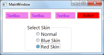
MainWindow.xaml,MainWindow.xaml.cs如下:
<Window x:Class="WPFStyleTriggerAndControlTemplate.MainWindow"
        xmlns="http://schemas.microsoft.com/winfx/2006/xaml/presentation"
        xmlns:x="http://schemas.microsoft.com/winfx/2006/xaml"
        Title="MainWindow" Height="303.719" Width="530.785">
    <Grid Margin="0,0,2,0">
        <TextBox HorizontalAlignment="Left" Height="23" Margin="10,35,0,0" TextWrapping="Wrap" Text="TextBox" VerticalAlignment="Top" Width="120"/>
        <TextBox HorizontalAlignment="Left" Height="23" Margin="156,35,0,0" TextWrapping="Wrap" Text="TextBox" VerticalAlignment="Top" Width="120"/>
        <TextBox HorizontalAlignment="Left" Height="23" Margin="293,35,0,0" TextWrapping="Wrap" Text="TextBox" VerticalAlignment="Top" Width="120" RenderTransformOrigin="1.577,0.303"/>
        <Button Content="Button" HorizontalAlignment="Left" Margin="433,35,0,0" VerticalAlignment="Top" Width="75"/>
        <GroupBox FontSize="28" Header="Select Skin"  Margin="75,102,62,0" VerticalAlignment="Top" Height="158">
            <StackPanel Orientation="Vertical" HorizontalAlignment="Center">
                <RadioButton Content="Normal" Checked="AllRadioButtonChecked"/>
                <RadioButton Content="Blue Skin" Checked="AllRadioButtonChecked"/>
                <RadioButton Content="Red Skin" Checked="AllRadioButtonChecked"/>
            </StackPanel>
        </GroupBox>
    </Grid>
</Window>
using System;
using System.Collections.Generic;
using System.Linq;
using System.Text;
using System.Threading.Tasks;
using System.Windows;
using System.Windows.Controls;
using System.Windows.Data;
using System.Windows.Documents;
using System.Windows.Input;
using System.Windows.Markup;
using System.Windows.Media;
using System.Windows.Media.Imaging;
using System.Windows.Navigation;
using System.Windows.Shapes;

namespace WPFStyleTriggerAndControlTemplate
{
    /// <summary>
    /// Interaction logic for MainWindow.xaml
    /// </summary>
    public partial class MainWindow : Window
    {
        public MainWindow()
        {
            InitializeComponent();
        }

        private void AllRadioButtonChecked(object sender, RoutedEventArgs e)
        {
            switch (((RadioButton)sender).Content.ToString())
            {
                case "Blue Skin":
                    ChangeSkin("Skins/BlueSkin.xaml");
                    break;
                case "Red Skin":
                    ChangeSkin("Skins/RedSkin.xaml");
                    break;
                case "Normal":
                    Application.Current.Resources.MergedDictionaries.Clear();
                    break;
            }
        }

        void ChangeSkin(string skinRelativeUri)
        {
            var si = Application.GetContentStream(new Uri(skinRelativeUri, UriKind.Relative));
            var rd = (ResourceDictionary)XamlReader.Load(si.Stream);
            Application.Current.Resources.MergedDictionaries.Clear();
            Application.Current.Resources.MergedDictionaries.Add(rd);
        }

    }
}
运行效果如下:

4.Other places to set styles
"The example shows styles applied to the FrameworkElement.Style property, but this is
not the only property that can accept a Style.
Other examples include the following:"
"FrameworkElement.FocusVisualStyle property: Accepts a Style that affects
the way the focus indicator is rendered when that element has the keyboard focus."
"ItemsControl.ItemContainerStyle property: Accepts a Style that affects the
container element of each data item (for example, ListBoxItem for a ListBox)."
"DataGrid.CellStyle: Accepts a Style that affects the way a cell is rendered.
Similar properties exposed by the DataGrid include ColumnHeaderStyle,
DragIndicatorStyle, DropLocationIndicatorStyle, RowHeaderStyle,
and RowStyle."
5.Style和ControlTemplate
ControlTemplate一般有如下2种使用方法
方法1:
<Window.Resources>
<ControlTemplate x:Key="AnimatedExpanderButtonTemp" TargetType="{x:Type ToggleButton}">
Template="{StaticResource RevealExpanderTemp}"
--------------
方法2:
<Style TargetType="{x:Type TabControl}">
<Setter Property="Template">
<Setter.Value>
<ControlTemplate TargetType="{x:Type TabControl}">
<Grid>
-----------------------------
关于DataTemplate请参考DebugLZQ前面的博文:WPF整理-使用 DataTemplate
6.Style & Trigger & ControlTemplate一个非常常见的例子
在实际应用中,这3个一般会同时用到。我们用一个自定义的最大化/最小化/关闭按钮等,如下:

一般有2种实现方法,第一种方法如下:
<Window x:Class="WpfApplication1.MainWindow"
        xmlns="http://schemas.microsoft.com/winfx/2006/xaml/presentation"
        xmlns:x="http://schemas.microsoft.com/winfx/2006/xaml"
        Title="MainWindow" Height="362.767" Width="524.468" WindowStyle="None" AllowsTransparency="True" Background="Transparent">
    <Window.Resources>
        <Style TargetType="Button" x:Key="btnStyle1">
            <Setter Property="Template">
                <Setter.Value>
                    <ControlTemplate  TargetType="Button">
                        <Grid x:Name="grid1" Background="Transparent">
                            <ContentPresenter Content="{TemplateBinding Content}" VerticalAlignment="Center" HorizontalAlignment="Center" RecognizesAccessKey="True"/>
                        </Grid>
                        <ControlTemplate.Triggers>
                            <Trigger Property="IsMouseOver" Value="True">
                                <Setter TargetName="grid1" Property="Grid.Background" Value="Red"/>
                            </Trigger>
                        </ControlTemplate.Triggers>
                    </ControlTemplate>
                </Setter.Value>
            </Setter>
        </Style>

        <ControlTemplate  TargetType="Button" x:Key="btnTemplate1">
            <Grid x:Name="grid1" Background="Transparent" Width="{TemplateBinding Width}" Height="{TemplateBinding Height}">
                <ContentPresenter Content="{TemplateBinding Content}" VerticalAlignment="Center" HorizontalAlignment="Center" RecognizesAccessKey="True"/>
            </Grid>
            <ControlTemplate.Triggers>
                <Trigger Property="IsMouseOver" Value="True">
                    <Setter TargetName="grid1" Property="Grid.Background" Value="LightBlue"/>
                </Trigger>
            </ControlTemplate.Triggers>
        </ControlTemplate>
    </Window.Resources>
    <Grid >
        <Grid.Background>
            <ImageBrush ImageSource="Button_Icons/background_mainwnd.png"/>
        </Grid.Background>
        <Grid.RowDefinitions>
            <RowDefinition Height="Auto"/>
            <RowDefinition Height="*"/>
        </Grid.RowDefinitions>
        <StackPanel Grid.Row="0" Orientation="Horizontal" FlowDirection="RightToLeft">
            <Button Style="{StaticResource btnStyle1}" Content="X" Foreground="White" FontSize="20" HorizontalAlignment="Left"  VerticalAlignment="Top" Width="23" Height="23" Margin="5,0,5,0"/>
            <Button Template="{StaticResource btnTemplate1}" Content="口" Foreground="White" FontSize="20" HorizontalAlignment="Left" VerticalAlignment="Top"   Width="23" Height="23" Margin="5,0,5,0"/>
            <Button Template="{StaticResource btnTemplate1}" Content="一" Foreground="White" FontSize="20" HorizontalAlignment="Left" VerticalAlignment="Top"   Width="23" Height="23" Margin="5,0,5,0"/>

        </StackPanel>
    </Grid>
</Window>
效果如下:
这种方法的缺点是,我们设置的Content比较粗糙~
第二中方法,借助相关的图标的png图片及相应的效果图片,来设置Content,原理同上
<Window x:Class="WpfApplication1.Window1"
        xmlns="http://schemas.microsoft.com/winfx/2006/xaml/presentation"
        xmlns:x="http://schemas.microsoft.com/winfx/2006/xaml"
        Title="Window1" Height="362.767" Width="524.468" WindowStyle="None" AllowsTransparency="True" Background="Transparent">
    <Window.Resources>
        <Style TargetType="Button" x:Key="btnStyle1">
            <Setter Property="Template">
                <Setter.Value>
                    <ControlTemplate  TargetType="Button">
                        <Grid  Background="Transparent">
                            <ContentPresenter x:Name="cp1" Content="{TemplateBinding Content}" VerticalAlignment="Center" HorizontalAlignment="Center" RecognizesAccessKey="True"/>
                        </Grid>
                        <ControlTemplate.Triggers>
                            <Trigger Property="IsMouseOver" Value="True">
                                <Setter TargetName="cp1" Property="Content">
                                    <Setter.Value>
                                        <Image Source="Button_Icons/xm.png"/>
                                    </Setter.Value>
                                </Setter>
                            </Trigger>
                        </ControlTemplate.Triggers>
                    </ControlTemplate>
                </Setter.Value>
            </Setter>
        </Style>
        <Style TargetType="Button" x:Key="btnStyle2">
            <Setter Property="Template">
                <Setter.Value>
                    <ControlTemplate  TargetType="Button">
                        <Grid  Background="Transparent">
                            <ContentPresenter x:Name="cp1" Content="{TemplateBinding Content}" VerticalAlignment="Center" HorizontalAlignment="Center" RecognizesAccessKey="True"/>
                        </Grid>
                        <ControlTemplate.Triggers>
                            <Trigger Property="IsMouseOver" Value="True">
                                <Setter TargetName="cp1" Property="Content">
                                    <Setter.Value>
                                        <Image Source="Button_Icons/mxm.png"/>
                                    </Setter.Value>
                                </Setter>
                            </Trigger>
                        </ControlTemplate.Triggers>
                    </ControlTemplate>
                </Setter.Value>
            </Setter>
        </Style>
        <Style TargetType="Button" x:Key="btnStyle3">
            <Setter Property="Template">
                <Setter.Value>
                    <ControlTemplate  TargetType="Button">
                        <Grid  Background="Transparent">
                            <ContentPresenter x:Name="cp1" Content="{TemplateBinding Content}" VerticalAlignment="Center" HorizontalAlignment="Center" RecognizesAccessKey="True"/>
                        </Grid>
                        <ControlTemplate.Triggers>
                            <Trigger Property="IsMouseOver" Value="True">
                                <Setter TargetName="cp1" Property="Content">
                                    <Setter.Value>
                                        <Image Source="Button_Icons/mim.png"/>
                                    </Setter.Value>
                                </Setter>
                            </Trigger>
                        </ControlTemplate.Triggers>
                    </ControlTemplate>
                </Setter.Value>
            </Setter>
        </Style>
    </Window.Resources>

    <Grid >
        <Grid.Background>
            <ImageBrush ImageSource="Button_Icons/background_mainwnd.png"/>
        </Grid.Background>
        <Grid.RowDefinitions>
            <RowDefinition Height="Auto"/>
            <RowDefinition Height="*"/>
        </Grid.RowDefinitions>
        <StackPanel Grid.Row="0" Orientation="Horizontal" FlowDirection="RightToLeft">
            <Button Style="{StaticResource btnStyle1}"  Foreground="White" FontSize="20" HorizontalAlignment="Left"  VerticalAlignment="Top" Width="30" Height="30" >
                <Button.Content>
                    <Image Source="Button_Icons/xn.png" />
                </Button.Content>
            </Button>
            <Button Style="{StaticResource btnStyle2}"  Foreground="White" FontSize="20" HorizontalAlignment="Left"  VerticalAlignment="Top" Width="30" Height="30" >
                <Button.Content>
                    <Image Source="Button_Icons/mxn.png" />
                </Button.Content>
            </Button>
            <Button Style="{StaticResource btnStyle3}"  Foreground="White" FontSize="20" HorizontalAlignment="Left"  VerticalAlignment="Top" Width="30" Height="30" >
                <Button.Content>
                    <Image Source="Button_Icons/min.png" />
                </Button.Content>
            </Button>

        </StackPanel>
    </Grid>
</Window>
效果如下:

Style的另一个非常常用的场景是:视图切换。参考DebugLZQ前面总结DataTemplate的博文中的一个例子:6.DataTemplate的一个非常常见的应用
请关注后续整理~
Wish it helps~

