python爬取知乎榜单
一、选题背景
知乎作为中文互联网高质量的问答社区和创作者聚集的原创内容平台,知乎能连接各行各业的用户,为用户提供社区服务,使用户之间能围绕一个感兴趣的话题去讨论。本次通过对知乎的爬取及数据分析,来爬取用户对话题的热度兴趣,用户比较于关注哪些话题,能帮助大家有效的了解。
二、爬虫设计方案
1.爬虫名称:爬取知乎榜单。
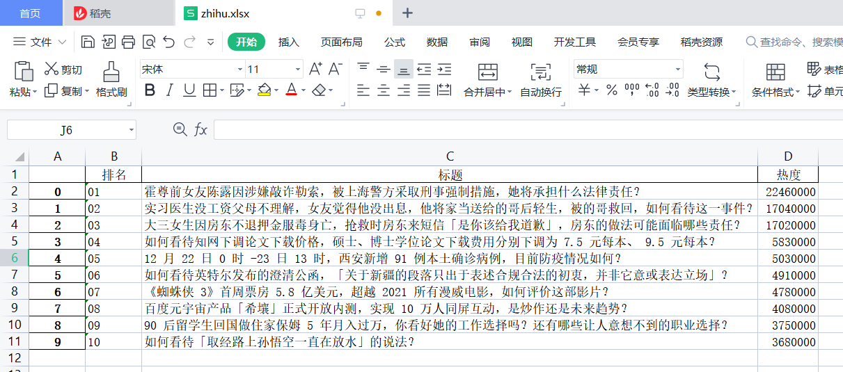
2.爬取内容:爬取知乎网页热榜标题、热度、排行及图片的一些相关内容。
3.方案概述:分析网站页面结构,找到爬取数据的位置,访问网页可得状态码200,分析网页源代码,找出所需要的的标签,逐个提取标签保存到相同路径xlsx文件中。
进行数据清洗,数据模型分析,数据可视化处理,绘制分布图,绘制相关拟合曲线图。
4.技术难点:在爬取知乎网页时,知乎更新了反爬虫,在爬取相关内容时,会出现网络问题。
三、主题页面的结构特征分析
1.主题页面的结构与特征分析:打开开发者控制工具,通过逐个检索分析找到自己需要的数据,发现所需的标签都在<body>的<div>中。
2.Htmls页面解析
四、网络爬虫程序设计
1.数据爬取与采集
#获取html网页,设置headers,并进行目标网址的请求
headers = {'user-agent': 'Mozilla/5.0 (Windows NT 10.0; Win64; x64) AppleWebKit/537.36 (KHTML, like Gecko) Chrome/75.0.3770.100 Safari/537.36'}
url = 'https://www.zhihu.com/billboard'
#请求超时时间为30秒
r = requests.get(url,timeout = 30,headers=headers)
#如果状态码不是200,则引发异常
r.raise_for_status()
#配置编码
r.encoding = r.apparent_encoding
html = requests.get(url, headers = headers)
print(html)

#用爬虫访问知乎首页,https://www.zhihu.com/billboard,bs解析后用soup对象命名
import requests
from bs4 import BeautifulSoup
url = 'https://www.zhihu.com/billboard'
res = requests.get(url)
res.encoding = res.apparent_encoding
soup=BeautifulSoup(html,'html.parser')
#print(soup.prettify())

#标题
r.text
html=r.text
soup=BeautifulSoup(html,'html.parser')
titles = soup.select('.HotList-itemTitle')
for title in titles:
     print(title.text)


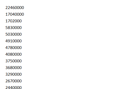
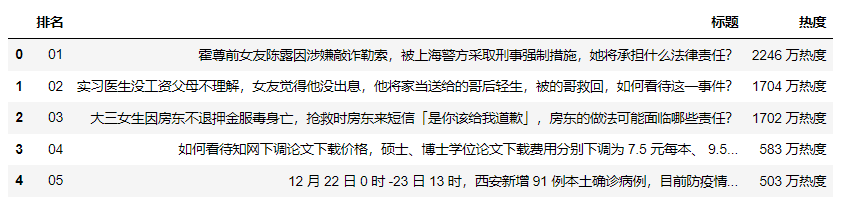
#热度
heats = soup.select('.HotList-itemMetrics')
for heat in heats:
    print(heat.text.replace('万热度','0000'))

#排名
ranks = soup.select('.HotList-itemPre')
for rank in ranks:
    print(rank.text)

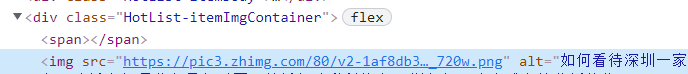
#标题相关图片
number = 0
imgs = soup.select('.HotList-itemImgContainer img')
for img in imgs:
    print(img['src'])
    alt = img['alt']

#保存数据,生成xlsx文件
num=10
dts = []
for i in range(num):
    lst = []
    lst.append(ranks[i].text)
    lst.append(titles[i].text)
    lst.append(heats[i].text.repalce('万热度','0000'))
    dts.append(lst)
df = pd.DataFrame(dts, columns=['排名','标题', '热度'])
df.to_excel(r'zhihu.xlsx')
2.使用pandas数据清洗
#删除无效列与行
#若处理无效行,设置axis=0
zhihu.drop('热度',axis=1,inplace=True)
zhihu.head()
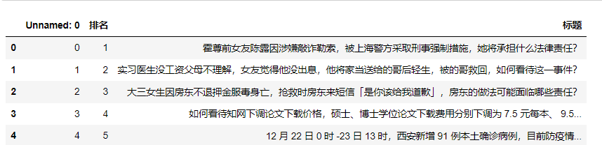
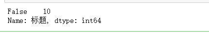
#空值的处理
zhihu['标题'].isnull().value_counts()
#重复值处理
zhihu.duplicated()

#空格处理
#删除数据两边的空格
zhihu['标题']=zhihu['标题'].map(str.strip)
#删除数据左边的空格
zhihu['标题']=zhihu['标题'].map(str.lstrip)
#删除数据右边的空格
zhihu['标题']=zhihu['标题'].map(str.rstrip)
#异常值处理
zhihu.describe()
#假设50.00000为异常值,可调用replace方法,将异常值替换平均值
#zhihu.replace([20.00000],zhihu['排名'].mean())

3.数据分析与可视化
#数据加载
zhihu_df=pd.read_excel(r'C:\Users\xun7788\zhihu.xlsx')
df.head()
#直方图
import matplotlib.pyplot as plt
import pandas as pd
import numpy as np
zhihu_df=pd.read_excel(r'C:\Users\xun7788\zhihu.xlsx')
data=np.array(zhihu_df['热度'][0:10])
#索引
index=np.arange(1,11)
#用来正常显示中文标签
plt.rcParams['font.sans-serif']=['Arial Unicode MS']
#用来正常显示负号
plt.rcParams['axes.unicode_minus']=False
#修改x轴字体大小为12
plt.xticks(fontsize=12)
#修改y轴字体大小为12
plt.yticks(fontsize=12)
print(data)
print(index)
#x标签
plt.xlabel('ranks')
#y标签
plt.ylabel('heats')
s = pd.Series(data, index)
s.plot(kind='bar',color='g')
plt.grid()
plt.show()

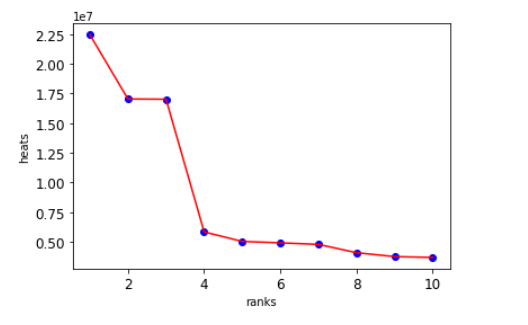
#散点图、折线图
zhihu_df=pd.read_excel(r'C:\Users\xun7788\zhihu.xlsx')
plt.rcParams['font.sans-serif']=['Arial Unicode MS']
plt.rcParams['axes.unicode_minus']=False
plt.xticks(fontsize=12)
plt.yticks(fontsize=12)
#散点
plt.scatter(zhihu_df.排名, zhihu_df.热度,color='b')
#折线
plt.plot(zhihu_df.排名, zhihu_df.热度,color='r')
#x标签
plt.xlabel('ranks')
#y标签
plt.ylabel('heats')
plt.show()
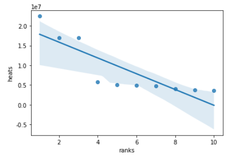
#排名与热度的线性回归图
import seaborn as sns
sns.regplot(zhihu_df.排名,zhihu_df.热度)
plt.xlabel('ranks')#x标签
plt.ylabel('heats')#y标签
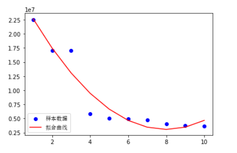
#选取排名和热度两个变量,进行一元二次方程拟合,并画出拟合曲线,给出拟合方程
import matplotlib.pyplot as plt
import matplotlib
import numpy as np
import scipy.optimize as opt
zhihu_df=pd.read_excel(r'C:\Users\xun7788\zhihu.xlsx')
x0=np.array(zhihu_df['排名'][0:10])
y0=np.array(zhihu_df['热度'][0:10])
def func(x,c0):
    a,b,c=c0
    return a*x**2+b*x+c
def errfc(c0,x,y):
    return y-func(x,c0)
c0=[0,2,3]
c1=opt.leastsq(errfc,c0,args=(x0,y0))[0]
a,b,c=c1
print(f"拟合方程为:y={a}*x**2+{b}*x+{c}")
chinese=matplotlib.font_manager.FontProperties(fname='C:\Windows\Fonts\simsun.ttc')
plt.plot(x0,y0,"ob",label="样本数据")
plt.plot(x0,func(x0,c1),"r",label="拟合曲线")
plt.legend(loc=3,prop=chinese)
plt.show()
五、完整代码
import requests
from bs4 import BeautifulSoup
import pandas as pd
import time
import random
from matplotlib import pyplot as plt
import numpy as np
from numpy import genfromtxt
import matplotlib.pyplot as plt
import matplotlib
from scipy.optimize import leastsq
import sklearn

#操作暂停一秒
time.sleep(1)
#用爬虫访问知乎首页,https://www.zhihu.com/billboard,bs解析后用soup对象命名
import requests
from bs4 import BeautifulSoup
url = 'https://www.zhihu.com/billboard'
res = requests.get(url)
res.encoding = res.apparent_encoding
soup=BeautifulSoup(html,'html.parser')
print(soup.prettify())
#获取html网页,设置headers,并进行目标网址的请求
headers = {'user-agent': 'Mozilla/5.0 (Windows NT 10.0; Win64; x64) AppleWebKit/537.36 (KHTML, like Gecko) Chrome/75.0.3770.100 Safari/537.36'}
url = 'https://www.zhihu.com/billboard'
#请求超时时间为30秒
r = requests.get(url,timeout = 30,headers=headers)
#如果状态码不是200,则引发异常
r.raise_for_status()
#配置编码
r.encoding = r.apparent_encoding
html = requests.get(url, headers = headers)
print(html)

#标题
r.text
html=r.text
soup=BeautifulSoup(html,'html.parser')
titles = soup.select('.HotList-itemTitle')
for title in titles:
     print(title.text)
#排名
ranks = soup.select('.HotList-itemPre')
for rank in ranks:
    print(rank.text)
#热度
heats = soup.select('.HotList-itemMetrics')
for heat in heats:
    print(heat.text.replace('万热度','0000')
#标题相关图片
number = 0
imgs = soup.select('.HotList-itemImgContainer img')
for img in imgs:
    print(img['src'])
    alt = img['alt']

#保存数据,生成xlsx文件
num=10
dts = []
for i in range(num):
    lst = []
    lst.append(ranks[i].text)
    lst.append(titles[i].text)
    lst.append(heats[i].text.replace('万热度','0000'))
    dts.append(lst)
df = pd.DataFrame(dts, columns=['排名','标题', '热度',])
df.to_excel(r'zhihu.xlsx')

#删除无效列与行
#若处理无效行,设置axis=0
zhihu.drop('热度',axis=1,inplace=True)
zhihu.head()
#空值的处理
zhihu['标题'].isnull().value_counts()
#重复值处理
zhihu.duplicated()
#空格处理
#删除数据两边的空格
zhihu['标题']=zhihu['标题'].map(str.strip)
#删除数据左边的空格
zhihu['标题']=zhihu['标题'].map(str.lstrip)
#删除数据右边的空格
zhihu['标题']=zhihu['标题'].map(str.rstrip)
#异常值处理
zhihu.describe()
#假设50.00000为异常值,可调用replace方法,将异常值替换平均值
#zhihu.replace([20.00000],zhihu['排名'].mean())

#数据加载
zhihu_df=pd.read_excel(r'C:\Users\xun7788\zhihu.xlsx')
df.head()

#直方图
import matplotlib.pyplot as plt
import pandas as pd
import numpy as np
zhihu_df=pd.read_excel(r'C:\Users\xun7788\zhihu.xlsx')
data=np.array(zhihu_df['热度'][0:10])
#索引
index=np.arange(1,11)
#用来正常显示中文标签
plt.rcParams['font.sans-serif']=['Arial Unicode MS']
#用来正常显示负号
plt.rcParams['axes.unicode_minus']=False
#修改x轴字体大小为12
plt.xticks(fontsize=12)
#修改y轴字体大小为12
plt.yticks(fontsize=12)
print(data)
print(index)
#x标签
plt.xlabel('ranks')
#y标签
plt.ylabel('heats')
s = pd.Series(data, index)
s.plot(kind='bar',color='g')
plt.grid()
plt.show()

#散点图、折线图
zhihu_df=pd.read_excel(r'C:\Users\xun7788\zhihu.xlsx')
plt.rcParams['font.sans-serif']=['Arial Unicode MS']
plt.rcParams['axes.unicode_minus']=False
plt.xticks(fontsize=12)
plt.yticks(fontsize=12)
#散点
plt.scatter(zhihu_df.排名, zhihu_df.热度,color='b')
#折线
plt.plot(zhihu_df.排名, zhihu_df.热度,color='r')
#x标签
plt.xlabel('ranks')
#y标签
plt.ylabel('heats')
plt.show()

#排名与热度的线性回归图
import seaborn as sns
sns.regplot(zhihu_df.排名,zhihu_df.热度)
plt.xlabel('ranks')#x标签
plt.ylabel('heats')#y标签

#数据分析
from sklearn.linear_model import LinearRegression
zhihu_df=pd.read_excel(r'C:\Users\xun7788\zhihu.xlsx')
predict_model=LinearRegression()
X=zhihu_df[["排名"]]
Y=zhihu_df["热度"]
predict_model.fit(X,Y)
print("回归方程系数为{}".format( predict_model.coef_))
print("回归方程截距:{0:2f}".format( predict_model.intercept_))

#选取排名和热度两个变量,进行一元二次方程拟合,并画出拟合曲线,给出拟合方程
import matplotlib.pyplot as plt
import matplotlib
import numpy as np
import scipy.optimize as opt
zhihu_df=pd.read_excel(r'C:\Users\xun7788\zhihu.xlsx')
x0=np.array(zhihu_df['排名'][0:10])
y0=np.array(zhihu_df['热度'][0:10])
def func(x,c0):
    a,b,c=c0
    return a*x**2+b*x+c
def errfc(c0,x,y):
    return y-func(x,c0)
c0=[0,2,3]
c1=opt.leastsq(errfc,c0,args=(x0,y0))[0]
a,b,c=c1
print(f"拟合方程为:y={a}*x**2+{b}*x+{c}")
chinese=matplotlib.font_manager.FontProperties(fname='C:\Windows\Fonts\simsun.ttc')
plt.plot(x0,y0,"ob",label="样本数据")
plt.plot(x0,func(x0,c1),"r",label="拟合曲线")
plt.legend(loc=3,prop=chinese)
plt.show()
六、总结
1.经过对主题数据的分析和可视化,从图表和拟合方程曲线可知热度是随着排名不断增大的,用户对热度越高的话题越感兴趣。
2.通过本次课程设计的学习,我也了解到了自己薄弱点地方,不足的地方也在慢慢改进,本次设计也是通过看网上的教学视频,参考借鉴了一些网络资源,再加上自己的不断摸索一步步做出来的,尝到了先苦后甜的滋味。