


bootstrap switch样式修改与多列等间距布局
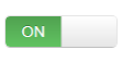
先以一张图开启今天的随笔

今天实习遇到了switch按钮,小姐姐说用插件bootstrap switch来写,我第一次用这个插件,首先在引入方面就遇到了很多坑,先来总结一下bootstrap switch的用法。
官网地址 http://www.bootcss.com/p/bootstrap-switch/
首先在bootstrap框架环境下引入bootstrap-switch.min.css和bootstrap-switch.min.js,或者bootstrap-switch.css和bootstrap-switch.js,需要注意的是支撑包中的css有针对bootstrap2和bootstrap3的,放在两个文件夹中,rel="stylesheet"记得加上,我就给傻逼的忘了,被自己坑了好久...
然后添加html
<div class="device-switch switch">
<input type="checkbox" checked/>
</div>
再初始化
$('.device-switch input').bootstrapSwitch({
onColor: "success",//项目需要,用了绿色
offColor: "default"
}).bootstrapSwitch('state', true);//按钮默认打开
有一些属性可以在html里指定,也可以在js中初始化,但是我设置大小属性的时候都没有效果,目前还没有找到原因,因为后面要改样式,就暂时没有深究。
然后我花了一个上午修改bootstrap switch的样式,没有什么捷径,就是用谷歌的开发者工具查看元素样式,一点一点尝试。
放上买家秀和卖家秀对比
修改前:
修改后:


这个买家秀还不错吧,嘻嘻
switch的简化结构大概是这样的
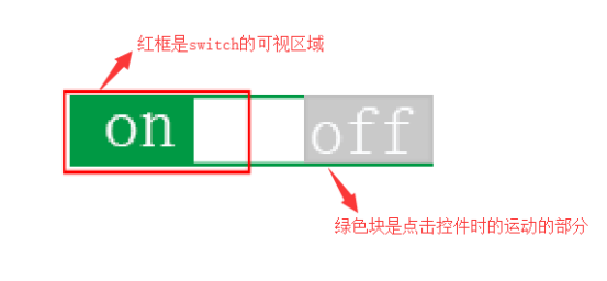
现在是开的状态,点击关闭后是这样

关闭的时候里面的块会左滑,显示off部分,所以我主要将边框改成圆角,并运用margin的负值将白色、灰色块左移,以填补圆角产生的背景空缺
至于里面的块具体移动多少,目前还没有明白它的计算机制,修改后的长度现在是可行的。
上代码:
.switch{display:inline-block;}

.bootstrap-switch{border-radius:22px;

width: 52px !important;height: 22px !important;

    }

.bootstrap-switch .bootstrap-switch-handle-off, .bootstrap-switch .bootstrap-switch-handle-on, .bootstrap-switch .bootstrap-switch-label

{

padding:0px;

    font-size: 12px;

    display: inline-block;

}

.bootstrap-switch .bootstrap-switch-label

{

width:42px !important;

height: 22px;

border-radius:11px !important;

position:relative;

}

.bootstrap-switch .bootstrap-switch-handle-on{

width: 52px !important;

    margin-right: -22px;

    padding-right: 22px;

    }

.bootstrap-switch .bootstrap-switch-handle-off{

width: 52px !important;

    border-radius: 11px;

    margin-left: -11px;

    padding-right: 2px;

    position:relative;

    color:#fff !important;

}
需要注意的是z-index在某些情况下会失效:
1、父标签 position属性为relative;
2、问题标签无position属性(不包括static);
3、问题标签含有浮动(float)属性。
代码中突然出现的position:relative就是为了解决这个问题
关于多列等间距均匀布局(最左边和最右边不留间隔),对这个疑惑已久,
三列均匀布局:
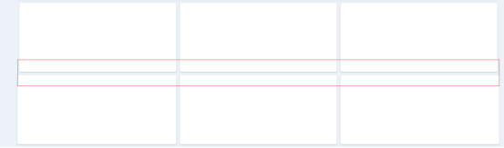
由于项目用了bootstrap,直接用了它的栅格布局,并修改了padding值,给左边的块margin-left取负值,具体数值根据padding值决定,右边则让margin-right取负值,修改后如上图下半部分的效果,最左边和最右边的间隔没有了。
但是这种方法还不是很好,左边和右边的可视区域宽度都改变了,这些多列布局还有很多疑惑,等研究清楚了再更新。
flex布局可以做到平均分配空间,但是间隔还是没搞定,留下没有技术的泪。
刚刚发现bootstrap已经解决了这个问题,row配合col-*-*就可以了


