

css弹性盒子属性
justify-content:
-
flex-start: 项目对齐到容器的左侧.
-
flex-end:项目对齐到容器的右侧.
-
center:项目对齐在容器的中心.
-
space-between:项目之间以相等的间距显示.
![image]()
-
space-around:显示的项目与他们周围的间距相等.
![image]()


align-items:
- flex-start: 项目与容器顶部对齐.
- flex-end: 项目与容器底部对齐.
- center: 项目在容器的垂直中心对齐.
- baseline: 项目显示在容器的基线处。.
- stretch:物品被拉伸以适合容器.
align-self:应用于单个项目,此属性接受与特定项目相同的值align-items
align-content来设置多行之间的间距:
- flex-start: 线装在容器的顶部。
- flex-end: 线装在容器的底部。
- center: 线在容器的垂直中心包装。
- space-between:行以相等的间距显示。
- space-around: 行以相等的间距显示在它们周围。
- stretch:线条被拉伸以适合容器。
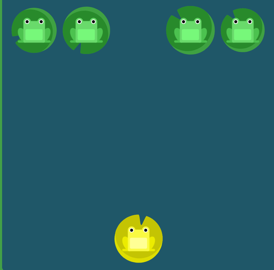
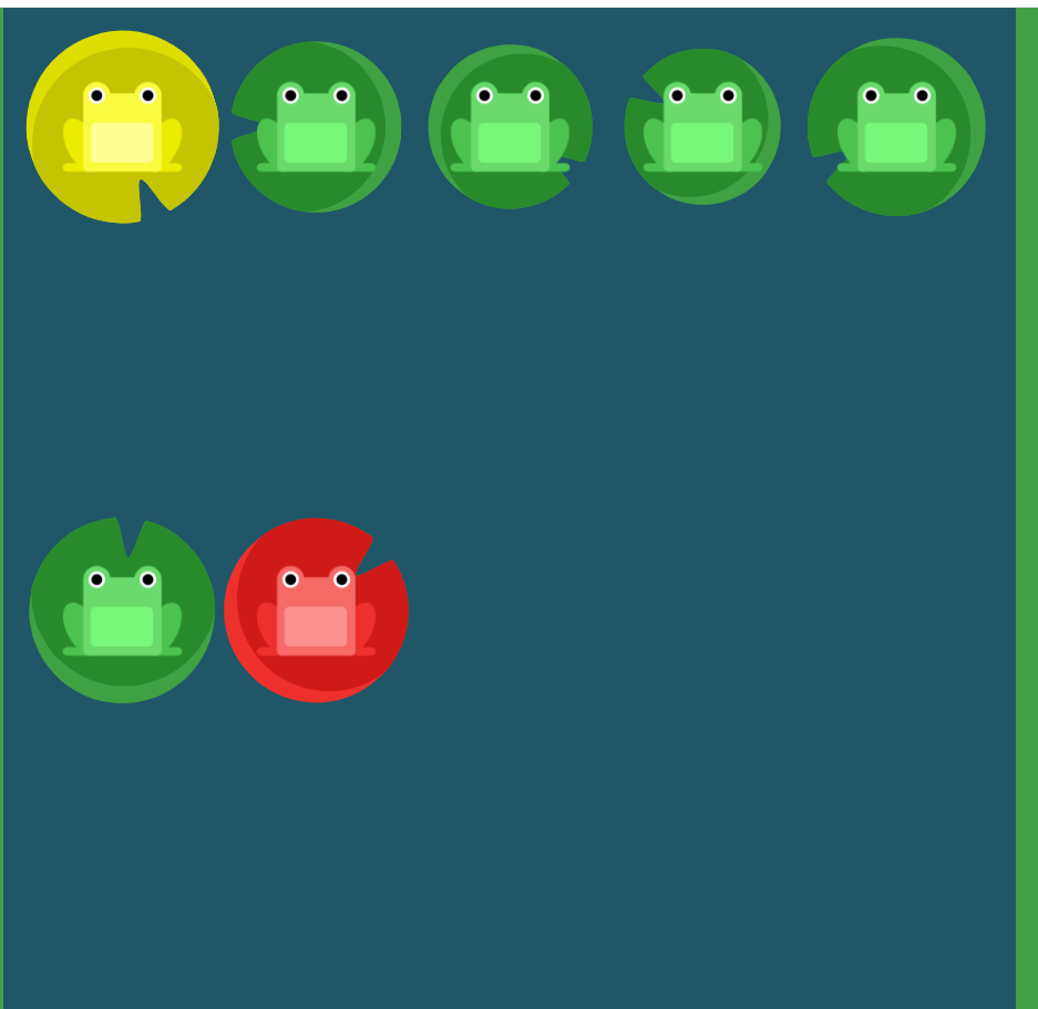
flex-direction:
-
row:项目的放置与文本方向相同。
-
row-reverse:项目放置在与文本方向相反的位置。
![image]()
-
column:项目从上到下放置。
![image]()
-
column-reverse:项目从下到上放置。


order:此属性将其设置为正整数或负整数值(-2、-1、0、1、2)
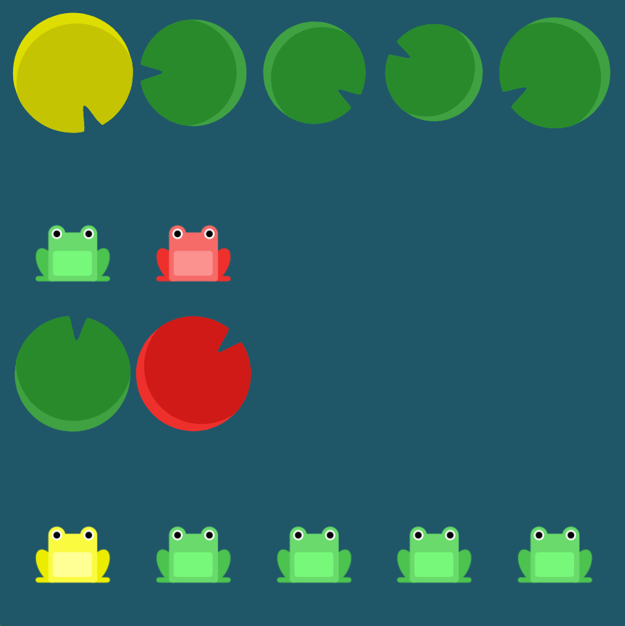
flex-wrap:
- nowrap:每个项目都适合一行。
- wrap:项目环绕到其他行。
![image]()
- wrap-reverse:项目反向环绕到附加行。
![image]()
flex-direction一起flex-wrap使用,flex-flow:
flex-flow: row wrap

 浙公网安备 33010602011771号