【WPF学习】第二十三章 列表控件
WPF提供了许多封装项的集合的控件,本章介绍简单的ListBox和ComboBox控件,后续哈会介绍更特殊的控件,如ListView、TreeView和ToolBar控件。所有这些控件都继承自ItemsControl类(ItemsControl类本身又继承自Control类)。
ItemsControl类添加了所有基于列表的控件都使用的基本功能。最显著的是,它提供了填充列表项的两种方式。最直接的方法是代码或XAML将列表项直接添加到Items集合中。然而,在WPF中使用数据绑定的方法更普遍。使用数据绑定方法,需将ItemsSource属性设置为希望显示的具有数据项集合的对象(后续章节介绍与列表数据绑定相关的更多内容)。
ItemsControl类之后的继承橙子有些混乱。一个主要分支是选择器(selector),包括ListBox、ComboBox以及TabControl。这些控件都继承自Selector类,并且都具有跟踪当前选择项(SelectedItem)或其位置(SelectedIndex)的属性,封装列表项的控件是另一个分支,以不同方式选择列表项。该分支包括用于菜单、工具栏以及树的类——所有这些类都属于ItemsControl,但不是选择器。
为了充分发挥所有ItemsControl控件的功能,需要使用数据绑定。即使不从数据库甚至外部数据源获取数据,也同样如此。WPF数据绑定非常普遍,可使用各种数据,包括自定义的数据对象和集合。但现在还不需要考虑数据绑定的细节。现在,先快速浏览一下ListBox控件和ComboBox控件。
一、ListBox
ListBox类代表了一种最常用的Windows设计——允许用户从长度可变的列表中选择一项。
如果将SelectionMode属性设置为Multiple或Extended,ListBox类还允许选择多项。在Multiple模式下,可通过单击项进行选择或取消选择。在Extended模式下,需要按下Ctrl键选择其他项,或按下Shift键选择某个选项范围。在这两种多选模式下,可用SelectedItems集合替代SelectedItem属性来获取所有选择的项。
为向ListBox控件中添加项,可在ListBox元素中嵌套ListBoxItem元素。例如,下面是一个包含颜色列表的ListBox:
<ListBox>
     <ListBoxItem>Yellow</ListBoxItem>
     <ListBoxItem>Blue</ListBoxItem>
     <ListBoxItem>Green</ListBoxItem>
     <ListBoxItem>Red</ListBoxItem>
     <ListBoxItem>LightBlue</ListBoxItem>
     <ListBoxItem>Black</ListBoxItem>
</ListBox>
不同控件采用不同方式处理嵌套的内容。ListBox控件在它的Items集合中存储每个嵌套的对象。
ListBox控件是一个非常灵活的控件。它不仅可以包含ListBoxItem对象,也可以驻留其他任意元素。这是因为ListBoxItem类继承自ContentControl类,从而ListBoxItem能够包含一段嵌套的内容。如果该内容继承自UIElement类,它将ListBox控件中呈现出来。如果是其他类型的对象,ListBoxItem对象会调用ToString()方法并显示最终的文本。
例如,如果决定创建一个包含图像的列表,可使用如下标记:
<ListBox>
        <ListBoxItem>
            <Image Source="happyface.jpg"></Image>
        </ListBoxItem>
        <ListBoxItem>
            <Image Source="redx.jpg"></Image>
        </ListBoxItem>
</ListBox>
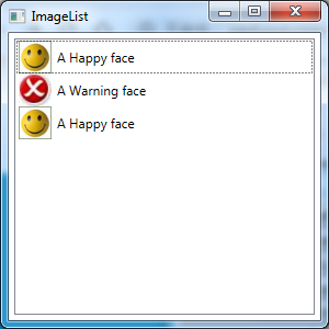
实际上ListBox控件足够职能,它能隐式地创建所需的ListBoxItem对象。这意味着可直接在ListBox元素中放置对象。厦门市一个更复杂的示例,该示例使用嵌套的StackPanel对象组合文本和图像内容:


<Window x:Class="Controls.ImageList"
        xmlns="http://schemas.microsoft.com/winfx/2006/xaml/presentation"
        xmlns:x="http://schemas.microsoft.com/winfx/2006/xaml"
        Title="ImageList" Height="300" Width="300">
    <ListBox Margin="5" SelectionMode="Multiple" Name="lst" SelectionChanged="lst_SelectionChanged">
        <StackPanel Orientation="Horizontal">
            <Image Source="happyface.jpg" Width="30" Height="30"></Image>
            <Label VerticalAlignment="Center">A Happy face</Label>
        </StackPanel>
        <StackPanel Orientation="Horizontal">
            <Image Source="redx.jpg" Width="30" Height="30"></Image>
            <Label VerticalAlignment="Center">A Warning face</Label>
        </StackPanel>
        <StackPanel Orientation="Horizontal">
            <Image Source="happyface.jpg" Width="30" Height="30"></Image>
            <Label VerticalAlignment="Center">A Happy face</Label>
        </StackPanel>
    </ListBox>
</Window>
在该例中,StackPanel面板变成被ListBoxItem封装的项。该标记创建的富列表如图下图所示:
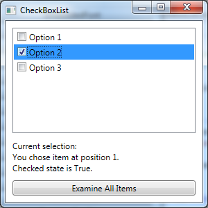
利用在列表框中的嵌套任意元素的能力,可创建出各种基于列表的控件,而不必使用其他类。例如,Windows窗体的哦该凝聚项中CheckedListBox类,该类显示在每个项的旁边都具有复选框的列表。在WPF中不需要这一特殊类,因为完全可使用标准的ListBox控件快速构建相同的效果:
<Window x:Class="Controls.CheckBoxList"
        xmlns="http://schemas.microsoft.com/winfx/2006/xaml/presentation"
        xmlns:x="http://schemas.microsoft.com/winfx/2006/xaml"
        Title="CheckBoxList" Height="300" Width="300">
    <Grid Margin="10">
        <Grid.RowDefinitions>
            <RowDefinition Height="*"></RowDefinition>
            <RowDefinition Height="Auto"></RowDefinition>
        </Grid.RowDefinitions>

        <ListBox Name="lst" SelectionChanged="lst_SelectionChanged"
             CheckBox.Click="lst_SelectionChanged" >
            <CheckBox Margin="3">Option 1</CheckBox>
            <CheckBox Margin="3">Option 2</CheckBox>
            <CheckBox Margin="3">Option 3</CheckBox>
        </ListBox>
        <StackPanel Grid.Row="1" Margin="0,10,0,0">
            <TextBlock>Current selection:</TextBlock>
            <TextBlock  Name="txtSelection" TextWrapping="Wrap"></TextBlock>
            <Button Margin="0,10,0,0" Click="cmd_CheckAllItems">Examine All Items</Button>
        </StackPanel>
    </Grid>
</Window>
当在列表内部使用不同元素时需要注意一点。当读取SelectedItem值时(以及SelectedItems和Items集合),看不到ListBoxItem对象——反而将看到放入到列表中的对象。在CheckedListBox示例中,这意味着SelectedItem提供了CheckBox对象。
例如,下面是一些响应SelectionChanged事件触发的代码。这些代码获取当天选中CheckBox对象并显示该项是否被选中:
private void lst_SelectionChanged(object sender, RoutedEventArgs e)
        {
            // Select when checkbox portion is clicked (optional).
            if (e.OriginalSource is CheckBox)
            {
                lst.SelectedItem = e.OriginalSource;
            }

            if (lst.SelectedItem == null) return;
            txtSelection.Text = String.Format(
                "You chose item at position {0}.\r\nChecked state is {1}.",
                lst.SelectedIndex,
                ((CheckBox)lst.SelectedItem).IsChecked);
        }
在下面的代码片段中,类似的代码遍历选项集合以确定哪一项被选中(对于使用复选框的多项选择列表,可以编写类似的代码来遍历选中项的集合)。
private void cmd_CheckAllItems(object sender, RoutedEventArgs e)
        {
            StringBuilder sb = new StringBuilder();
            foreach (CheckBox item in lst.Items)
            {
                if (item.IsChecked == true)
                {
                    sb.Append(
                        item.Content + " is checked.");
                    sb.Append("\r\n");
                }
            }
            txtSelection.Text = sb.ToString();
        }
最终效果如下所示:
在列表框中手动放置项时,由你决定是希望直接插入项还是在ListBoxItem对象中明确地包含每项。第二种方法通常更清晰,也更繁琐。最重要的考虑事项是一致性。例如,如果在列表中放置StackPanel对象,ListBox.SelectedItem对象将是StackPanel。如果放置由ListBoxItem对象封装的StackPanel对象,ListBox.SelectedItem对象将是ListBoxItem,所以可进行响应编码。
ListBoxItem提供了少许额外功能,通过这些功能可得到直接嵌套的对象。换言之,ListBoxItem定义了可以读取(或设置)的IsSelected属性,以及用于通知何时选中的Selected和Unselected事件。然而,可使用ListBox类的成员得到类似功能,如SelectedItem属性(或SelectedItems属性)以及SelectionChanged事件。
有趣的是,当使用嵌套对象方法时,有一项技术可为特定的对象检索ListBoxItem封装器。技巧是使用常被忽视的ContainerFromElement()方法。下面的代码使用该技术检查列表中的第一个条目是否被选中:
ListBoxItem item=(ListBoxItem)lst.ContainerFromElement((DependencyObject)lst.SelectedItems[0]);
MessageBox.Show("IsSelected:"+item.IsSelected.ToString());
二、ComboBox
ComboBox控件和ListBox控件类似。该控件包含ComboBoxItem对象的集合,既可以显示地也可以隐式地创建该集合。与ListBoxItem类似,ComboBoxItem也是可以包含任意嵌套元素的内容控件。
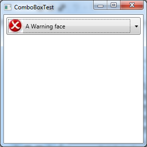
ComboBox类和ListBox类之间的重要区别是他们在窗口中呈现自身的方式。Combox控件使用下拉列表,这意味着一次只能选择一项。
如果希望允许用户在组合框中通过输入文本选项一项,就必须将IsEditable属性设置为true,并且必须确保选项集合中存储的是普遍的纯文本的ComboBoxItem对象,或是提供了有意义的ToString()表示的对象。例如,如果使用Image对象填充可编辑的组合框,那么在上面显示的文本将只有Image类的全名,这用处不大。
ComboBox控件的局限之一在于当使用自动改变尺寸功能时该控件改变自身尺寸的方法。ComboBox控件加宽自身以适应它的内容,这意味着当从一项移到另一项是它会改变自身大小。但没有简便的方法告诉ComboBox控件使用包含项的最大尺寸。相反,需要为Width属性提供硬编码的值,而这并不理想。
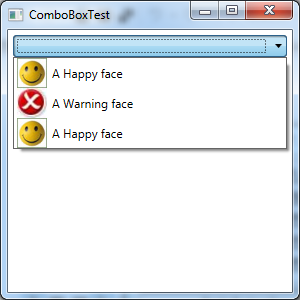
下面是一个简单的示例:
<Window x:Class="Controls.ComboBoxTest"
        xmlns="http://schemas.microsoft.com/winfx/2006/xaml/presentation"
        xmlns:x="http://schemas.microsoft.com/winfx/2006/xaml"
        Title="ComboBoxTest" Height="300" Width="300">
    <StackPanel>
        <ComboBox Margin="5">
            <StackPanel Orientation="Horizontal">
                <Image Source="happyface.jpg" Width="30" Height="30"></Image>
                <Label VerticalAlignment="Center">A Happy face</Label>
            </StackPanel>
            <StackPanel Orientation="Horizontal">
                <Image Source="redx.jpg" Width="30" Height="30"></Image>
                <Label VerticalAlignment="Center">A Warning face</Label>
            </StackPanel>
            <StackPanel Orientation="Horizontal">
                <Image Source="happyface.jpg" Width="30" Height="30"></Image>
                <Label VerticalAlignment="Center">A Happy face</Label>
            </StackPanel>
        </ComboBox>
    </StackPanel>
</Window>
最终效果图如下所示: