

Salesforce LWC学习(三十一) Quick Action适配
本篇参考:https://www.lightningdesignsystem.com/components/modals/
随着salesforce lwc的优化,越来越多的项目从aura转到了lwc开发,没有lwc的知识是不能的,但是指望lwc可以搞定所有的场景是万万不能的,比如今天的场景,quick action。目前 quick action只允许选择 Aura Component,所以我们开发 quick action基本操作是 aura 套着 lwc实现功能。那如何更好的适配UI,本篇浅入浅出,做一些特定场景的demo,以便有需求的小伙伴可以快速参考上手。先来一个简单的demo。
quickActionLwcAdjustment.html
<template>
    this is a component build by LWC
</template>
testQuickActionForLWC.cmp
<aura:component implements="force:lightningQuickActionWithoutHeader,force:hasRecordId,flexipage:availableForRecordHome,lightning:actionOverride">
    <aura:attribute name="recordId" type="Id"/>
    <c:quickActionLwcAdjustment/>
</aura:component>
将这个aura component配在 quick action中,我们demo中放在了account里面
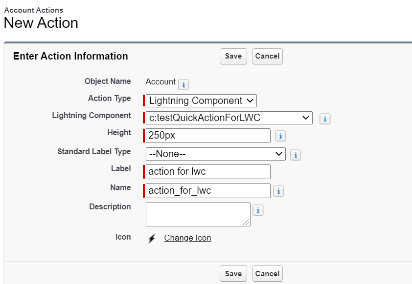
展示效果:
嗯,实现了,目测没啥问题。但是总觉怪怪的,因为弹出的 Modal没有header,没有footer,但是大部分弹出的需要这些内容,所以,OK,我们继续往下探索,加一下header 以及 footer,demo中 header / footer放在lwc中。
1.0版改动尝试
quickActionLwcAdjustment.html
<template>
    <div class="slds-modal slds-fade-in-open" style="width: 100%;">
        <div class="slds-modal__container" style="width:100%;">
            <header class="slds-modal__header">
                <h2 class="title slds-text-heading--medium slds-hyphenate">header title section</h2>
            </header>
            <div class="slds-modal__content slds-p-around--medium">
                <lightning-card style="text-align:center;">
                    <p class="title slds-text-heading--medium slds-hyphenate">this is a component build by LWC</p>
                </lightning-card>
            </div>

            <div class="slds-modal__footer">
                <lightning-button onclick={handleOKClick} variant="brand" label="OK" class="slds-m-right_x-small slds-no-flex text-right slds-float--right"></lightning-button>
            </div>
        </div>
    </div>
</template>
quickActionLwcAdjustment.js
import { LightningElement } from 'lwc';

export default class QuickActionLwcAdjustment extends LightningElement {
    handleOKClick(event) {
        this.dispatchEvent(new CustomEvent('closemodal'));
    }
}
testQuickActionFowLWC.cmp
<aura:component implements="force:lightningQuickActionWithoutHeader,force:hasRecordId,flexipage:availableForRecordHome,lightning:actionOverride">
    <aura:attribute name="recordId" type="Id"/>
    <c:quickActionLwcAdjustment onclosemodal="{!c.refreshAndCloseModal}"/>
</aura:component>
testQuickActionForLWCController.js
({
    refreshAndCloseModal : function(component, event, helper) {
        $A.get('e.force:refreshView').fire();
        $A.get("e.force:closeQuickAction").fire();
    }
})
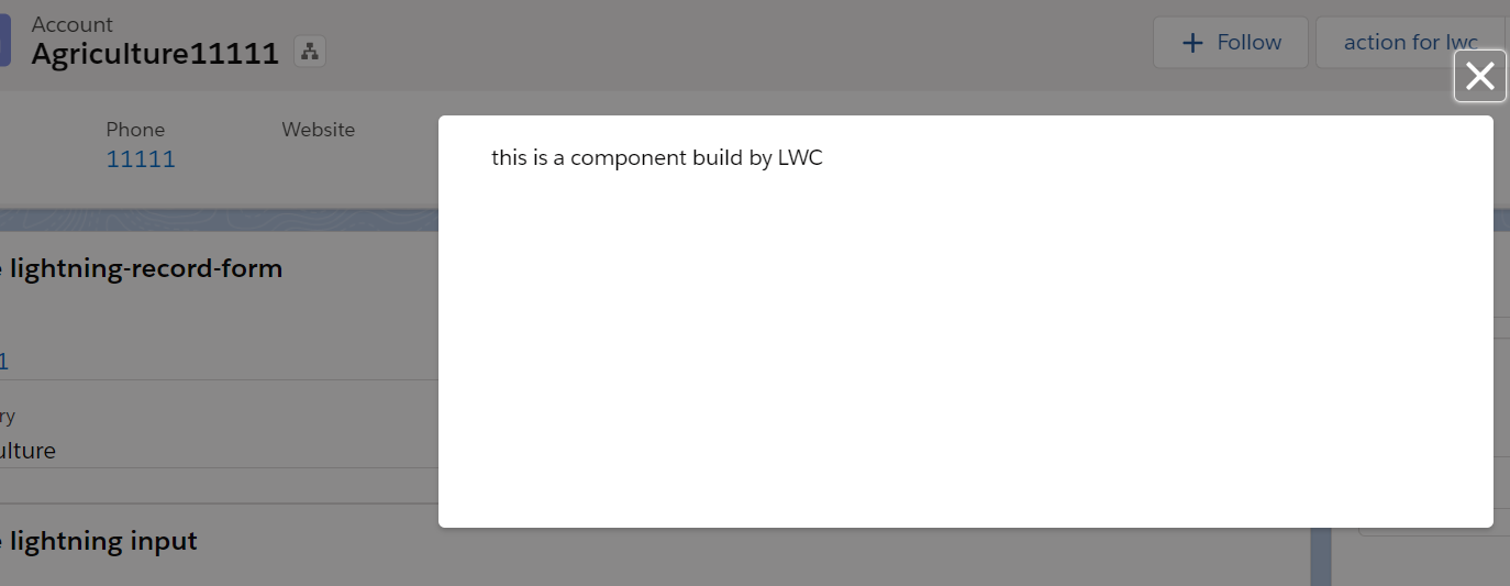
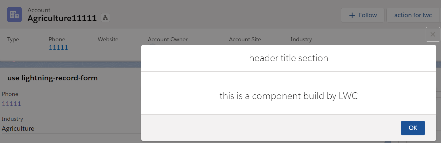
效果展示:
尽管还有点丑,但是雏形出来了,做一下适配。
2.0版改动尝试
testQuickActionForLWC上面加一下的样式
<aura:html tag="style">
        .slds-modal__content {
            height:unset !important;
            max-height:unset !important;
        }
</aura:html>
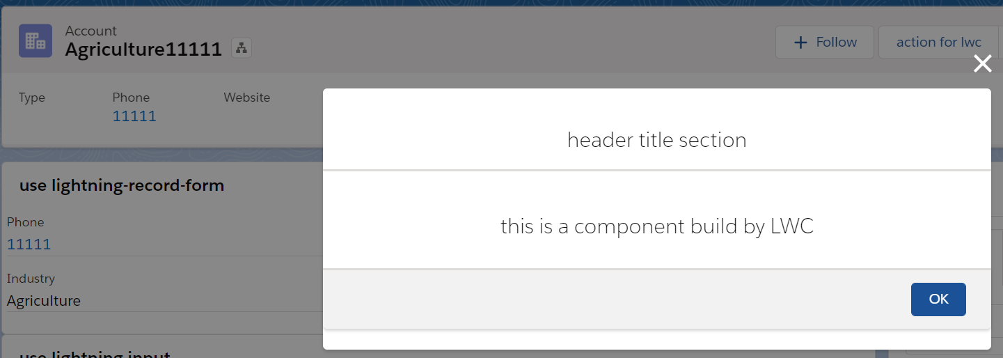
尽管整体效果挺好,但是关闭的按钮却没有顶上去,所以没法作为最终版本,我们通过样式把关闭按钮隐藏,使用lwc展示
3.0版改动尝试
testQuickActionForLWC.cmp
<aura:component implements="force:lightningQuickActionWithoutHeader,force:hasRecordId,flexipage:availableForRecordHome,lightning:actionOverride">
    <aura:html tag="style">
        .slds-modal__close {
            display: none;
        }

        .slds-modal__content {
            height:unset !important;
            max-height:unset !important;
        }
    </aura:html>
    <aura:attribute name="recordId" type="Id"/>
    <c:quickActionLwcAdjustment onclosemodal="{!c.refreshAndCloseModal}"/>
</aura:component>
quickActionLwcAdjustment.html
<template>
    <div class="slds-modal slds-fade-in-open" style="width: 100%;">
        <div class="slds-modal__container" style="width:100%;">
            <header class="slds-modal__header inner">
                <h2 class="title slds-text-heading--medium slds-hyphenate">header title section</h2>
                <lightning-button-icon class="slds-button slds-button_icon slds-modal__close slds-button_icon-inverse"
                    icon-name="utility:close"  alternative-text="close" title="close" onclick={handleOKClick}>
                </lightning-button-icon>
            </header>
            <div class="slds-modal__content slds-p-around--medium">
                <lightning-card style="text-align:center;">
                    <p class="title slds-text-heading--medium slds-hyphenate">this is a component build by LWC</p>
                </lightning-card>
            </div>

            <div class="slds-modal__footer">
                <lightning-button onclick={handleOKClick} variant="brand" label="OK" class="slds-m-right_x-small slds-no-flex text-right slds-float--right"></lightning-button>
            </div>
        </div>
    </div>
</template>
quickActionLwcAdjustment.css:做一个派生选择器,先隐藏整体,然后指定css下子样式展示
.inner .slds-modal__close {
    display: inline !important;
}
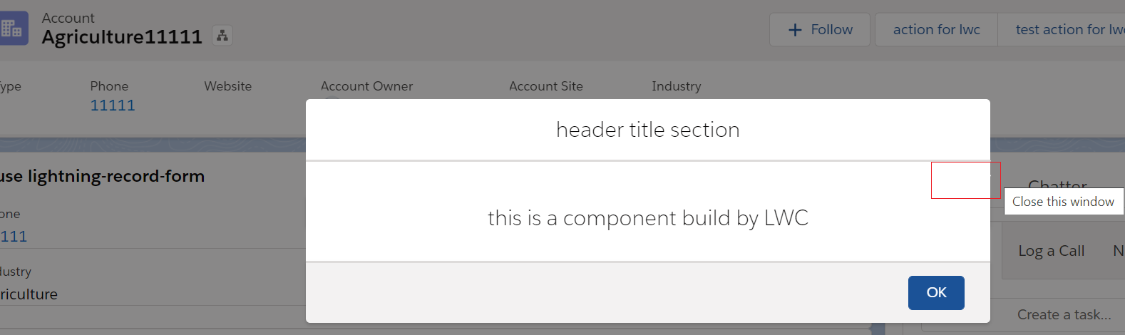
显示效果如下:
总结: 这个demo现在还有瑕疵,quick action展示的关闭按钮是白色,这个是透明色。本篇抛砖引玉,大神们类似需求如何实现,欢迎留言和讨论。篇中有错误欢迎指出,有不懂欢迎留言。
作者:zero
博客地址:http://www.cnblogs.com/zero-zyq/
本文欢迎转载,但未经作者同意必须保留此段声明,且在文章页面明显位置给出原文连接
如果文章的内容对你有帮助,欢迎点赞~
为方便手机端查看博客,现正在将博客迁移至微信公众号:Salesforce零基础学习,欢迎各位关注。

