
纯css实现进度条效果
去年7月份做一个公司商城的微信页面(微信用的chrome内核)需要写一个提示返现进度的进度条效果。
一个完整的进度条效果其实可以拆分一下:
一段背景;
一小段的静态的斜纹进度条;
斜纹进度条用线性渐变 linear-gradient 类实现,原理很好理解,2个参数:
1、角度;
2、关键点(包含2个参数,1是颜色,2是长度位置)
display: inline-block;
width: 100px;
height: 100px;
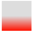
background-image: linear-gradient(0, #f10 0px, #ddd 50px);
这是最基础的渐变,构造了一个100px*100px的正方形,渐变角度为0(从下到上),关键点A颜色#f10,开始长度为0px,关键B颜色#ddd,开始长度为50px,长度为 点A到点B的长度差(50px)的这一段 就是渐变区域,点B到末尾就是纯点B的颜色#ddd的区域,即上图的渐变其实有个隐藏的关键点C颜色#ddd,开始长度为100px,上图的线性渐变完整的写法是:
background-image: linear-gradient(0, #f10 0px, #ddd 50px, #ddd 100px);

例如我写的这个静态的斜纹进度条的样式是:
linear-gradient(60deg, transparent 0, transparent 0.8rem, #4dafe2 0.8rem, #4dafe2 1.6rem, transparent 1.6rem, transparent 2.4rem, #4dafe2 2.4rem);
渐变角度为60度;
0~0.8rem是第一段渐变区域,由于2个关键点的颜色相同(transparent是透明的,即颜色由背景决定),所以这一段渐变区域 在忽略渐变角度的情况下 其实是纯色的的长度为0.8rem的长方形;
0.8rem~0.8rem是第二段渐变区域,由于2个关键点的长度位置相同,所以即便2个关键点的颜色不同,但是这一段渐变区域的长度为 2个关键点的长度位置的差值 即0,等于没有任何渐变效果;
0.8rem~1.6rem……同理。
那么就构造出了这么一段静态的进度条,我们只需要一个无限循环的动画不断控制background-position水平移动,就可以写出一个进度条的效果。

附上源代码:
  1 <!doctype html>
  2 <head>
  3 <meta charset="UTF-8">
  4 <title>process</title>
  5 <style>
  6     html {
  7         font-size: 62.5%;
  8     }
  9     .bg_fff {
 10         background-color: #fff;
 11     }
 12     .xui-wrapper {
 13         margin:0 auto;
 14         width:100%;
 15         max-width:750px;
 16         /*height:100vh;*/
 17         background-color:#efeff4;
 18     }
 19     .xui-myPromption-wrapper .xui-returnCommission .xui-process {
 20         position: relative;
 21         display: inline-block;
 22         vertical-align: middle;
 23         padding: 28px 0 12px;
 24         width: 76%;
 25     }
 26     .xui-myPromption-wrapper .xui-process .xui-icon-flag {
 27         position: absolute;
 28         top: 10px;
 29         left: 0;
 30         width: 12px;
 31         height: 18px;
 32         background-size: 11px;
 33     }
 34     .xui-myPromption-wrapper .xui-process .xui-process-static {
 35         width: 100%;
 36         height: 15px;
 37         border-radius: 10px;
 38         -webkit-box-shadow: 0 0 5px rgba(0, 198, 255,.6);
 39         box-shadow: 0 0 5px rgba(0, 198, 255,.6);
 40         background-color: rgba(0, 198, 255,.6);
 41     }
 42     .xui-myPromption-wrapper .xui-process .xui-process-active {
 43         position: absolute;
 44         top: 28px;
 45         left: 0;
 46         width: 0;
 47         height: 14px;
 48         border: 1px solid #4dafe2;
 49         border-radius: 10px;
 50         background-image: linear-gradient(60deg, transparent 0rem, transparent 0.8rem, #4dafe2 0.8rem, #4dafe2 1.6rem, transparent 1.6rem, transparent 2.4rem, #4dafe2 2.4rem);
 51         background-color: #008cd5;
 52         background-size: 20px 38px;
 53         -box-shadow: box-shadow: 1px 1px 5px rgba(0, 140, 213, .8);
 54         box-shadow: 1px 1px 5px rgba(0, 140, 213, .8);
 55         -webkit-animation: process 800ms infinite linear;
 56         animation: process 800ms infinite linear;
 57     }
 58     .xui-myPromption-wrapper .xui-process .xui-process-active:after {
 59         content: '';
 60         position: absolute;
 61         top: 0;
 62         left: 0;
 63         right: 0;
 64         bottom: 0;
 65         height: 100%;
 66         border-radius: 10px;
 67         background-image: linear-gradient(to bottom,rgba(0, 140, 213, .6), rgba(0, 140, 213, .6) 15%, transparent 60%, rgba(0, 140, 213, .6));
 68     }
 69
 70     /* 动画 */
 71     @-webkit-keyframes process {
 72         0% { background-position: 0 0; }
 73         100% { background-position: 20px 0; }
 74     }
 75     @keyframes process {
 76         0% { background-position: 0 0; }
 77         100% { background-position: 20px 0; }
 78     }
 79 </style>
 80 </head>
 81 <body>
 82 <div class="xui-wrapper xui-myPromption-wrapper">
 83     <div class="xui-mainContain pt10 bg_fff">
 84         <div class="xui-returnCommission">
 85             <div class="xui-process">
 86                 <i id="icon-flag" class="xui-icon-flag"></i>
 87                 <div class="xui-process-static"></div>
 88                 <div id="process-bar" class="xui-process-active"></div>
 89             </div>
 90         </div>
 91     </div>
 92 </div>
 93 <script>
 94 (function (hasGet, totalGet) {
 95     var flag = document.getElementById('icon-flag'),
 96         processBar = document.getElementById('process-bar'),
 97         widthPercentage = Math.round(hasGet/totalGet*100);
 98     if (widthPercentage >= 100) {
 99         widthPercentage = 100;
100     }
101     flag.style.left = (widthPercentage-1) + '%';
102     processBar.style.width = widthPercentage + '%';
103     if (widthPercentage == 0) {
104         processBar.style.borderStyle = 'none';
105     }
106 })(10, 20);
107 </script>
108 </body>
109 </html>

