【实战HTML5与CSS3 第一篇】初探水深,美丽的导航,绚丽的图片爆炸!!
目录
【实战HTML5与CSS3 第一篇】初探水深,美丽的导航,绚丽的图片爆炸!!
【实战HTML5与CSS3 第三篇】我第一个HTML5网页诞生了(提供源码)
前言
先八卦一下,我昨天离职了,把电脑也退了,离职前,我发了一封邮件给整个部门,陈述自己的不舍与团队管理问题(估计传说中的leader要抓狂了),然后就昏昏的回家了,所以昨天没有什么产出。
最近经常有朋友惊叹我的发帖速度很快,其实是有原因的,我最近两周要离职,所以就不太理我那传说中的leader了,每天多出很多时间可以学习。
但是,下周后便会入职一家新公司了,我已经有感觉进去一段时间会很忙,会很有压力,这正是我所希望的,所以便不会向这样发帖了,
以后的话,一周能发10-15篇我感觉都不错了,为了我的理想“两年成为国内优秀的web前端技术人员”我会努力的。
废话结束,让我们进入正题,终于到了今天了,我这个五一是带着任务与觉悟来的,这几天我会试着以html5与css3实现这个网站:
http://www.zhinengshe.com/index.html
这是我见过的一个html5与css3比较好的网站了(因为见得不多),要做什么,我等下再一一说明。
我们会做什么?
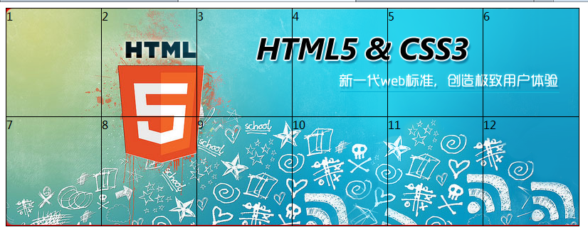
无图无真相,我们先上几张图:

用高版本浏览器进入的同学会发现,他们的网站时做得很漂亮的,有很多不错的特效,我这里为巩固html5与css3的知识会尝试以下东西:
目录
首页左下角新闻相关数据采用本地数据库
使用最新的布局标签(并考虑向下兼容)
联系我们这块会用Geolocation api
期间还会用到其它一些东西,都只有看工作量说话了,因为我只有5.1的时间。时间多的话就全做,时间不够的话可能只做首页了。
好了,让我们开始吧,我们一步步来,第一步,完成其中的小特效:
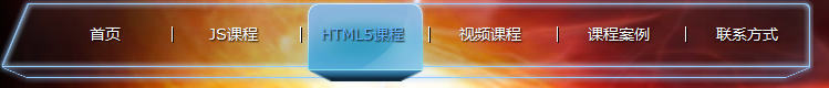
美丽的导航
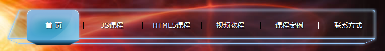
他这个导航还是很有特色的哟,先不看他们的实现,若是我做的话,后面估计会是背景图,然后会有点事件吧,光说不练,我还是试试吧!
 初步效果
初步效果

 1 <!DOCTYPE html>
 2
 3 <html xmlns="http://www.w3.org/1999/xhtml">
 4 <head>
 5     <title></title>
 6     <style type="text/css">
 7     body, ul, ol, li, p, h1, h2, h3, h4, h5, h6, form, fieldset, table, td, img, div, dl, dt, dd, input { border: 0 none; margin: 0; padding: 0; }
 8     body {  background: url("images/bodyBg.jpg") no-repeat scroll center top #000000; font-family: '新宋体','宋体',Verdana; font-size: 12px; color: #EEEEEE;}
 9
10     ul, ol { list-style-type: none; }
11     select, input, img { outline: medium none; vertical-align: middle; }
12     a { text-decoration: none; outline: medium none;}
13
14     .nav { width: 720px; background:url("images/navBg.png") no-repeat; height: 77px; padding-left: 40px; position: relative; z-index: 10; }
15     .nav div { position: absolute; background:url("images/navA_hover.png") no-repeat; width: 116px; height: 78px; text-indent: -999px; top: -2px; z-index: -10; }
16     .nav ul{ }
17     .nav ul li{ display: inline-block; line-height: 60px; height: 77px; width: 106px;  text-align: center; margin: 0 2px;}
18     .nav ul li a {  font-size: 14px;  color: White;   text-shadow: 1px 1px 1px #000000; font-family: Verdana;}
19     .nav ul li a:hover { color: #63B1FF; text-shadow: 1px 1px 1px #000000; }
20     .nav ul li span { background: none repeat scroll 0 0 #FFFFFF; box-shadow: 1px 1px 0 #000000; height: 14px; margin: 24px -8px 0 0; overflow: hidden; vertical-align: top; width: 1px; float: right;}
21
22     </style>
23     <script src="js/jquery-1.7.1.js" type="text/javascript"></script>
24     <script type="text/javascript">
25         $(document).ready(function () {
26             var div_hover = $('#nav div');
27             $('#nav ul').delegate('li', 'mouseenter', function (e) {
28                 var el = $(this),
29                 offset = el.offset();
30                 div_hover.css('left', offset.left + 'px');
31                 var s = '';
32             });
33         });
34
35     </script>
36 </head>
37 <body>
38     <nav class="nav" id="nav">
39         <div>hover</div>
40         <ul>
41             <li><a href="javascript:;">首页</a><span></span></li>
42             <li><a href="javascript:;">JS课程</a><span></span></li>
43             <li><a href="javascript:;">HTML5课程</a><span></span></li>
44             <li><a href="javascript:;">视频课程</a><span></span></li>
45             <li><a href="javascript:;">课程案例</a><span></span></li>
46             <li><a href="javascript:;">联系方式</a></li>
47         </ul>
48     </nav>
49 </body>
50 </html>
我的做法与原来的不太一致,就实现上来说我我的就是个试验品,与原版的无法比的,先看看我们这里干了些什么:
基本布局如下:
<nav class="nav" id="nav">
    <div>hover</div>
    <ul>
        <li><a href="javascript:;">首页</a><span></span></li>
        <li><a href="javascript:;">JS课程</a><span></span></li>
        <li><a href="javascript:;">HTML5课程</a><span></span></li>
        <li><a href="javascript:;">视频课程</a><span></span></li>
        <li><a href="javascript:;">课程案例</a><span></span></li>
        <li><a href="javascript:;">联系方式</a></li>
    </ul>
</nav>
原网站布局我们这里就不说了,我这里使用了nav标签,nav标签据说有助于语义化,seo,盲人/手机阅读器,既然这么多好处,我们就使用吧。。。
这里也贴个原网站结果算了:
<div class="navTxt"> <div style="left: 40px;" class="hover"> </div> <a href="index.html">首 页</a><span></span><a href="js02_desc.html">JS课程</a><span></span><a href="html5_01_desc.html">HTML5课程</a><span></span><a href="video.html">视频教程</a><span></span><a href="works.html">课程案例</a><span></span><a href="contact.html">联系方式</a> </div>
他这里没有使用ul标签,我们说不管白猫黑猫能实现功能就是好猫,所以这里我就不关注他了,只看我自己的:
我这里布局实现代码没什么好说的,主要注意:
div是绝对定位的,nav是相对定位的,为他们设置了z-index相关用于显示,不用想在其它浏览器上估计会有bug;
然后使用了前面说的冒泡机制,将所有事件绑定到ul上,鼠标进入时,便记录lleft位置,然后改变div位置即可,这里还没有动画效果,等下加上。
PS:在其它浏览器下会很恐怖的,不建议看,后面我们在考虑下渐进增强
导航完整代码
 1 <!DOCTYPE html>
 2
 3 <html xmlns="http://www.w3.org/1999/xhtml">
 4 <head>
 5     <title></title>
 6     <style type="text/css">
 7     body, ul, ol, li, p, h1, h2, h3, h4, h5, h6, form, fieldset, table, td, img, div, dl, dt, dd, input { border: 0 none; margin: 0; padding: 0; }
 8     body {  background: url("images/bodyBg.jpg") no-repeat scroll center top #000000; font-family: '新宋体','宋体',Verdana; font-size: 12px; color: #EEEEEE;}
 9
10     ul, ol { list-style-type: none; }
11     select, input, img { outline: medium none; vertical-align: middle; }
12     a { text-decoration: none; outline: medium none;}
13
14     .nav { width: 720px; background:url("images/navBg.png") no-repeat; height: 77px; padding-left: 40px; position: relative; z-index: 10; }
15     .nav div { position: absolute; background:url("images/navA_hover.png") no-repeat; width: 116px; height: 78px; text-indent: -999px; top: -2px; z-index: -10; }
16     .nav ul{ }
17     .nav ul li{ display: inline-block; line-height: 60px; height: 77px; width: 106px;  text-align: center; margin: 0 2px;}
18     .nav ul li a {  font-size: 14px;  color: White;   text-shadow: 1px 1px 1px #000000; font-family: Verdana;}
19     .nav ul li a:hover { color: #63B1FF; text-shadow: 1px 1px 1px #000000; }
20     .nav ul li span { background: none repeat scroll 0 0 #FFFFFF; box-shadow: 1px 1px 0 #000000; height: 14px; margin: 24px -8px 0 0; overflow: hidden; vertical-align: top; width: 1px; float: right;}
21
22     </style>
23     <script src="js/jquery-1.7.1.js" type="text/javascript"></script>
24     <script type="text/javascript">
25         $(document).ready(function () {
26             var div_hover = $('#nav div');
27             $('#nav ul').delegate('li', 'mouseenter', function (e) {
28                 var el = $(this),
29                 offset = el.offset(),
30                 time_step = 100;
31                 div_hover.animate({ left: (offset.left + 20) + 'px' }, time_step).animate({ left: (offset.left - 20) + 'px' }, time_step).animate({ left: (offset.left) + 'px' }, time_step);
32                 var s = '';
33             });
34         });
35
36     </script>
37 </head>
38 <body>
39     <nav class="nav" id="nav">
40         <div>hover</div>
41         <ul>
42             <li><a href="javascript:;">首页</a><span></span></li>
43             <li><a href="javascript:;">JS课程</a><span></span></li>
44             <li><a href="javascript:;">HTML5课程</a><span></span></li>
45             <li><a href="javascript:;">视频课程</a><span></span></li>
46             <li><a href="javascript:;">课程案例</a><span></span></li>
47             <li><a href="javascript:;">联系方式</a></li>
48         </ul>
49     </nav>
50
51 </body>
52 </html>
这个导航完整代码,差是查了一点,但是还是可以看的。但是他整个过程不够平滑,因为我每移过一个li他便听一下,有时候我无意义的移过一个导航
他也会有所反应,这就造成了资源浪费与不好的用户体验,所以我们需要修正,还有其它一点细节:
最终版
  1 <!DOCTYPE html>
  2 <html xmlns="http://www.w3.org/1999/xhtml">
  3 <head>
  4     <title></title>
  5     <style type="text/css">
  6         body, ul, ol, li, p, h1, h2, h3, h4, h5, h6, form, fieldset, table, td, img, div, dl, dt, dd, input
  7         {
  8             border: 0 none;
  9             margin: 0;
 10             padding: 0;
 11         }
 12         body
 13         {
 14             background: url("images/bodyBg.jpg") no-repeat scroll center top #000000;
 15             font-family: '新宋体' , '宋体' ,Verdana;
 16             font-size: 12px;
 17             color: #EEEEEE;
 18         }
 19
 20         ul, ol
 21         {
 22             list-style-type: none;
 23         }
 24         select, input, img
 25         {
 26             outline: medium none;
 27             vertical-align: middle;
 28         }
 29         a
 30         {
 31             text-decoration: none;
 32             outline: medium none;
 33         }
 34
 35         .nav
 36         {
 37             width: 720px;
 38             background: url("images/navBg.png") no-repeat;
 39             height: 77px;
 40             padding-left: 40px;
 41             position: relative;
 42             z-index: 10;
 43         }
 44         .nav div
 45         {
 46             position: absolute;
 47             background: url("images/navA_hover.png") no-repeat;
 48             width: 116px;
 49             height: 78px;
 50             text-indent: -999px;
 51             top: -2px;
 52             z-index: -10;
 53         }
 54         .nav ul
 55         {
 56         }
 57         .nav ul li
 58         {
 59             display: inline-block;
 60             line-height: 60px;
 61             height: 77px;
 62             width: 106px;
 63             text-align: center;
 64             margin: 0 2px;
 65         }
 66         .nav ul li a
 67         {
 68             font-size: 14px;
 69             color: White;
 70             text-shadow: 1px 1px 1px #000000;
 71             font-family: Verdana;
 72         }
 73         .nav ul li a:hover
 74         {
 75             color: #63B1FF;
 76             text-shadow: 1px 1px 1px #000000;
 77         }
 78         .nav ul li span
 79         {
 80             background: none repeat scroll 0 0 #FFFFFF;
 81             box-shadow: 1px 1px 0 #000000;
 82             height: 14px;
 83             margin: 24px -8px 0 0;
 84             overflow: hidden;
 85             vertical-align: top;
 86             width: 1px;
 87             float: right;
 88         }
 89     </style>
 90     <script src="js/jquery-1.7.1.js" type="text/javascript"></script>
 91     <script type="text/javascript">
 92         $(document).ready(function () {
 93             var div_hover = $('#nav div');
 94
 95             $('#nav ul').delegate('li', 'mouseenter', function (e) {
 96                 var el = $(this),
 97                 el_left = el.offset().left,
 98                 div_left = div_hover.offset().left;
 99                 time_step = 100;
100
101                 div_hover.stop().animate({ left: el_left + 'px' }, time_step, function () {
102                     if (el_left > div_left) {
103                         div_hover.animate({ left: (el_left - 20) + 'px' }, time_step).animate({ left: el_left + 'px' }, time_step);
104                     } else {
105                         div_hover.animate({ left: (el_left + 20) + 'px' }, time_step).animate({ left: el_left + 'px' }, time_step);
106                     }
107                 });
108
109                 var s = '';
110             });
111         });
112
113     </script>
114 </head>
115 <body>
116     <nav class="nav" id="nav">
117         <div>
118             hover</div>
119         <ul>
120             <li><a href="javascript:;">首页</a><span></span></li>
121             <li><a href="javascript:;">JS课程</a><span></span></li>
122             <li><a href="javascript:;">HTML5课程</a><span></span></li>
123             <li><a href="javascript:;">视频课程</a><span></span></li>
124             <li><a href="javascript:;">课程案例</a><span></span></li>
125             <li><a href="javascript:;">联系方式</a></li>
126         </ul>
127     </nav>
128 </body>
129 </html>
虽然仍无法与原版媲美,但是已经比原来平滑多了,我做到这个程度基本上够了。
总结:
这块代码其实还是主要是jquery的东西,我们CSS3中的transitions也可以具备动画效果,但是这里使用他就感觉不太合适,
因为这里背景到达时有一定抖动效果;然后每次都会计算当前鼠标位置,所以除了js实现外,我还找不到好的办法呢。
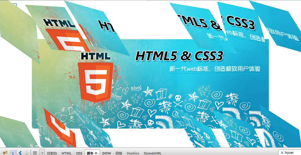
绚丽的图片轮询
大家都看到了,他这个图片轮询展示结束后会碎成一块一块的,对于他的实现,至于你懂不懂,反正我是不懂了!!!
对于他的实现,我这边就当真一头雾水了,他的效果是令人惊艳的:
1 图片会碎成12块
2 每块会选择不同的反转,渐渐隐藏
PS:刚刚不注意点了下自动排版,我的css结构给破坏啦。。。将就用吧
我们来看看原版的html结构:
1 <div class="slide"> 2 <a class="slide_img" target="_blank" href="http://wpa.qq.com/msgrd?v=3&amp;uin=1030939631&amp;site=qq&amp;menu=yes" 3 style="background: url("images/index_pic/2.png") no-repeat scroll 0% 0% transparent;"> 4 </a> 5 <div class="number"> 6 <div> 7 <a href="javascript:;"></a><span></span><a href="javascript:;"></a><span></span> 8 <a href="javascript:;"></a><span></span><a href="javascript:;"></a><span></span> 9 <a href="javascript:;"></a> 10 </div> 11 </div> 12 <div class="number2"> 13 <div> 14 <a class="active" href="javascript:;" style="opacity: 1;"></a><span></span><a href="javascript:;" 15 class="" style="opacity: 0;"></a><span></span><a href="javascript:;" class="" style="opacity: 0;"> 16 </a><span></span><a href="javascript:;" class="" style="opacity: 0;"></a><span> 17 </span><a href="javascript:;" class="" style="opacity: 0;"></a> 18 </div> 19 </div> 20 <a id="prev" class="prev" href="javascript:;"></a><a id="prev_active" class="prev_active" 21 href="javascript:;"></a><a id="next" class="next" href="javascript:;"></a><a id="next_active" 22 class="next_active" href="javascript:;"></a> 23 </div>
里面有很多明奇妙的东西的,我们关注2-4行即可,这里我们发现,他其实就是一个a标签显示的图片是其背景图片了。
但其在IE(低版本浏览器)下结构如下:
<ul style="left: -235.19px; top: 0px; width: 4200px; height: 305px; position: absolute;">
    <li style='background: url("images/index_pic/2.png") no-repeat; width: 840px; height: 305px;
        float: left;'></li>
    <li style='background: url("images/index_pic/1.png") no-repeat; width: 840px; height: 305px;
        float: left;'></li>
    <li style='background: url("images/index_pic/3.png") no-repeat; width: 840px; height: 305px;
        float: left;'></li>
    <li style='background: url("images/index_pic/4.png") no-repeat; width: 840px; height: 305px;
        float: left;'></li>
    <li style='background: url("images/index_pic/5.png") no-repeat; width: 840px; height: 305px;
        float: left;'></li>
</ul>
所以我有理由相信,这可能是个完整的插件,而且做了向下兼容的哟,上面的导航亦有可能如此,具体我们先不关注,继续向下。
现在假想我们就是在最新的浏览器下,那么他这个特效应该如何实现呢?哎,确实不知道,查个资料吧。。。
最后网上发现了个代码,写得有点复杂,我真的打开一看,直接给跪了,代码大概就600行了,天知道里面有些什么,而且还没有写注释呢,看来我确实是想不出来了。。。。
于是我跟个小白似的在google里面检索“图片爆炸”,由陆陆续续出来了许多很酷的效果,我真的直接给跪了。。。。
PS:刚刚干其他研究搞久了,这边写了很多东西给死机了,然后一些内容就给丢失了!!!!
总之,图片爆炸这种功能网上还是有不少的,但是,代码都有点多,我这里不想调用其它插件,也不能写出来,就只好往戳的地方走。
比较戳的办法:
如图,外层一个div宽度高度固定,其背景图便是我们展示的图片,其内部有12个div绝对定位,再操作background-position形成以上图片。
现在,我们就只是操作12个div爆炸即可,其实这也不容易的。。。
最戳最原始的结果
 1 <!DOCTYPE html>
 2 <html xmlns="http://www.w3.org/1999/xhtml">
 3 <head>
 4     <title></title>
 5     <style type="text/css">
 6     .outer { background: url("pic/5.png") no-repeat; width: 804px; height: 306px; position: relative; margin: 100px;}
 7     .outer div { background: url("pic/5.png") no-repeat; width: 134px; height: 153px; position: absolute; transition: transform 1s linear; }
 8     </style>
 9     <script src="js/jquery-1.7.1.js" type="text/javascript"></script>
10     <script type="text/javascript">
11         $(document).ready(function () {
12             $('#test').click(function () {
13                 $('.outer div').each(function (i) {
14                     var el = $(this);
15                     var step = 200;
16                     var x = 0, y = 0;
17                     var reg = Math.round(Math.random() * 80);
18                     if (i < 3) {
19                         x = -1 * step;
20                         y = -1 * step;
21                     } else if (i < 6) {
22                         x = step;
23                         y = -1 * step;
24                     } else if (i < 9) {
25                         x = -1 * step;
26                         y = step;
27                     } else {
28                         x = step;
29                         y = step;
30                     }
31                     el.css('transform', 'translate(' + x + 'px, ' + y + 'px)  skew(' + reg + 'deg)');
32                     setTimeout(function () {
33                         el.hide();
34                     }, 1000);
35
36                 });
37             });
38
39             $('.outer div').each(function (i) {
40                 var el = $(this);
41                 var y = i > 5 ? 153 : 0,
42                 x = i > 5 ? i - 6 : i;
43                 el.css({ 'left': (x * 134) + 'px', 'top': y + 'px', 'background-position': (-1 * x * 134) + 'px ' + (-1 * y) + 'px' });
44                 var s = '';
45             });
46         });
47
48     </script>
49 </head>
50 <body>
51 <input type="button"  id="test" value="变形"/>
52     <div class="outer">
53         <div>
54             1</div>
55         <div>
56             2</div>
57         <div>
58             3</div>
59         <div>
60             4</div>
61         <div>
62             5</div>
63         <div>
64             6</div>
65         <div>
66             7</div>
67         <div>
68             8</div>
69         <div>
70             9</div>
71         <div>
72             10</div>
73         <div>
74             11</div>
75         <div>
76             12</div>
77     </div>
78 </body>
79 </html>

如图所示,这里使用了一点CSS3的变形技术,做出了如此之戳的东西,真是令人感到汗颜。。。于是我继续研究,看可否优化!!!先保存一个再说!
这里做了一点微调后,效果好了不少:
微调后爆炸
 1 <!DOCTYPE html>
 2 <html xmlns="http://www.w3.org/1999/xhtml">
 3 <head>
 4     <title></title>
 5     <style type="text/css">
 6     .outer { background: url("pic/5.png") no-repeat; width: 804px; height: 306px; position: relative; margin: 100px;}
 7     .outer div { background: url("pic/5.png") no-repeat; width: 134px; height: 153px; position: absolute; transition: transform 0.5s linear; }
 8     </style>
 9     <script src="js/jquery-1.7.1.js" type="text/javascript"></script>
10     <script type="text/javascript">
11         $(document).ready(function () {
12             $('#test').click(function () {
13                 $('.outer div').each(function (i) {
14                     var el = $(this);
15                     var step = 200;
16                     var x = 0, y = 0;
17                     var regx = Math.round(Math.random() * 60);
18                     var regy = Math.round(Math.random() * 60);
19                     if (i < 3) {
20                         x = -1 * step;
21                         y = -1 * step;
22                     } else if (i < 6) {
23                         x = step;
24                         y = -1 * step;
25                     } else if (i < 9) {
26                         x = -1 * step;
27                         y = step;
28                     } else {
29                         x = step;
30                         y = step;
31                     }
32                     el.css('transform', 'translate(' + x + 'px, ' + y + 'px)  skew(' + regx + 'deg, ' + regy + 'deg)');

33                     setTimeout(function () {
34                         el.hide();
35                     }, 500);
36
37                 });
38             });
39
40             $('.outer div').each(function (i) {
41                 var el = $(this);
42                 var y = i > 5 ? 153 : 0,
43                 x = i > 5 ? i - 6 : i;
44                 el.css({ 'left': (x * 134) + 'px', 'top': y + 'px', 'background-position': (-1 * x * 134) + 'px ' + (-1 * y) + 'px' });
45                 var s = '';
46             });
47         });
48
49     </script>
50 </head>
51 <body>
52 <input type="button"  id="test" value="变形"/>
53     <div class="outer">
54         <div>
55             1</div>
56         <div>
57             2</div>
58         <div>
59             3</div>
60         <div>
61             4</div>
62         <div>
63             5</div>
64         <div>
65             6</div>
66         <div>
67             7</div>
68         <div>
69             8</div>
70         <div>
71             9</div>
72         <div>
73             10</div>
74         <div>
75             11</div>
76         <div>
77             12</div>
78     </div>
79 </body>
80 </html>

功能看似实现了,但是这个样子非常不好,因为我一次性操作了12个div并且进行了较复杂的动画操作,这个样子对整个页面性能势必是有影响的!!!
若是各位在google下不能运行,需要改下代码,在css上面加上-webkit前缀
好了,差是差点,但是为了追求功能的完整,我还是先将这个功能完成,再慢慢优化吧!!!
PS:动画很烧CPU的,原版的依旧烧CPU,越是绚丽的效果,对性能影响越大!!!
flash完整代码
  1 <!DOCTYPE html>
  2 <html xmlns="http://www.w3.org/1999/xhtml">
  3 <head>
  4     <title></title>
  5     <style type="text/css">
  6         body, ul, ol, li, p, h1, h2, h3, h4, h5, h6, form, fieldset, table, td, img, div, dl, dt, dd, input
  7         {
  8             border: 0 none;
  9             margin: 0;
 10             padding: 0;
 11         }
 12         body
 13         {
 14             background: url("images/bodyBg.jpg") no-repeat scroll center top #000000;
 15             font-family: '新宋体' , '宋体' ,Verdana;
 16             font-size: 12px;
 17             color: #EEEEEE;
 18             overflow: hidden;
 19         }
 20         #flash
 21         {
 22             background: url("images/slideBg.png") no-repeat;
 23             width: 1010px;
 24             height: 385px;
 25             position: relative;
 26         }
 27         .outer
 28         {
 29             background: url("pic/1.png") no-repeat;
 30             width: 840px;
 31             height: 306px;
 32             position: relative;
 33             transition: background-image 10s linear;
 34             border-radius: 10px;
 35             top: 32px;
 36             left: 84px;
 37         }
 38         .outer div
 39         {
 40             background: url("pic/1.png");
 41             width: 134px;
 42             height: 153px;
 43             position: absolute;
 44             transition: transform 0.5s linear;
 45             text-indent: -999px;
 46         }
 47         .bt
 48         {
 49             display: inline-block;
 50             background: url("images/znsComBg.png") no-repeat scroll 0 0 transparent;
 51             width: 41px;
 52             height: 42px;
 53             text-indent: -999px;
 54             position: absolute;
 55             opacity: 0.5;
 56             transition: opacity 1s linear;
 57         }
 58         #pre
 59         {
 60             background-position: -274px -43px;
 61             top: 160px;
 62             left: 20px;
 63
 64         }
 65         #next
 66         {
 67             background-position: -315px -43px;
 68             top: 160px;
 69             right: 20px;
 70         }
 71         #pre:hover
 72         {
 73             background-position: -273px 0;
 74             opacity: 1;
 75         }
 76         #next:hover
 77         {
 78             background-position: -314px 0;
 79             opacity: 1;
 80         }
 81          #pager
 82          {
 83              position: absolute;
 84              bottom: 14px;
 85              right: 100px;
 86          }
 87         #pager a
 88         {
 89             display: inline-block;
 90             width: 24px;
 91             height: 24px;
 92             background: url("images/znsComBg.png") no-repeat scroll 0 0 transparent;
 93             opacity: 0.5;
 94             transition: opacity 1s linear;
 95             background-position: -143px -1px;
 96             text-indent: -999px;
 97         }
 98         #pager .sec
 99         {
100             opacity: 1;
101             background-position: -119px -1px;
102         }
103         #pager a:hover
104         {
105             opacity: 1;
106             background-position: -119px -1px;
107         }
108     </style>
109     <script src="js/jquery-1.7.1.js" type="text/javascript"></script>
110     <script type="text/javascript">
111         $(document).ready(function () {
112             var index = 1;
113             var timer = null;
114             $('#outer div').each(function (i) {
115                 var el = $(this);
116                 var y = i > 5 ? 153 : 0,
117                 x = i > 5 ? i - 6 : i;
118                 el.css({ 'left': (x * 134) + 'px', 'top': y + 'px', 'background-position': (-1 * x * 134) + 'px ' + (-1 * y) + 'px' });
119                 var s = '';
120             });
121             function setFlash() {
122                 if (timer) clearTimeout(timer);
123                 $('#outer').css('background-image', 'url("pic/' + index + '.png")');
124                 $('#pager a').removeClass('sec');
125                 $('#pager .p' + index).addClass('sec');
126                 $('#outer div').each(function (i) {
127                     var el = $(this);
128                     var step = 200;
129                     var x = 0, y = 0;
130                     var regx = Math.round(Math.random() * 80);
131                     var regy = Math.round(Math.random() * 80);
132                     var r1 = Math.random() > 0.5 ? 1 : -1;
133                     var r2 = Math.random() > 0.5 ? 1 : -1;
134                     if (i < 3) {
135                         x = -1 * step;
136                         y = -1 * step;
137                     } else if (i < 6) {
138                         x = step;
139                         y = -1 * step;
140                     } else if (i < 9) {
141                         x = -1 * step;
142                         y = step;
143                     } else {
144                         x = step;
145                         y = step;
146                     }
147                     x += r1 * Math.random() * step;
148                     y += r2 * Math.random() * step;
149                     el.css('transform', 'translate(' + x + 'px, ' + y + 'px)  skew(' + regx + 'deg, ' + regy + 'deg)');
150
151                     setTimeout(function () {
152                         el.css('transform', '');
153                         el.css('background-image', 'url("pic/' + index + '.png")');
154                     }, 500);
155                 });
156             }
157             $('#pre').click(function () {
158                 if (index == 1) index = 5; else index--;
159                 setFlash();
160             });
161             $('#next').click(function () {
162                 if (index == 5) index = 1; else index++;
163                 setFlash();
164             });
165             $('#pager').delegate('a', 'click', function () {
166                 var el = $(this);
167                 var num = el.html();
168                 index = num;
169                 setFlash();
170             });
171             var func = function () {
172                 if (index == 5) index = 1; else index++;
173                 setFlash();
174                 timer = setTimeout(func, 3000);
175             }
176             timer = setTimeout(function () {
177                 func();
178             }, 3000);
179
180
181         });
182
183     </script>
184 </head>
185 <body>
186     <div id="flash">
187         <a id="pre" href="javascript:;" class="bt">pre</a> <a id="next" href="javascript:;" class="bt">next</a>
188         <div id="pager">
189             <a class="p1" href="javascript:;" >1</a>
190             <a class="p2" href="javascript:;" >2</a>
191             <a class="p3" href="javascript:;" >3</a>
192             <a class="p4" href="javascript:;" >4</a>
193             <a class="p5" href="javascript:;" >5</a>
194         </div>
195         <div class="outer" id="outer">
196             <div>
197                 1</div>
198             <div>
199                 2</div>
200             <div>
201                 3</div>
202             <div>
203                 4</div>
204             <div>
205                 5</div>
206             <div>
207                 6</div>
208             <div>
209                 7</div>
210             <div>
211                 8</div>
212             <div>
213                 9</div>
214             <div>
215                 10</div>
216             <div>
217                 11</div>
218             <div>
219                 12</div>
220         </div>
221     </div>
222 </body>
223 </html>


整个效果与原版相比又打了不小的折扣,而且性能方面是硬伤!!!接下来在想法优化吧!
结语
第一篇想不到写了这么久,从上午写到晚上了。。。。。因为在图片爆炸这一块研究花了很多时间,最后却得到一个不怎么满意的结果!
若是各位大哥对图片爆炸有什么好的方案的话,请一定说出来哟!
到后面时候,都有点累了就有点乱了,比如图片flash处右下角的分页按钮可以做优化,标签优化到只有一个,这里也没有关注了。
最后我提供阶段性下载地址吧,希望各位与我一起研究:
文件下载:
https://files.cnblogs.com/yexiaochai/html5css3.zip
有什么问题请各位讨论,初次做这种东西有点水,请各位见谅。
最后如果你觉得这篇文章还不错,请帮忙点击一下推荐,谢谢!