

前言:
如今我们经常能见到全屏网站,尤其是国外网站。这些网站用几幅很大的图片或色块做背景,再添加一些简单的内容,显得格外的高端大气上档次。
在学习过jQuery插件之后,才发现之前的很多网站特效完全可以借助jQuery插件来实现,今天我们来尝试使用move.js以及fullPage.js插件来制作一个“高端网站”。
网站效果展示如下:
fullPage.js 是一个基于 jQuery 的插件,它能够很方便、很轻松的制作出全屏网站,主要功能有:
- 支持鼠标滚动
- 支持前进后退和键盘控制
- 多个回调函数
- 支持手机、平板触摸事件
- 支持 CSS3 动画
- 支持窗口缩放
- 窗口缩放时自动调整
- 可设置滚动宽度、背景颜色、滚动速度、循环选项、回调、文本对齐方式等等
Move.js是一款简单小巧的模拟CSS3动画的JS插件。它可以完成CSS3的各种动画效果:移动、变形、倾斜、背景色渐变、旋转等。并且可以在动画中使用各种easing效果。
首先,我们再h5中写出基本结构主体,代码如下:
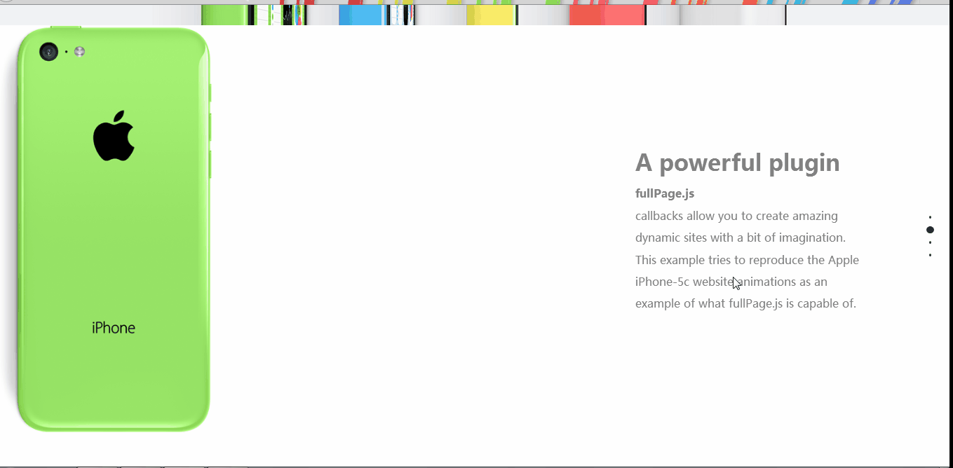
<body>
        <div id="fullpage">
            <div class="section" id="section1">
                <h1>fullpage-演示iphone5C官网</h1>
                <img src="img/iphone1.jpg" />
            </div>
            <div class="section" id="section2">
                <img src="img/iphone2.png" class="img2" />
                <img src="img/iphone3.png" class="img3" />
                <img src="img/iphone4.png" class="img4" />
                <div class="description">
                    <h1>A powerful plugin</h1>
                    <strong>fullPage.js</strong>
                    <br /> callbacks allow you to create amazing dynamic sites with a bit of imagination. This example tries to reproduce the Apple iPhone-5c website animations as an example of what fullPage.js is capable of.
                </div>
            </div>
            <div class="section" id="section3">
                <img src="img/iphone-red.png" class="red" />
                <img src="img/iphone-yellow.png" class="yellow" />
                <img src="img/iphone-blue.png" class="blue" />

                <div class="description">
                    <h2>Amazing stuff</h2> Combining
                    <strong>fullPage.js</strong> with your own CSS styles and animations, you will be able to create something remarkable.
                </div>

            </div>
            <div class="section" id="section4">

                <div class="description">
                    <h2>Just a demo</h2>
                    This is, of course, just a demo. I didn't want to spend much time on it. Don't expect it to work perfectly in all kind of screens. It has been designed to work on 1180px width or over on modern browsers with CSS3.
                </div>
                <img src="img/iphone-green.png" class="green" />
                <img src="img/iphone-two.png" class="two" />
            </div>
        </div>

    </body>
tips:
在fullPage中,class为section表示一个屏幕。
section不能执行包裹在body中,必须使用一个div包裹所有的section。
section中的每一个slide表示一个横向幻灯片,可在当前屏中左右横向切换。
在CSS样式中,我们对各部分元素进行了定位和静态的页面布局设置,代码如下:
*{
    margin: 0px;
    padding: 0px;
}
#section1{
    background-color: #F0F2F4;
    overflow: hidden;
    text-align: center;
}
#fullPage{
    min-width: 1250px;
}
.section{
    min-height: 650px;
}
#section1 h1{
    font-size: 70px;
    text-align: center;
    margin: 60px 0px;
}
#section img{
     width: 45%;
}
#section2{
    position: relative;
    overflow: hidden;
}
#section2 .description{
    width: 370px;
    position: absolute;
    top: 200px;
    right: 130px;
    color: #808080;
    font-size: 18px;
    line-height: 35px;

}
#section2 .description h1{
    font-size: 36px;
    margin-bottom: 15px;
}
#section2 img{
    height: 685px;
    position: absolute;
    transform: scale(0.6);
    top: -17px;

}
#section2 .img3{
    z-index: 100;
}
#section3{
    position: relative;
    overflow: hidden;
}
#section3 .description{
    width: 500px;
    position: absolute;
    top: 200px;
    right: 130px;
    color: #808080;
    font-size: 18px;
    line-height: 35px;

}
#section3 .description h1{
    font-size: 36px;
    margin-bottom: 15px;
}
#section3 img{
    position: absolute;
}
#section3 .red{
    left: 250px;
    top: 150px;
}
#section3 .yellow{
    left: -40px;
    bottom: -400px;
}
#section3 .blue{
    bottom: -400px;
    left: 550px;
}
#section4{
    position: relative;
}

#section4 .green{
    position: absolute;
    left:250px;
    top: 200px;
}
#section4 .description{
    width: 90%;
    position: absolute;
    top: 100px;
    left: 5%;
    color: #808080;
    font-size: 14px;
    line-height: 25px;
    text-align: center;

}
#section4 .description h2{
    font-size: 36px;
    margin-bottom: 15px;
}
#section4 .two{
    position: absolute;
    bottom: -230px;
    left: 600px;
}
接下来便是导入需要的JS文件:
需要注意的地方是:fullPage.js必须在JQuery.js文件之后导入!而move.js使用的是原生JS语言,故没有要求。

在我们组建好网页布局之后,必须先选中包裹所有section的div的ID,并调用fullPage()方法,才能加载布局。
调用fullPage()方法之后,可以给函数传入对象类型的参数,设置fullPage的各种属性。
<script type="text/javascript">
        $(function() {
            $("#fullpage").fullpage({
                navigation: true,
                verticalCentered: false,
                anchors: ["page1", "page2", "page3", "page4"],
                onLeave: function(index, nextIndex, direction) {
                    switch(index) {
                        case 2:
                            move(".img2").x(0).duration(".7").delay(600).scale(0.8).end();
                            move(".img3").x(0).duration(".7").delay(600).scale(1).end()
                            move(".img4").x(0).duration(".7").delay(600).scale(0.8).end()

                            break;

                        case 3:
                        if(nextIndex!=4){
                            move(".red").y(0).duration("1").scale(1).end();
                            move(".yellow").y(0).duration("1").scale(0.8).end()
                            move(".blue").y(0).duration("1").scale(0.8).end()

                            break;
                            }
                        case 4:
                               move(".green").y(0).duration("0.7").scale(1).end()
                               move(".two").y(0).duration("0.7").scale(0.9).skewY(0).end()
                           break;

                    }
                    switch(nextIndex) {
                        case 2:
                            move(".img2").x(-35).duration(".7").delay(700).scale(0.8).end();
                            move(".img3").x(300).duration(".7").delay(700).scale(1).end()
                            move(".img4").x(700).duration(".7").delay(700).scale(0.8).end()

                            break;
                        case 3:

                            move(".red").y(-400).duration("1.2").scale(1).end();
                            move(".yellow").y(-400).duration("1.2").scale(0.8).end()
                            move(".blue").y(-400).duration("1.2").scale(0.8).end()
                            move(".green").y(-400).duration("1.2").scale(1).end()
                            move(".two").y(0).duration("0.7").scale(0.9).rotate(180).end()
                           break;

                    }
                }

            });
        });
    </script>
网站主题效果出来之后需要进行细致的调整,另外插件只是工具,提升自己能力的途径是尝试自己创作插件。

