
基于Bootrap的列表组及栅格布局来实现
模型定义
public class StreetEvent
    {
        public int Id { get; set; }
        public string StreetName { get; set; }
        public int LACnt { get; set; }

        public int JACnt { get; set; }

        public int SLCnt { get; set; }

        public int PQCnt { get; set; }
    }
测试Controller方法
public ActionResult TableView2([Form]Para para)
        {
            List<StreetEvent> list = new List<StreetEvent>();
            for (int i = 0; i < 20; i++)
            {
                list.Add(new StreetEvent
                {
                    Id = i,
                    StreetName = "街道" + i.ToString(),
                    LACnt = 10 + i * 2,
                    SLCnt = 15 + i * 3,
                    JACnt = 8 + i * 2,
                    PQCnt = 5 + i * 2
                });
            }
            return View(list);
        }
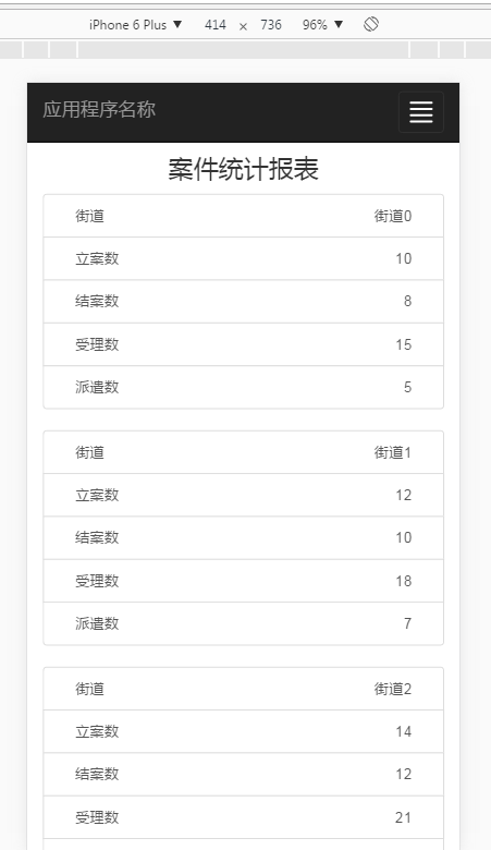
输出视图
@model IEnumerable<MvcWeb01.Models.StreetEvent>

@{
    ViewBag.Title = "TableView2";
}
<div class="container">
    <div class="row">
        <div class="col-xs-12 text-center"><h3>案件统计报表</h3></div>
    </div>
</div>
@foreach (MvcWeb01.Models.StreetEvent item in Model)
{
    <div class="list-group">
        <a href="#" class="list-group-item">
            <div class="container">
                <div class="row">
                    <div class="col-xs-6 text-left">街道</div>
                    <div class="col-xs-6 text-right">@item.StreetName</div>
                </div>
            </div>
        </a>
        <a href="#" class="list-group-item">
            <div class="container">
                <div class="row">
                    <div class="col-xs-6 text-left">立案数</div>
                    <div class="col-xs-6 text-right">@item.LACnt</div>
                </div>
            </div>
        </a>
        <a href="#" class="list-group-item">
            <div class="container">
                <div class="row">
                    <div class="col-xs-6 text-left">结案数</div>
                    <div class="col-xs-6 text-right">@item.JACnt</div>
                </div>
            </div>
        </a>
        <a href="#" class="list-group-item">
            <div class="container">
                <div class="row">
                    <div class="col-xs-6 text-left">受理数</div>
                    <div class="col-xs-6 text-right">@item.SLCnt</div>
                </div>
            </div>
        </a>
        <a href="#" class="list-group-item">
            <div class="container">
                <div class="row">
                    <div class="col-xs-6 text-left">派遣数</div>
                    <div class="col-xs-6 text-right">@item.PQCnt</div>
                </div>
            </div>
        </a>
    </div>

}
输出效果:
响应式Table:https://dbushell.com/demos/tables/rt_05-01-12.html
<!DOCTYPE html>
<html>
<head>
    <meta charset="UTF-8">
    <meta name="viewport" content="width=device-width, initial-scale=1">
    <title>Responsive Tables</title>

    <style>

    .cf:after { visibility: hidden; display: block; font-size: 0; content: " "; clear: both; height: 0; }
    * html .cf { zoom: 1; }
    *:first-child+html .cf { zoom: 1; }

    body, h1, h2, h3 { margin: 0; font-size: 100%; font-weight: normal; }

    code { padding: 0 .5em; background: #fff2b2; }

    body { padding: 1.25em; font-family: 'Helvetica Neue', Arial, sans-serif; background: #eee; }

    h1 { font-size: 2em; }
    h2 { font-size: 1.5em; }
    h1, h2 { margin: .5em 0; font-weight: bold; }

    .rt { width: 100%; font-size: 0.75em;/*12*/ line-height: 1.25em;/*15*/ border-collapse: collapse; border-spacing: 0; }

    .rt th,
    .rt td { margin: 0; padding: 0.4166em;/*10*/ vertical-align: top; border: 1px solid #babcbf; background: #fff; }
    .rt th { text-align: left; background: #fff2b2; }


    @media only screen and (max-width: 40em) { /*640*/

        #rt1 { display: block; position: relative; width: 100%; }
        #rt1 thead { display: block; float: left; }
        #rt1 tbody { display: block; width: auto; position: relative; overflow-x: auto; white-space: nowrap; }
        #rt1 thead tr { display: block; }
        #rt1 th { display: block; }
        #rt1 tbody tr { display: inline-block; vertical-align: top; }
        #rt1 td { display: block; min-height: 1.25em; }

        #rt2 { display: block; position: relative; width: 100%; }
        #rt2 thead { display: block; float: left; }
        #rt2 tbody { display: -webkit-box; overflow-x: auto; }
        #rt2 th,
        #rt2 tr,
        #rt2 td { display: block; }

        /* sort out borders */

        .rt th { border-bottom: 0; }
        .rt td { border-left: 0; border-right: 0; border-bottom: 0; }
        .rt tbody tr { border-right: 1px solid #babcbf; }
        .rt th:last-child,
        .rt td:last-child { border-bottom: 1px solid #babcbf; }

    }

    </style>


 </head>
<body>

    <h1>Responsive Tables (2)</h1>

    <p><strong>Introduction:</strong> <a href="http://dbushell.com/2012/01/05/responsive-tables-2">Responsive Tables</a> — 5th January, 2012.</p>

    <p>The following tables change orientation on small screens. A horizontal scroll or swipe is used to view more data. The table head is always visible.</p>

    <table id="rt1" class="rt cf">
        <thead class="cf">
            <tr>
                <th>Selector</th>
                <th>IE7</th>
                <th>IE8</th>
                <th>IE9</th>
                <th>FF 3.6</th>
                <th>FF 4</th>
                <th>Safari 5</th>
                <th>Chrome 5</th>
                <th>Opera 10</th>
            </tr>
        </thead>
        <tbody>
            <tr>
                <td>* selector</td>
                <td>yes</td>
                <td>yes</td>
                <td>yes</td>
                <td>yes</td>
                <td>yes</td>
                <td>yes</td>
                <td>yes</td>
                <td>yes</td>
            </tr><tr>
                <td>:before :after</td>
                <td>no</td>
                <td>yes</td>
                <td>yes</td>
                <td>yes</td>
                <td>yes</td>
                <td>yes</td>
                <td>yes</td>
                <td>yes</td>
            </tr><tr>
                <td>:nth-of-type()</td>
                <td>no</td>
                <td>no</td>
                <td>no</td>
                <td>yes</td>
                <td>yes</td>
                <td>yes</td>
                <td>yes</td>
                <td>incorrect</td>
            </tr><tr>
                <td>background-clip</td>
                <td>no</td>
                <td>no</td>
                <td>yes</td>
                <td>no</td>
                <td>yes</td>
                <td>-webkit-</td>
                <td>-webkit-</td>
                <td>buggy</td>
            </tr><tr>
                <td>background-repeat</td>
                <td>incomplete</td>
                <td>incomplete</td>
                <td>yes</td>
                <td>incomplete</td>
                <td>incomplete</td>
                <td>incorrect</td>
                <td>incorrect</td>
                <td>yes</td>
            </tr><tr>
                <td>::selection</td>
                <td>no</td>
                <td>no</td>
                <td>yes</td>
                <td>-moz-</td>
                <td>-moz-</td>
                <td>yes</td>
                <td>yes</td>
                <td>yes</td>
            </tr>
        </tbody>
    </table>

    <p>The trick is to use <code>display: inline-block;</code> on the table rows and <code>white-space: nowrap;</code> on the table body.</p>

    <br>
    <h2>CSS3 Flexible Box model</h2>
    <p>This table replicates the same layout using <code>display: -webkit-box;</code></p>

    <table id="rt2" class="rt cf">
        <thead class="cf">
            <tr>
                <th>Selector</th>
                <th>IE7</th>
                <th>IE8</th>
                <th>IE9</th>
                <th>FF 3.6</th>
                <th>FF 4</th>
                <th>Safari 5</th>
                <th>Chrome 5</th>
                <th>Opera 10</th>
            </tr>
        </thead>
        <tbody>
            <tr>
                <td>* selector</td>
                <td>yes</td>
                <td>yes</td>
                <td>yes</td>
                <td>yes</td>
                <td>yes</td>
                <td>yes</td>
                <td>yes</td>
                <td>yes</td>
            </tr><tr>
                <td>:before :after</td>
                <td>no</td>
                <td>yes</td>
                <td>yes</td>
                <td>yes</td>
                <td>yes</td>
                <td>yes</td>
                <td>yes</td>
                <td>yes</td>
            </tr><tr>
                <td>:nth-of-type()</td>
                <td>no</td>
                <td>no</td>
                <td>no</td>
                <td>yes</td>
                <td>yes</td>
                <td>yes</td>
                <td>yes</td>
                <td>incorrect</td>
            </tr><tr>
                <td>background-clip</td>
                <td>no</td>
                <td>no</td>
                <td>yes</td>
                <td>no</td>
                <td>yes</td>
                <td>-webkit-</td>
                <td>-webkit-</td>
                <td>buggy</td>
            </tr><tr>
                <td>background-repeat</td>
                <td>incomplete</td>
                <td>incomplete</td>
                <td>yes</td>
                <td>incomplete</td>
                <td>incomplete</td>
                <td>incorrect</td>
                <td>incorrect</td>
                <td>yes</td>
            </tr><tr>
                <td>::selection</td>
                <td>no</td>
                <td>no</td>
                <td>yes</td>
                <td>-moz-</td>
                <td>-moz-</td>
                <td>yes</td>
                <td>yes</td>
                <td>yes</td>
            </tr>
        </tbody>
    </table>

    <br>

    <p>This concept needs further work to achieve cross-browser support but I think it has potential!</p>

<script type="text/javascript">
var _gaq = _gaq || [];
_gaq.push(['_setAccount', 'UA-9497100-1']);
_gaq.push(['_setDomainName', 'dbushell.com']);
_gaq.push(['_trackPageview']);

(function() {
    var ga = document.createElement('script'); ga.type = 'text/javascript'; ga.async = true;
    ga.src = ('https:' == document.location.protocol ? 'https://ssl' : 'http://www') + '.google-analytics.com/ga.js';
    var s = document.getElementsByTagName('script')[0]; s.parentNode.insertBefore(ga, s);
})();
</script>

</body>
</html>

