


CSS 拾遗
注意:font:后边写属性的值。一定按照书写顺序。
文本属性连写文字大小和字体为必写项。
font: font-style font-weight font-size/line-height font-family;
文字的表达方式(Chrome浏览器)
第一步:f12
第二步:找到console
第三步:输入escape(“宋体”) 注意英文的括号和双引号。
表格样式重置
table{border-collapse:collapse;} 单元格间隙合并 写在样式里的时候这么用
th,td{padding:0;}重置单元格默认填充
表单 hidden
<!--有时候不要用户添加,但是需要存一些值的时候用 hidden-->
<input type="hidden" name="" id="" value="" />
CSS三大特性
层叠性
当多个样式作用于同一个(同一类)标签时,样式发生了冲突,总是执行后边的代码(后边代码层叠前边的代码)。和标签调用选择器的顺序没有关系。
<!DOCTYPE HTML>
<html>
	<head>
		<meta charset="UTF-8"/>
		<title></title>
		<style type="text/css">
			.box{
				font: 14px/20px "微软雅黑";
				color: red;
			}
			.box2{
				font: 30px/38px "宋体";
				color: blue;
			}
		</style>
	</head>
	<body>
		<div class="box box2">哎呦我去!!!</div>
	</body>
</html>
继承性
继承性发生的前提是包含(嵌套关系)
★ 文字颜色可以继承
★ 文字大小可以继承
★ 字体可以继续
★ 字体粗细可以继承
★ 文字风格可以继承
★ 行高可以继承
总结:文字的所有属性都可以继承。
◆ 特殊情况:
h 系列不能继承文字大小。
a 标签不能继承文字颜色。
优先级
默认样式<标签选择器<类选择器<id选择器<行内样式<!important
0 1 10 100 1000 1000以上
| 默认样式 | 标签选择器 | 类选择器 | id选择器 | 行内样式 | !important |
| 0 | 1 | 10 | 100 | 1000 | 1000以上 |
◆ 优先级特点
★ 继承的权重为0--当自己没有样式的时候,就继承父级元素的样式,这时候所继承样式的权重为0,如上表所示,也就是权重最低。
★ 权重会叠加
链接伪类
a:link{属性:值;} 链接默认状态
a:visited{属性:值;} 链接访问之后的状态
a:hover{属性:值;} 鼠标放到链接上显示的状态
a:active{属性:值;} 链接激活的状态
:focus{属性:值;} 获取焦点
背景属性
background-color 背景颜色
background-image 背景图片
Background-repeat repeat(默认) | no-repeat | repeat-x | repeat-y 背景平铺
Background-position left | right | center | top | bottom 背景定位
★方位值只写一个的时候,另外一个值默认居中。
★写2个方位值的时候,顺序没有要求。
★写2个具体值的时候,第一个值代表水平方向,第二个值代表垂直方向。
Background-attachment 背景是否滚动 scroll | fixed
背景属性连写
★:连写的时候没有顺序要求,url为必写项。
行高
◆浏览器默认文字大小
浏览器默认文字大小:16px
行高:是基线与基线之间的距离
行高=文字高度+上下边距
一行文字行高和父元素高度一致的时候,垂直居中显示。
行高的单位
|
行高单位 |
文字大小 |
值 |
|
20px |
20px |
20px |
|
2em |
20px |
40px |
|
150% |
20px |
30px |
|
2 |
20px |
40px |
总结:单位除了像素以为,行高都是与文字大小乘积。
|
行高单位 |
父元素文字大小 |
子元素文字大小 |
行高 |
|
40px |
20px |
30px |
40px |
|
2em |
20px |
30px |
40px |
|
150% |
20px |
30px |
30px |
|
2 |
20px |
30px |
60px |
总结:不带单位时,行高是和子元素文字大小相乘,em和%的行高是和父元素文字大小相乘。行高以像素为单位,就是定义的行高值。
◆推荐行高使用像素为单位,这样不会乱,行高就是定义的行高。
边框合并
border-collapse:collapse;
<style type="text/css">
			table{
				width: 300px;
				height: 200px;
				border: 1px solid #aaccee;
				border-collapse: collapse; /*合并border,做成细线表格*/
			}
			td{
				border: 1px solid #aaccee;
			}
		</style>
表单控件 获取焦点
<!DOCTYPE html>
<html lang="zh">
<head>
	<meta charset="UTF-8" />
	<meta name="viewport" content="width=device-width, initial-scale=1.0" />
	<meta http-equiv="X-UA-Compatible" content="ie=edge" />
	<title>Document</title>
	<style type="text/css">
		.username{
			border: 0 none; /*去掉边框,前面写0的原因是,有些浏览器对none不友好,需要用0来去掉边框*/
			outline: none; /*去掉轮廓线*/
			/*outline (轮廓)是绘制于元素周围的一条线,位于边框边缘的外围,可起到突出元素的作用。
			注释:轮廓线不会占据空间,也不一定是矩形。
			可以按顺序设置如下属性:
			outline-color
			outline-style
			outline-width
			如果不设置其中的某个值,也不会出问题,比如 outline:solid #ff0000; 也是允许的。*/
			border: 1px dotted green;
			background: #E0E1E2;
		}
		.username:focus{
			background: #FF0000;
		}
	</style>
</head>
<body>
	<label for="user_name">用户名:</label><input class="username" type="text" id="user_name" value="" />
</body>
</html>
label for id 获取光标焦点
内边距撑大盒子的问题
影响盒子宽度的因素:
内边距影响盒子的宽度
边框影响盒子的宽度
盒子的宽度=定义的宽度+边框宽度+左右内边距
◆ 继承的盒子一般不会被撑大
包含(嵌套)的盒子,如果子盒子没有定义宽度,给子盒子设置左右内边距,一般不会撑大盒子。
margin
◆ 垂直方向外边距合并
两个盒子垂直一个设置上外边距,一个设置下外边距,取的设置较大的值。
◆ 嵌套的盒子外边距塌陷
解决方法:
1 给父盒子设置边框
2给父盒子overflow:hidden; BFC 格式化上下文
<!DOCTYPE html>
<html lang="en">
<head>
    <meta charset="UTF-8">
    <title>Title</title>
    <style rel="stylesheet">
    .father{
        width: 500px;
        height: 300px;
        background-color: aquamarine;
        overflow: hidden;
        /*子级的margin-top,使得父级塌陷跟着子级一起向上边距50px,用overflow: hidden;解决*/
    }
    .son{
        width: 100px;
        height: 100px;
        background: antiquewhite;
        margin-top: 50px;
    }
    </style>
</head>
<body>
<div class="father">
    <div class="son"></div>
</div>
</body>
</html>
行内元素可以定义左右的内外边距,上下会被忽略掉。
行内块可以定义内外边距。
文档流(标准流)
元素自上而下,自左而右,块元素独占一行,行内元素在一行上显示,碰到父集元素的边框换行。
浮动布局
float: left | right
特点:
★元素浮动之后不占据原来的位置(脱标)
★浮动的盒子在一行上显示
★行内元素浮动之后转换为行内块元素。(不推荐使用,转行内元素最好使用display: inline-block;)
浮动的作用
◆文本绕图
◆制作导航
◆网页布局
清除浮动
当父盒子没有定义高度,嵌套的盒子浮动之后,下边的元素发生位置错误。
◆清除浮动不是不用浮动,清除浮动产生的不利影响。
◆清除浮动的方法
clear: left | right | both
工作里用的最多的是clear:both;
★额外标签法
在最后一个浮动元素后添加标签,。
★给父集元素使用overflow:hidden; bfc
如果有内容出了盒子,不能使用这个方法,会被overflow:hidden裁掉溢出部分。
★伪元素清除浮动 推荐使用.
<!DOCTYPE html>
<html>
	<head>
		<meta charset="UTF-8">
		<title></title>
		<style type="text/css">
			.box{
				width: 500px;
				/*height: 500px;*/
				margin-bottom: 10px;
			}
			.box_left{
				width: 260px;
				height: 500px;
				float: left;
				background: yellow;
			}
			.box_ringht{
				width: 230px;
				height: 500px;
				float: right;
				background: green;
			}
			.bottom{
				width: 500px;
				height: 50px;
				background: #000;

			}
			.clearfix{
				zoom: 1;
			}
			.clearfix:after{
				content: "";
				display: block;
				clear: both;
			}
		</style>
	</head>
	<div class="box clearfix">
		<div class="box_left"></div>
		<div class="box_ringht"></div>
	</div>
	<div class="bottom"></div>
	<body>
	</body>
</html>
下面是网易写法:
.clearfix:after {
    clear: both;
    height: 0;
    overflow: hidden;
    display: block;
    visibility: hidden;
    content: ".";
}
新浪的写法:
.clearfix:after {
    content: ".";
    display: block;
    height: 0;
    clear: both;
    visibility: hidden;
}
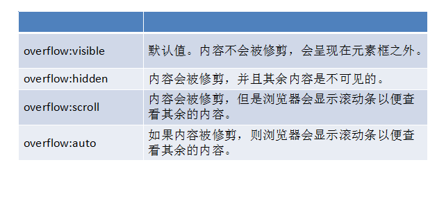
overflow
定位
定位方向: left | right | top | bottom
◆ position:static; 静态定位。默认值,就是文档流。
◆绝对定位
position:absolute;
特点:
★元素使用绝对定位之后不占据原来的位置(脱标)
★元素使用绝对定位,位置是从浏览器出发。
★嵌套的盒子,父盒子没有使用定位,子盒子绝对定位,子盒子位置是从浏览器出发。
★嵌套的盒子,父盒子使用定位,子盒子绝对定位,子盒子位置是从父元素位置出发。
★给行内元素使用绝对定位之后,转换为行内块。(不推荐使用,推荐使用display:inline-block;)
◆相对定位
position: relative;
特点:
★使用相对定位,位置从自身出发。
★还占据原来的位置。
★子绝父相(父元素相对定位,子元素绝对定位) --为什么不用子绝父绝呢?因为绝对定位脱标了,会让下方元素上去。而相对定位还会占据原来的位置。
★行内元素使用相对定位不能转行内块
◆固定定位
position:fixed;
特点:
★固定定位之后,不占据原来的位置(脱标)
★元素使用固定定位之后,位置从浏览器出发。
★元素使用固定定位之后,会转化为行内块(不推荐,推荐使用display:inline-block;)
定位的盒子居中显示
★ margin:0 auto; 只能让标准流的盒子居中对齐。脱标的盒子没效果。
★ 定位的盒子居中:先向右走父元素盒子的一半50%,再向左走子盒子的一半(margin-left:负值。)
<!DOCTYPE HTML>
<html>
	<head>
		<meta charset="utf-8">
		<title></title>
		<style type="text/css">
			body{
				margin:0;
				padding:0;
			}
			.box{
				height: 500px;
				background: #0000FF;
				position: relative;
			}
			.nav{
				width:960px;
				height:60px;
				background: #FF0000;
				position:absolute;
				bottom:0;
				left:50%; /*先向右走父元素盒子的一半50%*/
				margin-left:-480px; /*再向左走子盒子的一半(margin-left:负值。)*/
			}
		</style>
	</head>
	<body>
		<div class="box">
			<div class="nav"></div>
		</div>
	</body>
</html>
标签包含规范
◆div可以包含所有的标签。
◆p标签不能包含div h1等标签。
◆h1可以包含p,div等标签。
◆行内元素尽量包含行内元素,行内元素不要包含块元素。
规避脱标流
◆尽量使用标准流。
◆标准流解决不了的使用浮动。
◆浮动解决不了的使用定位。
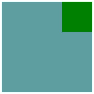
<!DOCTYPE html>
<html lang="zh">
<head>
	<meta charset="UTF-8" />
	<title>Document</title>
	<style type="text/css">
		.box{
			width: 300px;
			height: 300px;
			background: cadetblue;
		}
		.s_box{
			width: 100px;
			height: 100px;
			background: green;
			margin-left: auto;
		}
	</style>
</head>
<body>
	<div class="box">
		<div class="s_box"></div>
	</div>
</body>
</html>
这里的margin-left:auto; 表示如果设置盒子左边距为auto,则盒子会冲到最右边。
结果如下图:
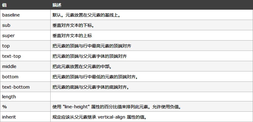
图片和文字垂直居中对齐
vertical-align对inline-block最敏感。默认属性是:vertical-align:baseline;
垂直对齐一幅图像:
img
{
vertical-align:text-top;
}
CSS 可见性
overflow:hidden; 溢出隐藏
visibility:hidden; 隐藏元素 隐藏之后还占据原来的位置。
display:none; 隐藏元素 隐藏之后不占据原来的位置。
display:block; 元素可见
display:none 和 display:block 常配合js使用。
<!doctype html>
<html lang="en">
<head>
    <meta charset="UTF-8">
    <meta name="viewport"
          content="width=device-width, user-scalable=no, initial-scale=1.0, maximum-scale=1.0, minimum-scale=1.0">
    <meta http-equiv="X-UA-Compatible" content="ie=edge">
    <title>Document</title>
    <style type="text/css">
    .box,#div1,#div2,#div3{
        width: 300px;
        height: 200px;
    }
    .box{
        overflow:hidden;
    }
    #div1{
        background: #aaccee;
    }
    #div2{
        background: #33ffaa;
    }
    #div3{
        background: #552277;
    }

    </style>
</head>
<body>
<a href="#div1">div1</a>
<a href="#div2">div2</a>
<a href="#div3">div3</a>

<div class="box">
<div id="div1"></div>
<div id="div2"></div>
<div id="div3"></div>
</div>
</body>
</html>
CSS之内容移除(网页优化)
◆ 使用 text-indent:-5000em;
◆ 将元素高度设置为0,使用内边距将盒子撑开,给盒子使用overflow:hidden;将文字隐藏。
或者设置 overflow:hidden; 并将行高设为 line-height:500px
CSS 精灵图
属性选择器
标签[属性]{
样式
}
<!doctype html>
<html>
<head>
    <meta charset="UTF-8">
    <title>Document</title>
    <style type="text/css">
        a[href]{
            color: #aaccee;
        }
    </style>
</head>
<body>
<a href="http://www.baidu.com/">可以选择属性</a>
<!--href 属性被选择,颜色变化,也可以是具体的属性,比如:[href="http://www.baidu.com/"]-->
<a>不可以选择属性</a>
</body>
</html>

 浙公网安备 33010602011771号