
Flutter学习笔记(21)--TextField文本框组件和Card卡片组件
如需转载,请注明出处:Flutter学习笔记(21)--TextField文本框组件和Card卡片组件
今天来学习下TextField文本框组件和Card卡片组件。
只要是应用程序就少不了交互,基本上所有的应用程序都会有用户名、密码输入框,搜索框等等,前面我们有写过一篇基于Form表单的输入功能,今天来看一下TextField文本框组件,文本输入是最常见的一种交互方式,TextField组件就是用来做文本输入的组件。注意这个要和Text组件区分开来,Text组件主要用于显示文本,并不能接受输入文本。
-
TextField文本框组件
TextField组件构造方法:
const TextField({
Key key,
// controller是TextField的控制器,当TextField在编辑时回调,
// 如果不设置则TextField默认创建自己的controller,重点是如果两个TextField使用一个controller,那么在一个中输入内容,另一个会同步
this.controller,
this.focusNode,//焦点控制
this.decoration = const InputDecoration(),//TextField装饰器,主要用于控制TextField的外观及提示等
TextInputType keyboardType,//键盘类型,有number、phone、emailAddress、text等
this.textInputAction,//键盘事件类型,有send、search等
this.textCapitalization = TextCapitalization.none,//
this.style,//输入文本的样式
this.strutStyle,
this.textAlign = TextAlign.start,//对齐方式,默认开始位置对齐
this.textDirection,//文本方向,默认从左到右
this.autofocus = false,//是否自动获得焦点,默认false
this.obscureText = false,//文本内容是否加密,默认false
this.autocorrect = true,//是否自动更正
this.maxLines = 1,//最大行数
this.minLines,//最小行数
this.expands = false,
this.maxLength,//最大长度
this.maxLengthEnforced = true,//超过最大长度输入,是否提示错误,默认true,如果设置了false,可以继续输入但是会提示错误
this.onChanged,//内容改变时回调
this.onEditingComplete,//编辑完成时回调
this.onSubmitted,//提交时回调
this.inputFormatters,//允许输入的格式,比如只能输入数字或字母
this.enabled,//是否禁用
this.cursorWidth = 2.0,//光标宽度
this.cursorRadius,//光标圆角
this.cursorColor,//光标颜色
this.keyboardAppearance,
this.scrollPadding = const EdgeInsets.all(20.0),
this.dragStartBehavior = DragStartBehavior.start,
this.enableInteractiveSelection,
this.onTap,//点击控件时调用
this.buildCounter,
this.scrollPhysics,
})
简单实现一个登陆的功能,限制用户名输入框输入的内容长度为10位,不到10位长度,给toast提示,Demo示例:
import 'package:flutter/material.dart';
import 'package:fluttertoast/fluttertoast.dart';

void main() => runApp(DemoApp());

class DemoApp extends StatelessWidget{
  final TextEditingController _useController = new TextEditingController();
  final TextEditingController _pwdController = new TextEditingController();
  @override
  Widget build(BuildContext context) {
    _useController.addListener((){
      Fluttertoast.showToast(msg: '您输入的内容为:${_useController.text}');
    });
    return new MaterialApp(
      title: 'TextField And Card Demo',
      debugShowCheckedModeBanner: false,
      home: new Scaffold(
        appBar: AppBar(
          title: new Text('TextField And Card Demo'),
        ),
        body: new Column(
          children: <Widget>[
            Padding(
              padding: EdgeInsets.only(left: 20,top: 0,right: 20,bottom: 0),
              child: TextField(
                  controller: _useController,//绑定controller
                  maxLines: 1,//最多一行
                  maxLength: 10,//最多输入10个字符
                  autofocus: true,//自动获取焦点
                  textAlign: TextAlign.left,//从左到右对齐
                  style: new TextStyle(color: Colors.white,fontSize: 20.0),//输入内容颜色和字体大小
                  cursorColor: Colors.deepPurple,//光标颜色
                  keyboardType: TextInputType.phone,
                  decoration: InputDecoration(
                    //添加装饰效果
                    filled: true,//背景是否填充
                    fillColor: Colors.redAccent,//添加黄色填充色(filled: true必须设置,否则单独设置填充色不会生效)
                    helperText: '用户名',
                    prefixIcon: Icon(Icons.person_add),//左侧图标
                    suffixText: '用户名',//右侧文本提示
                    suffixStyle: new TextStyle(fontSize: 20),//右侧提示文案字体大小
                    hintText: 'input user name',//hint提示文案
                    hintStyle: new TextStyle(color: Colors.amber),//hint提示文案字体颜色
                    border: OutlineInputBorder(
                      borderRadius: BorderRadius.circular(10.0),//添加圆角
                    ),
                  )
              ),
            ),
            Padding(
              padding: EdgeInsets.only(left: 20,top: 0,right: 20,bottom: 0),
              child: TextField(
                  controller: _pwdController,//绑定controller
                  maxLines: 1,//最多一行
                  maxLength: 10,//最多输入10个字符
                  autofocus: true,//自动获取焦点
                  textAlign: TextAlign.left,//从左到右对齐
                  style: new TextStyle(color: Colors.white,fontSize: 20.0),//输入内容颜色和字体大小
                  cursorColor: Colors.deepPurple,//光标颜色
                  keyboardType: TextInputType.phone,
                  decoration: InputDecoration(
                    //添加装饰效果
                    filled: true,//背景是否填充
                    fillColor: Colors.redAccent,//添加黄色填充色(filled: true必须设置,否则单独设置填充色不会生效)
                    helperText: '密  码',
                    prefixIcon: Icon(Icons.person_add),//左侧图标
                    suffixText: '密  码',//右侧文本提示
                    suffixStyle: new TextStyle(fontSize: 20),//右侧提示文案字体大小
                    hintText: 'input user pwd',//hint提示文案
                    hintStyle: new TextStyle(color: Colors.amber),//hint提示文案字体颜色
                    border: OutlineInputBorder(
                      borderRadius: BorderRadius.circular(10.0),//添加圆角
                    ),
                  )
              ),
            ),
            RaisedButton(
                onPressed: _loginSubmit,
                child: new Text('登陆'),
            )
          ],
        ),
      ),
    );
  }

  void _loginSubmit() {
    if(_useController.text.length != 10){
      Fluttertoast.showToast(msg: '用户名长度为11位');
    }
  }
}
效果截图:

上面的各类属性设置都有很详细的注释,这里就挑几个容易踩的坑来讲一下吧!
1.多个TextField一定要对应多个controller,不然多个TextField用同一个controller的话,会导致一个输入框的内容会同步到其他输入框内:
  final TextEditingController _useController = new TextEditingController();
  final TextEditingController _pwdController = new TextEditingController();
2.如果要给TextField设置背景填充色,filled和fillColor这两个属性一定要成对出现,不然你会发现设置不生效:
filled: true,//背景是否填充
fillColor: Colors.redAccent,//添加黄色填充色(filled: true必须设置,否则单独设置填充色不会生效)
3.通过controller获取输入框内输入的内容:
_useController.text
4.TextField内容变化监听,一般可用作金额输入进行动态计算操作:
onChanged: (value){
    Fluttertoast.showToast(msg: value);
},
5.TextField装饰器构造方法
InputDecoration({
    this.icon,    //位于装饰器外部和输入框前面的图片
    this.labelText,  //用于描述输入框,例如这个输入框是用来输入用户名还是密码的,当输入框获取焦点时默认会浮动到上方,
    this.labelStyle,  // 控制labelText的样式,接收一个TextStyle类型的值
    this.helperText, //辅助文本,位于输入框下方,如果errorText不为空的话,则helperText不会显示
    this.helperStyle, //helperText的样式
    this.hintText,  //提示文本,位于输入框内部
    this.hintStyle, //hintText的样式
    this.hintMaxLines, //提示信息最大行数
    this.errorText,  //错误信息提示
    this.errorStyle, //errorText的样式
    this.errorMaxLines,   //errorText最大行数
    this.hasFloatingPlaceholder = true,  //labelText是否浮动,默认为true,修改为false则labelText在输入框获取焦点时不会浮动且不显示
    this.isDense,   //改变输入框是否为密集型,默认为false,修改为true时,图标及间距会变小
    this.contentPadding, //内间距
    this.prefixIcon,  //位于输入框内部起始位置的图标。
    this.prefix,   //预先填充的Widget,跟prefixText同时只能出现一个
    this.prefixText,  //预填充的文本,例如手机号前面预先加上区号等
    this.prefixStyle,  //prefixText的样式
    this.suffixIcon, //位于输入框后面的图片,例如一般输入框后面会有个眼睛,控制输入内容是否明文
    this.suffix,  //位于输入框尾部的控件,同样的不能和suffixText同时使用
    this.suffixText,//位于尾部的填充文字
    this.suffixStyle,  //suffixText的样式
    this.counter,//位于输入框右下方的小控件,不能和counterText同时使用
    this.counterText,//位于右下方显示的文本,常用于显示输入的字符数量
    this.counterStyle, //counterText的样式
    this.filled,  //如果为true,则输入使用fillColor指定的颜色填充
    this.fillColor,  //相当于输入框的背景颜色
    this.errorBorder,   //errorText不为空,输入框没有焦点时要显示的边框
    this.focusedBorder,  //输入框有焦点时的边框,如果errorText不为空的话,该属性无效
    this.focusedErrorBorder,  //errorText不为空时,输入框有焦点时的边框
    this.disabledBorder,  //输入框禁用时显示的边框,如果errorText不为空的话,该属性无效
    this.enabledBorder,  //输入框可用时显示的边框,如果errorText不为空的话,该属性无效
    this.border, //正常情况下的border
    this.enabled = true,  //输入框是否可用
    this.semanticCounterText,
    this.alignLabelWithHint,
  })
-
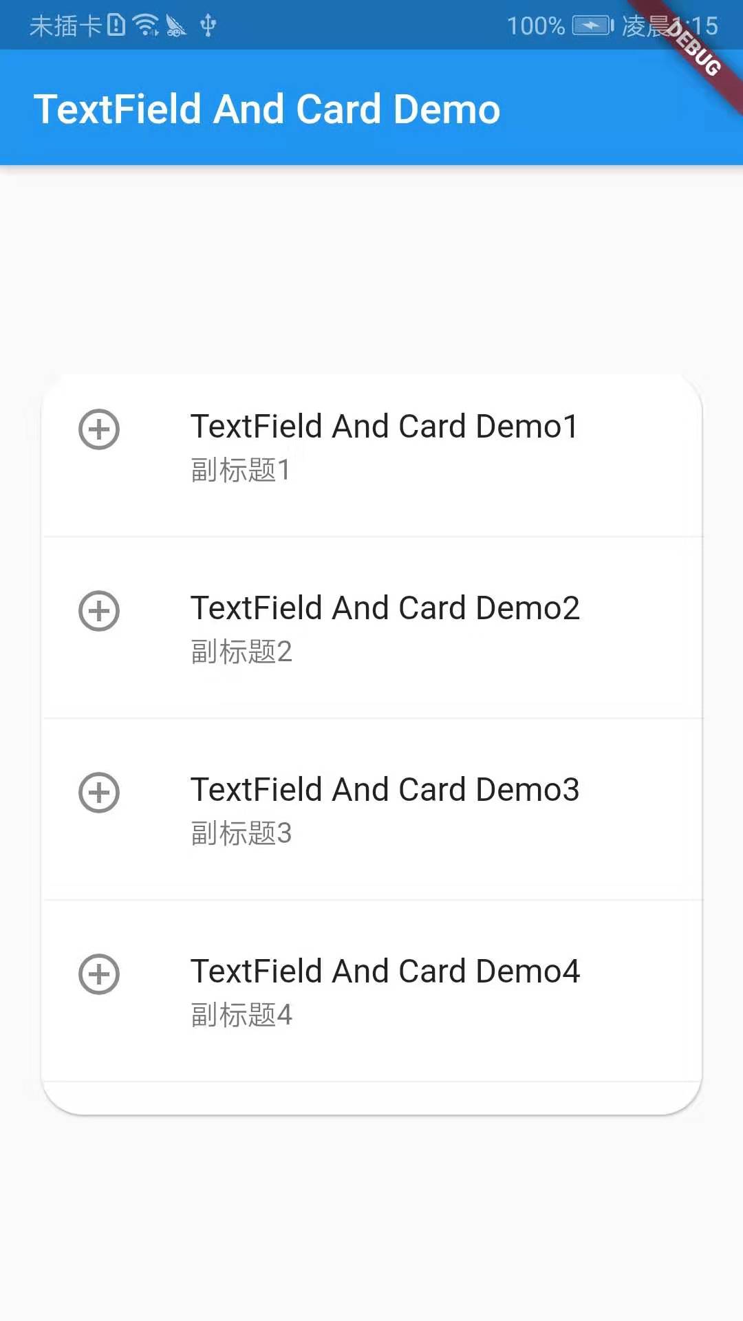
Card卡片组件
Card即卡片组件块,内容可以由大多数类型的Widget构成,但通常和ListTitle一起使用,Card有一个child,但它可以是支持多个child的列、行、网格或其他小部件。默认情况下,Card将其大小缩小为0像素,你可以使用SizeBox来限制Card的大小,在Flutter中,Card具有圆角和阴影。
demo示例:
import 'package:flutter/material.dart';
import 'package:fluttertoast/fluttertoast.dart';

void main() => runApp(DemoApp());

class DemoApp extends StatelessWidget{
  @override
  Widget build(BuildContext context) {
    // TODO: implement build
    return new MaterialApp(
      title: 'TextField And Card Demo',
      home: Scaffold(
        appBar: AppBar(
          title: new Text('TextField And Card Demo'),
        ),
        body: Center(
          child: new SizedBox(
            height: 360,
            child: Card(
              color: Colors.white,
              margin: EdgeInsets.only(left: 20,top: 0,right: 20,bottom: 0),
              shape: RoundedRectangleBorder(borderRadius: BorderRadius.circular(20)),//设置圆角
              child: Column(
                children: <Widget>[
                  new ListTile(
                    leading: Icon(Icons.add_circle_outline),
                    title: new Text('TextField And Card Demo1'),
                    subtitle: new Text('副标题1'),
                  ),
                  new Divider(),
                  new ListTile(
                    leading: Icon(Icons.add_circle_outline),
                    title: new Text('TextField And Card Demo2'),
                    subtitle: new Text('副标题2'),
                    onTap: (){

                    },
                  ),
                  new Divider(),
                  new ListTile(
                    leading: Icon(Icons.add_circle_outline),
                    title: new Text('TextField And Card Demo3'),
                    subtitle: new Text('副标题3'),
                  ),
                  new Divider(),
                  new ListTile(
                    leading: Icon(Icons.add_circle_outline),
                    title: new Text('TextField And Card Demo4'),
                    subtitle: new Text('副标题4'),
                  ),
                  new Divider(),
                ],
              ),
            ),
          ),
        )
      ),
    );
  }
}
效果截图:
以上就是今天的学习内容啦!!!

