理解使用before,after伪类实现小三角形气泡框
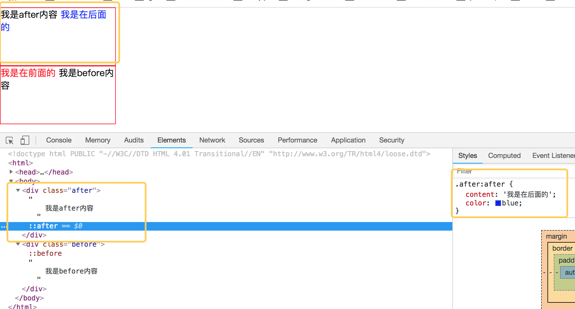
2018-11-25 11:59 龙恩0707 阅读(5260) 评论(0) 编辑 收藏 举报先来理解before和after伪类的用法吧,before从字面上的意思可以理解为前面的意思,它一般和content属性一起使用,把内容插入在其他元素的前面,同理after的含义就是把内容插入到其他元素的后面了。先来看一个简单的demo,如下代码:
<!DOCTYPE html PUBLIC "-//W3C//DTD HTML 4.01 Transitional//EN" "http://www.w3.org/TR/html4/loose.dtd">
<html>
<head>
<meta http-equiv="Content-Type" content="text/html; charset=UTF-8">
<title>Insert title here</title>
<style type="text/css" id="colorFlipFlop">
  * {margin:0; padding: 0;}
  div {
    width: 200px;
    height: 100px;
    border: 1px solid red;
  }
  .after:after {
    content: '我是在后面的';
    color: blue;
  }
  .before:before {
    content: '我是在前面的';
    color: red;
  }
</style>
</head>
<body>
  <div class="after">
    我是after内容
  </div>
  <div class="before">
    我是before内容
  </div>
</body>
</html>
效果如下:
简单理解完 before 和 after后,我们来看看如何使用 before 和 after来制作小三角形吧。
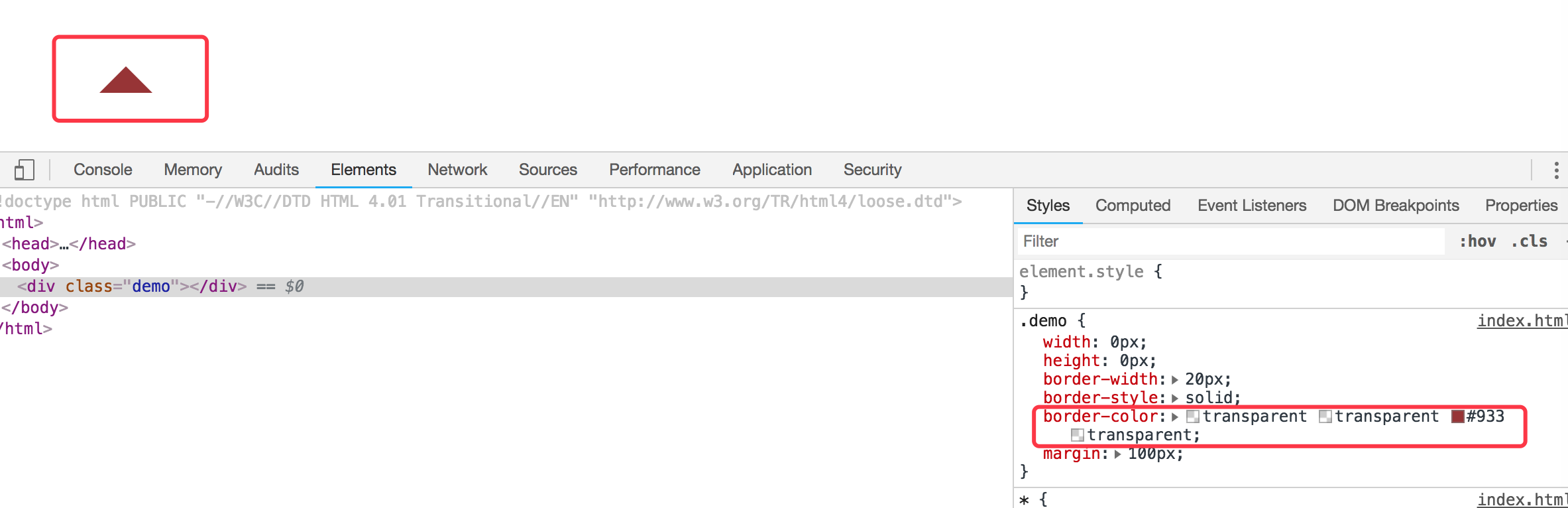
1. 首先我们来看看 css border属性,当我们把div中的border-color 设置成不同的颜色后,代码如下:
<!DOCTYPE html PUBLIC "-//W3C//DTD HTML 4.01 Transitional//EN" "http://www.w3.org/TR/html4/loose.dtd">
<html>
<head>
<meta http-equiv="Content-Type" content="text/html; charset=UTF-8">
<title>Insert title here</title>
<style type="text/css" id="colorFlipFlop">
  * {margin:0; padding: 0;}
  .demo {
    width: 50px;
    height: 50px;
    border-width: 20px;
    border-style: solid;
    border-color: #CCC #00F #933 #0C9;
    margin: 100px;
  }
</style>
</head>
<body>
  <div class="demo"></div>
</body>
</html>
效果如下图:

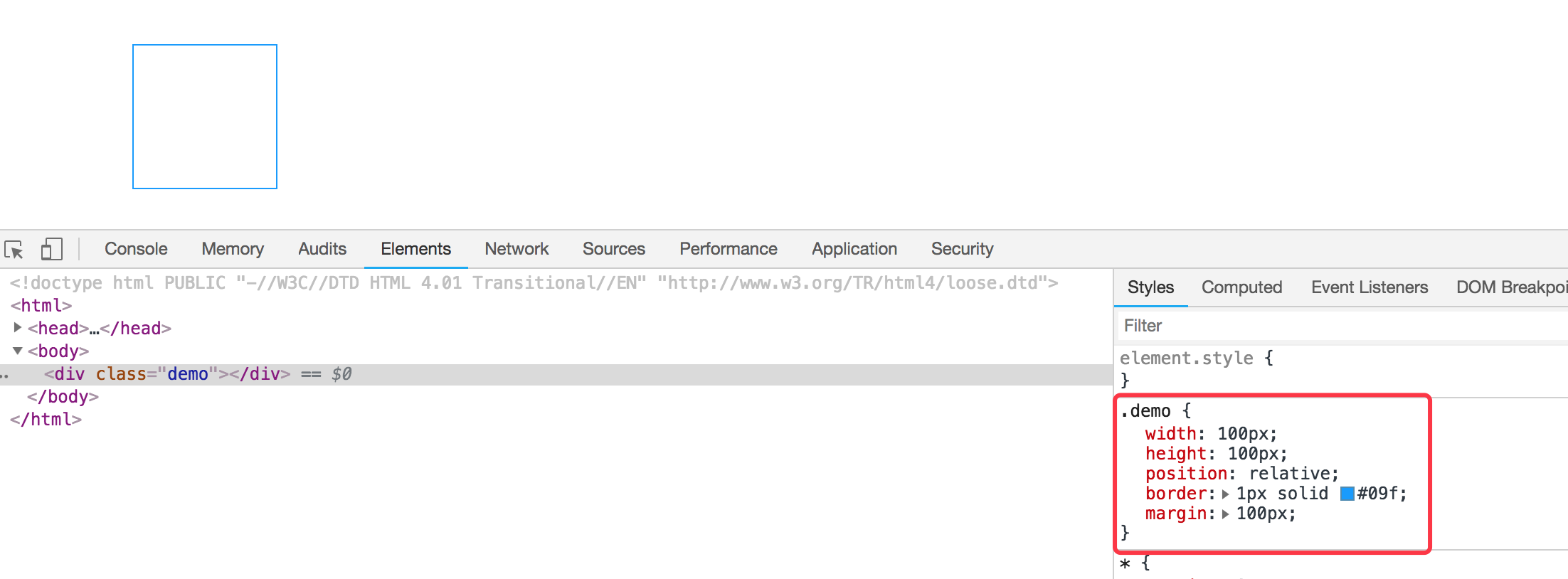
如果我们现在把div的宽度和高度设置为0的话,那么四边就会变成三角形了,如下代码:
<!DOCTYPE html PUBLIC "-//W3C//DTD HTML 4.01 Transitional//EN" "http://www.w3.org/TR/html4/loose.dtd">
<html>
<head>
<meta http-equiv="Content-Type" content="text/html; charset=UTF-8">
<title>Insert title here</title>
<style type="text/css" id="colorFlipFlop">
  * {margin:0; padding: 0;}
  .demo {
    width: 0px;
    height: 0px;
    border-width: 20px;
    border-style: solid;
    border-color: #CCC #00F #933 #0C9;
    margin: 100px;
  }
</style>
</head>
<body>
  <div class="demo"></div>
</body>
</html>
效果变为如下:

应该可以理解掉吧,如上把宽度和高度设置为0的话,中间那个宽50px和高50px变为0,中间那块就没有了。
现在我们需要一个三角形,那么我们现在只需要把其他三边的颜色设置为透明就可以了,将其他三边颜色设置为透明,即color的值为transparent. 如下代码:
<!DOCTYPE html PUBLIC "-//W3C//DTD HTML 4.01 Transitional//EN" "http://www.w3.org/TR/html4/loose.dtd">
<html>
<head>
<meta http-equiv="Content-Type" content="text/html; charset=UTF-8">
<title>Insert title here</title>
<style type="text/css" id="colorFlipFlop">
  * {margin:0; padding: 0;}
  .demo {
    width: 0px;
    height: 0px;
    border-width: 20px;
    border-style: solid;
    border-color: transparent transparent #933 transparent;
    margin: 100px;
  }
</style>
</head>
<body>
  <div class="demo"></div>
</body>
</html>
然后效果如下:
现在小三角形可以实现了,当然如果需要不同的方向的三角形可以设置对应不同的 border-color 位置对应的透明。
我们现在需要实现的是使用before和after这样的伪类来实现气泡框类似的效果。先看下一个简单的demo,如下:
<div class="demo"></div>
<style>
  * {margin:0; padding: 0;}
  .demo {
    width: 100px;
    height: 100px;
    position: relative;
    border: 1px solid #09f;
    margin: 100px;
  }
</style>
效果如下:
然后需要把小三角形定位上去即可。利用上面的介绍实现的小三角形的效果放在该元素的伪类上来。
我们需要在该div元素后面加一个小三角形,需要使用到伪类after,然后把伪类上的小三角定位上去即可,如下代码所示:
<!DOCTYPE html PUBLIC "-//W3C//DTD HTML 4.01 Transitional//EN" "http://www.w3.org/TR/html4/loose.dtd">
<html>
<head>
<meta http-equiv="Content-Type" content="text/html; charset=UTF-8">
<title>Insert title here</title>
<style type="text/css" id="colorFlipFlop">
  * {margin:0; padding: 0;}
  .demo {
    width: 100px;
    height: 100px;
    position: relative;
    border: 1px solid #09f;
    margin: 100px;
  }
  .demo:after {
    width: 0px;
    height: 0px;
    border-width: 12px;
    border-style: solid;
    border-color: transparent transparent #933 transparent;
    position: absolute;
    content: ' ';
    left: 39px;
    top: -24px;
  }
</style>
</head>
<body>
  <div class="demo"></div>
</body>
</html>
如上代码,我们使用了伪元素after,把小三角定位上去,实现的效果变成如下了:

空心三角
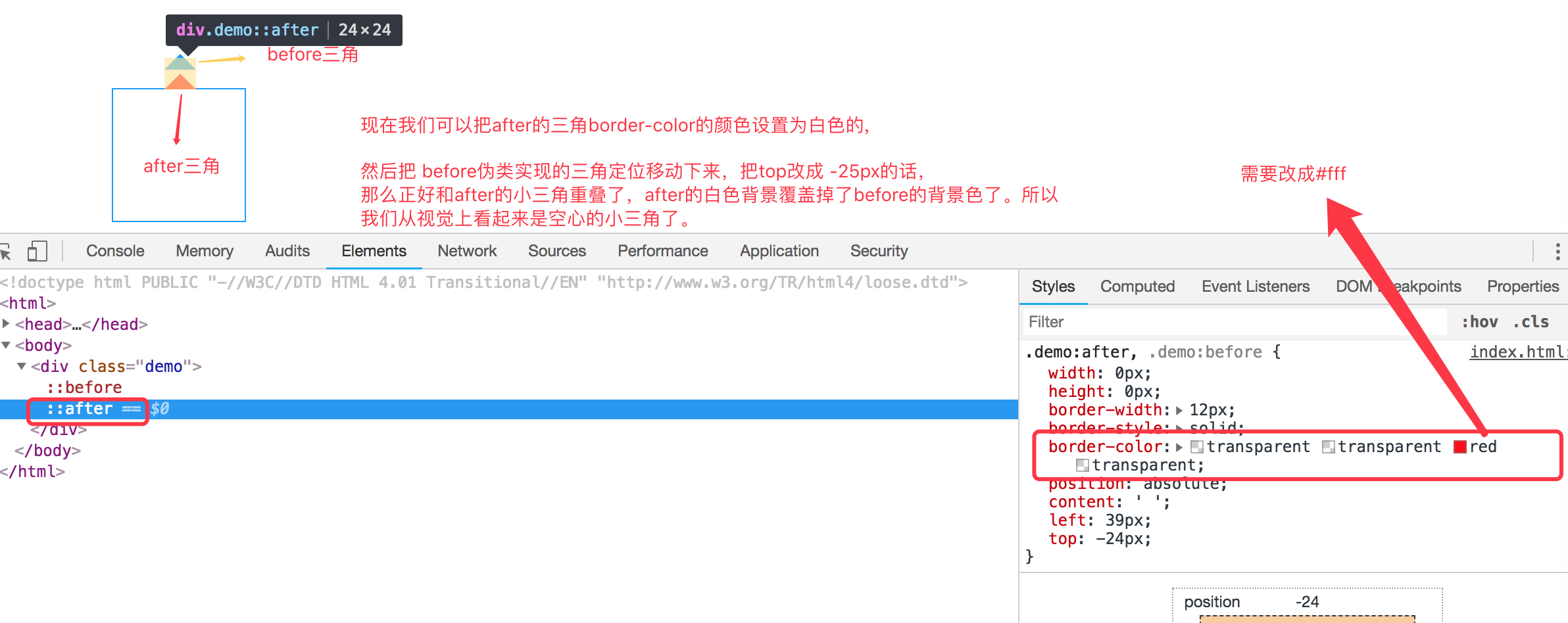
现在效果基本实现了气泡框的效果,但是呢上面的小三角是实心的,在很多应用场景中,小三角形是空心的,我们现在需要使用到另外一个伪类元素before。
空心三角的设计思路其实和实心的三角类似,使用的是before伪类,也是把小三角定位上去,但是before伪类设置的小三角可能没有after设置小三角宽度大而已,并且before实现的小三角设置颜色为白色的实心三角,然后两个小三角实现重叠一下,这样的话,从视觉上看到的貌似是空心的三角了。如下代码:
<!DOCTYPE html PUBLIC "-//W3C//DTD HTML 4.01 Transitional//EN" "http://www.w3.org/TR/html4/loose.dtd">
<html>
<head>
<meta http-equiv="Content-Type" content="text/html; charset=UTF-8">
<title>Insert title here</title>
<style type="text/css" id="colorFlipFlop">
  * {margin:0; padding: 0;}
  .demo {
    width: 100px;
    height: 100px;
    position: relative;
    border: 1px solid #09f;
    margin: 100px;
  }
  .demo:after, .demo:before {
    width: 0px;
    height: 0px;
    border-width: 12px;
    border-style: solid;
    border-color: transparent transparent #fff transparent;
    position: absolute;
    content: ' ';
    left: 39px;
    top: -24px;
  }
  .demo:before {
    top: -25px;
    border-color: transparent transparent #09f transparent;
  }
</style>
</head>
<body>
  <div class="demo"></div>
</body>
</html>
如下图所示: