Android Material Design--TextInputLayout
1. 简介
官网开篇:
Layout which wraps an EditText (or descendant) to show a floating label when the hint is hidden due to the user inputting text.
Also supports showing an error via setErrorEnabled(boolean) and setError(CharSequence), and a character counter via setCounterEnabled(boolean).
Password visibility toggling is also supported via the setPasswordVisibilityToggleEnabled(boolean) API and related attribute. If enabled, a button is displayed to toggle between the password being displayed as plain-text or disguised, when your EditText is set to display a password.
Note: When using the password toggle functionality, the 'end' compound drawable of the EditText will be overridden while the toggle is enabled. To ensure that any existing drawables are restored correctly, you should set those compound drawables relatively (start/end), opposed to absolutely (left/right).
大致意思:
将布局控件TextInputLayout套在编辑框TextInputEditText或EditText外,当用户编辑时会把指定的hint(无输入时的提示信息)内容上浮显示为标题,支持计数、错误及密码可见控制图标等属性的设置。
详细介绍和用使用案例建议前往官网浏览,毕竟越没有经过加工的信息越接近真相,毕竟写文章是为了自我总结和抛砖引玉,而不是写教程。
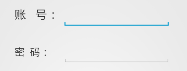
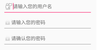
用户名和密码常见的输入样式有以下两种(其他还有很多):
而利用Material Design的TextInputLayout可以轻松地实现下面这种效果:
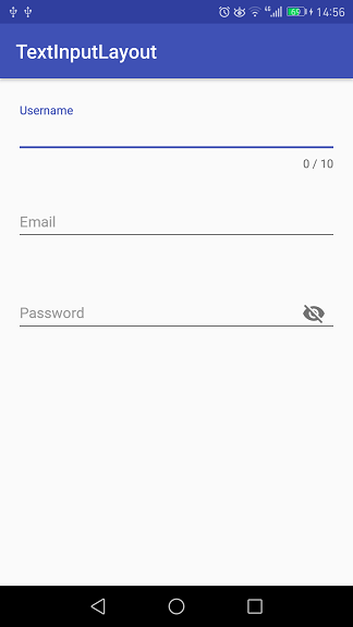
只需给TextInputLayout设置好hint属性,那么当其包含的TextInputEditText或EditText处于编辑状态时,hint内容会上浮作为标题显示,如图中的Username。
从图中还可以看到,分别对Username的最大字数限制,Password的是否可见属性进行了设置,其实Email同样设置了格式检测,下面就通过具体的代码来看看用TextInputLayout实现这些功能的便捷与高效。
2. 实例
项目代码放在Github上,感兴趣的朋友自行下载。
先在module build.gradle文件中添加dependencies项:
1 compile 'com.android.support:design:25.1.0'
Username的布局代码:
 1 <android.support.design.widget.TextInputLayout
 2   android:id="@+id/til_username"
 3   style="@style/TextInputLayoutStyle"
 4   app:errorEnabled="true"
 5   app:counterEnabled="true"
 6   app:counterMaxLength="10"
 7   app:hintTextAppearance="@style/HintAppearance"
 8   app:errorTextAppearance="@style/TextErrorAppearance"
 9   app:counterOverflowTextAppearance="@style/HintErrorAppearance">
10
11   <android.support.design.widget.TextInputEditText
12     android:id="@+id/et_username"
13     android:hint="@string/username"
14     style="@style/EditTextStyle" />
15
16 </android.support.design.widget.TextInputLayout>
其中用到的五个style定义:
 1 <style name="TextInputLayoutStyle">
 2   <item name="android:layout_width">match_parent</item>
 3   <item name="android:layout_height">wrap_content</item>
 4   <item name="android:layout_marginTop">@dimen/edit_top_margin</item>
 5 </style>
 6
 7 <style name="EditTextStyle">
 8   <item name="android:layout_width">match_parent</item>
 9   <item name="android:layout_height">wrap_content</item>
10   <item name="android:textSize">@dimen/edit_content_size</item>
11   <item name="android:textColor">@color/colorEditContent</item>
12 </style>
13
14 <style name="HintAppearance" parent="TextAppearance.AppCompat">
15   <item name="android:textSize">@dimen/edit_hint_size</item>
16   <item name="android:textColor">@color/colorAccent</item>
17 </style>
18
19 <style name="HintErrorAppearance" parent="TextAppearance.AppCompat">
20   <item name="android:textSize">@dimen/edit_hint_size</item>
21   <item name="android:textColor">@color/colorHintError</item>
22   <item name="textColorError">@color/colorHintError</item>
23 </style>
24
25 <style name="TextErrorAppearance" parent="TextAppearance.AppCompat">
26   <item name="android:textSize">@dimen/edit_hint_size</item>
27   <item name="android:textColor">@color/colorTextError</item>
28   <item name="textColorError">@color/colorTextError</item>
29 </style>
首先看一下字数限制的文本样式设置:
1 app:counterEnabled="true"
2 app:counterMaxLength="10"
3 app:counterOverflowTextAppearance="@style/HintErrorAppearance"
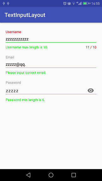
Username设置了最大字数限制--10,当输入字数超过上限之后就会将hint标题显示为counterOverflowTextAppearance样式。

颜色设置给出截图,可以直观地看到代码对应的颜色:
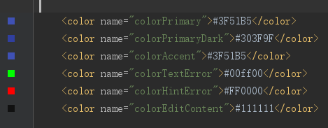
colorTextError对应编辑框左下角的错误提示,colorHintError对应右下角的字数限制和左上角的hint标题。
从运行结果可以看出,设置了字数限制后,Design会自动在编辑框右下角显示最大字数和当前输入字数(随着输入情况实时变化)。当字数在限制范围内时,hint样式为hintTextAppearance;字数超过之后,hint样式为counterOverflowTextAppearance。当然,如果没有设置counterOverflowTextAppearance属性,Design一般会将错误文本显示为红色,至于不同设备不同主题会有些差别。
接下来看看编辑框左下角的错误提示是怎么设置的,布局代码:
1 app:errorEnabled="true"
2 app:errorTextAppearance="@style/TextErrorAppearance"
还需要在Java代码中指定显示的时机和文本:
 1 private TextInputLayout mTILUsername;
 2 private EditText mETUsername;
 3 ...
 4 mETUsername.addTextChangedListener(new TextWatcher() {
 5     @Override
 6     public void beforeTextChanged(CharSequence s, int start, int count, int after) {}
 7
 8     @Override
 9     public void onTextChanged(CharSequence s, int start, int before, int count) {
10         if (s.length() > 10) {
11             mTILUsername.setErrorEnabled(true);
12             mTILUsername.setError("Username max length is 10.");
13         } else {
14             mTILUsername.setErrorEnabled(false);
15         }
16     }
17
18     @Override
19     public void afterTextChanged(Editable s) {}
20 });
给编辑框mETUsername设置了编辑状态改变监听器,参数为TextWatcher匿名类,实现onTextChanged方法。当字数超过限制之后将错误属性enable,同时设置错误提示内容;否则,就将错误属性disable。
测试后发现,布局代码中的app:errorEnabled="true"和Java中的mTILUsername.setErrorEnabled(true)是可以不设置的,调用setError方法就够了。
从截图中可以看出,编辑框下方那条线的颜色是跟随errorTextAppearance样式变化的,而不是counterOverflowTextAppearance。
再来看看邮箱格式的检测,这里是利用正则表达式,而且是比较基础的:
1 private static final Pattern EMAIL_PATTERN = Pattern.compile(
2             "\\w+([-+.]\\w+)*@\\w+([-.]\\w+)*\\.\\w+([-.]\\w+)*");
1 if (!EMAIL_PATTERN.matcher(s.toString().trim()).matches()) {
2     mTILEmail.setErrorEnabled(true);
3     mTILEmail.setError("Please input correct email.");
4 } else {
5     mTILEmail.setErrorEnabled(false);
6 }
matches方法返回false时表示输入内容不匹配邮箱格式,进而给出错误提示信息。
错误的情况上面已经给出了,正确的情况见下图:
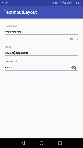
密码编辑框右边带有一个类似眼睛的图标,这就是内容是否可见的开关。布局代码如下:
 1 <android.support.design.widget.TextInputLayout
 2     android:id="@+id/til_password"
 3     android:layout_below="@id/til_email"
 4     style="@style/TextInputLayoutStyle"
 5     app:errorEnabled="true"
 6     app:passwordToggleEnabled="true"
 7     app:hintTextAppearance="@style/HintAppearance"
 8     app:errorTextAppearance="@style/TextErrorAppearance">
 9
10     <android.support.design.widget.TextInputEditText
11         android:id="@+id/et_password"
12         android:hint="@string/password"
13         android:inputType="textPassword"
14         style="@style/EditTextStyle" />
15
16 </android.support.design.widget.TextInputLayout>
设置passwordToggleEnabled为true,inputType为textPassword,默认情况下输入内容是以点的形式显示。点击图标之后便会显示明文,再点一下又会显示密文,如此反复切换。明文形式如下:
3. 总结
上面通过例子简单地描述了TextInputLayout的基本用法,官网上的介绍还包含了其他的一些方法,能实现更多的效果。Android Design中文学习资料点这里。