使用Sass优雅并高效的实现CSS中的垂直水平居中(附带Flex布局,CSS3+SASS完美版)
实现css水平垂直居中的方法有很多,在这里我简单的说下四种比较常用的方法:
1.使用CSS3中的Flex布局
对于flex,我们要了解的是它是一个display的属性,而且必须要给他的父元素设置flex属性(flex必须配合绝对定位使用!!!!!),除了设置display:flex之外,还有另外两个属性需要设置,分别是justify-content和align-items,他们的意思分别是水平居中和垂直居中。HTML+CSS代码如下:
body {
    position: absolute;
    width: 100%;
    height: 100%;
    display: flex;
    justify-content: center;
    align-items: center;
}
.parentNode {
    width: 400px;
    height: 400px;
    background: #f00;
}
<body>
    <div class="parentNode"></div>
</body>
当需求改变时,比如我们要在此div里面嵌套一个div,根据我上面提到的,要想子DIV垂直水平居中,我们也要给父DIV同样这样设置
<!DOCTYPE html>
<html lang="en">
<head>
    <meta charset="UTF-8">
    <title>Document</title>
    <style>
        * {
            margin: 0;
            padding: 0;
        }
        body {
            position: absolute; // flex必须配合absolute使用才会生效
            width: 100%;
            height: 100%;
            display: flex;
            justify-content: center;
            align-items: center;
        }
        .parentNode {
            width: 400px;
            height: 400px;
            background: #f00;
            position: relative;  // 这里必须用relative 原因是 相对于 body这个父标签定位 如果用absolute会找上级的relative,如果没有,就到顶级的document
            display: flex;
            justify-content: center;
            align-items: center;
        }
        .childNode {
            width: 200px;
            height: 200px;
            background: #fff;
        }
    </style>
</head>
<body>
    <div class="parentNode">
        <div class="childNode"></div>
    </div>
</body>
</html>
2.使用CSS3中的transform
.parentNode {
    width: 400px;
    height: 400px;
    background: #f00;
    position: absolute;
    left: 50%;
    top: 50%;
    transform: translate(-50%, -50%);
}
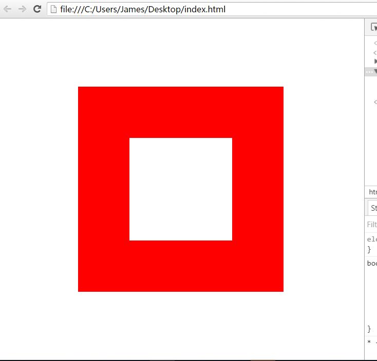
3.当你知道元素的width与height时,使用CSS2中的最普通不过的margin
.parentNode {
    width: 400px;
    height: 400px;
    background: #f00;
    position: absolute;
    left: 50%;
    top: 50%;
    margin: -200px 0 0 -200px;
}
4.使用比较特殊的margin:auto
.parentNode {
    width: 400px;
    height: 400px;
    background: #f00;
    overflow: auto;
    margin: auto;      // 在标准流的情况下,让 margin-top 以及 margin-bottom 都为0
    position: absolute;
    top: 0; left: 0; bottom: 0; right: 0;  // 使浏览器对其元素所在的区域内重新渲染,四个值都设为0目的是让整个窗口都为该元素的重新渲染区域,之后margin-top以及margin-bottom都相等
}
现在让我们来使用强大的SASS重构一下这几个样式,先拿flex开刀吧,
@mixin center {
    display: flex;
    justify-content: center;
    align-items: center;
}
body {
    position: absolute;
    width: 100%;
    height: 100%;
    @include center;

    .parentNode {
        width: 400px;
        height: 400px;
        background: #f00;
        position: relative;
        @include center;

        .childNode {
           width: 200px;
           height: 200px;
           background: #fff;
        }
    }
}
如果你的整个网站中有几处小样式类似,比如颜色,字体等,在 Sass 可以使用"$"变量来统一处理,那么这种选择还是不错的。但当你的样式变得越来越复杂,需要重复使用大段的样式时,使用变量就无法达到我们目了。这个时候 Sass 中的混合宏就会变得非常有意义,@mixin 是用来声明混合宏的关键词,有点类似 CSS 中的 @media、@font-face 一样。center 是混合宏的名称。大括号里面是复用的样式代码。@include为调用混合宏。除了声明一个不带参数的混合宏之外,还可以在定义混合宏时带有参数,并且在里面还可以写更加复杂的逻辑。
下面我将会用到if else语句以及@mixin混合宏来封装我们上面的第2,3,4方法。
我们的思路是先将DIV的左上角绝对定位到容器的中心位置,然后为 mixin 添加两个可选参数($width,$height),分别代表元素的宽高,如果传递了参数,那么就使用负向 margin 的方法实现居中;如果没有传递参数,就使用 CSS3的transform 的方法。
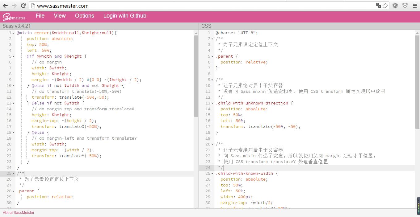
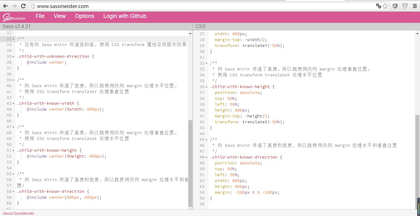
/**
 * 为子元素设定定位上下文
 */
.parent {
    position: relative;
}

/**
 * 让子元素绝对居中于父容器
 * 没有向 Sass mixin 传递宽和高,使用 CSS transform 属性实现居中效果
 */
.child-with-unknown-direction {
    @include center;
}

/**
 * 让子元素绝对居中于父容器
 * 向 Sass mixin 传递了宽度,所以就使用负向 margin 处理水平位置,
 * 使用 CSS transform translateY 处理垂直位置
 */
.child-with-known-width {
    @include center(400px);
}

/**
 * 让子元素绝对居中于父容器
 * 向 Sass mixin 传递了高度,所以就使用负向 margin 处理垂直位置,
 * 使用 CSS transform translateX 处理水平位置
 */
.child-with-known-height {
    @include center($height: 400px);
}

/**
 * 让子元素绝对居中于父容器
 * 向 Sass mixin 传递了高度和宽度,所以就使用负向 margin 处理水平和垂直位置
 */
.child-with-known-direction {
    @include center(400px, 400px);
}
现在我们开始封装@mixin,由上面的CSS分析知,要实现居中必须先让元素绝对定位
@mixin center($width: null, $height: null) {
    position: absolute;
    top: 50%;
    left: 50%;
}
然后根据下面的逻辑搭建@mixin的骨架
| width | height | solution |
|---|---|---|
| null | null | translate |
| defined | defined | margin |
| defined | null | margin-left + translateY |
| null | defined | margin-right + translateX |
@mixin center($width:null,$height:null){
    display: flex;
    justify-content: center;
    align-items: center;
    @if $width and $height {
        // do margin
    } @else if not $width and not $height {
        // do transform translate(-50%,-50%)
    } @else if not $width {
        // do margin-top and transform translateX
    } @else {
    // do margin-left and transform translateY
    }
}
最后我们把具体的代码插入到不同的条件中去
@mixin center($width:null,$height:null){
    position: absolute;
            top: 50%;
            left: 50%;
    @if $width and $height {
            // do margin
            width: $width;
            height: $height;
            margin: -($height / 2) #{0 0} -($width / 2);   //这里如果直接写 0 0 他会编译为 margin: xx 0 xx 而不是 margin:xx 0 0 xx,所以用 #{0 0}

    } @else if not $width and not $height {
            // do transform translate(-50%,-50%)
            transform: translate(-50%,-50);
    } @else if not $width {
            // do margin-top and transform translateX
            height: $height;
            margin-top: -(height / 2);
            transform: translateX(-50%);
    } @else {
            // do margin-left and transform translateY
            width: $width;
            margin-top: -(width / 2);
            transform: translateY(-50%);
    }
}
最后我们可以通过Koala软件离线编译也可以通过http://www.sassmeister.com/在线编译,下面是编译好的结果
@charset "UTF-8";
/**
 * 为子元素设定定位上下文
 */
.parent {
  position: relative;
}

/**
 * 让子元素绝对居中于父容器
 * 没有向 Sass mixin 传递宽和高,使用 CSS transform 属性实现居中效果
 */
.child-with-unknown-direction {
  position: absolute;
  top: 50%;
  left: 50%;
  transform: translate(-50%, -50);
}

/**
 * 让子元素绝对居中于父容器
 * 向 Sass mixin 传递了宽度,所以就使用负向 margin 处理水平位置,
 * 使用 CSS transform translateY 处理垂直位置
 */
.child-with-known-width {
  position: absolute;
  top: 50%;
  left: 50%;
  width: 400px;
  margin-top: -width/2;
  transform: translateY(-50%);
}

/**
 * 让子元素绝对居中于父容器
 * 向 Sass mixin 传递了高度,所以就使用负向 margin 处理垂直位置,
 * 使用 CSS transform translateX 处理水平位置
 */
.child-with-known-height {
  position: absolute;
  top: 50%;
  left: 50%;
  height: 400px;
  margin-top: -height/2;
  transform: translateX(-50%);
}

/**
 * 让子元素绝对居中于父容器
 * 向 Sass mixin 传递了高度和宽度,所以就使用负向 margin 处理水平和垂直位置
 */
.child-with-known-direction {
  position: absolute;
  top: 50%;
  left: 50%;
  width: 400px;
  height: 400px;
  margin: -200px 0 0 -200px;
}