
css3动画--边框线条动画
网上看到一个css3动画,地址
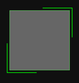
最开始思路是,里面一个DIV方块,右上角一个同样大小的div1,向上,向右平移8px,设div1的border-top,border-right值形成,如图所示

再用clip截取一半,形成半折角。

同理左下角建一个div,向左、向下平移8px,设border-left,border-bottom值,用clip截取形成
<div class="cont">
	<div class="bb"></div>
</div>


html,body{
            margin: 0;padding: 0;
            background: #101010;
        }
        .cont{
            width:500px;
            margin: 150px auto;
        }

        .bb{
            position: relative;
            width: 200px;
            height: 200px;
            background: #666666;
            border: 1px solid #5EF75E;
        }
        .bb:before{
            content: " ";
            display: block;
            position: absolute;
            width:200px;
            height:200px;
            top: -10px;
            right: -10px;
            border-top:2px solid #00FF00;
            border-right:2px solid #00FF00;
            z-index:10;
            box-sizing: border-box;
            clip:rect(0px,200px,100px,100px);
        }

        .bb:after{
            content: " ";
            display: block;
            position: absolute;
            width:200px;
            height:200px;
            left: -10px;
            bottom: -10px;
            border-left:2px solid #00FF00;
            border-bottom:2px solid #00FF00;
            z-index:10;
            box-sizing: border-box;
            clip:rect(100px,100px,200px,0px);
        }
然而着手写动画CSS的时候发现问题,线条逆时针旋转,右上角的线条不能平滑过渡到左下角。
然后看了一下人家写的代码,才发现里面两个DIV其实是比最初DIV大的,而且样式一样!!!
再仔细看看动画发现,其实就是两条一样长的线条在运动,只是一条比另一条块半圈
所以设置动画的时候只要一个延迟1/2时间开始就可以了
Dooooo....敲完代码
        .bb{
            position: relative;
            width: 200px;
            height: 200px;
            background: #666666;
            border: 1px solid #5EF75E;
        }
        .bb:before,.bb:after{
            content: " ";
            display: block;
            position: absolute;
            width:220px;
            height:220px;
            top: -10px;
            left: -10px;
            border:2px solid #00FF00;
            z-index:10;
            box-sizing: border-box;
            -webkit-animation: clipAni 4s infinite linear;
        }
        .bb:before{
            -webkit-animation-delay: 2s;
        }
        @keyframes  clipAni{
            0%,100%{
                clip:rect(0px,220px,220px,217px);
            }
            25%{
                clip:rect(0px,220px,3px,0px);
            }
            50%{
                clip:rect(0px,3px,220px,0px);
            }
            75%{
                clip:rect(217px,220px,220px,0px);
            }
        }
运行一看,前2s不对,DIV4周都有边框,2s后开始正常。想想确实是,div:before设置了边框动画延迟2s,前2s保持原有状态。
但是要进入页面就开始动画,且两个动画有时间错开,怎么办?
哈哈,想起动画delay负数的妙用
css:
html,body{
            margin: 0;padding: 0;
            background: #101010;
        }
        .cont{
            width:500px;
            margin: 50px auto;
        }

        .bb{
            position: relative;
            width: 200px;
            height: 200px;
            background: #666666;
            border: 1px solid #5EF75E;
        }
        .bb:before,.bb:after{
            content: " ";
            display: block;
            position: absolute;
            width:220px;
            height:220px;
            top: -10px;
            left: -10px;
            border:2px solid #00FF00;
            z-index:10;
            box-sizing: border-box;
            -webkit-animation: clipAni 4s infinite linear;
        }
        .bb:before{
            -webkit-animation-delay: -2s;
        }
        @keyframes  clipAni{
            0%,100%{
                clip:rect(0px,220px,220px,217px);
            }
            25%{
                clip:rect(0px,220px,3px,0px);
            }
            50%{
                clip:rect(0px,3px,220px,0px);
            }
            75%{
                clip:rect(217px,220px,220px,0px);
            }
        }
成功~!

