
UWP开发入门(十四)—— UserControl中Adaptive UI的小技巧
本篇我们通过绘制一个非常简单的UserControl控件,来分享一下对Adaptive UI的理解及一些图形绘制的技巧。
现在流行的APP都少不了精致的用户头像,首先假设我们需要绘制如下的图形作为默认头像:
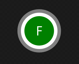
<UserControl
    x:Class="AdaptiveUserControl.Circle0"
    xmlns="http://schemas.microsoft.com/winfx/2006/xaml/presentation"
    xmlns:x="http://schemas.microsoft.com/winfx/2006/xaml"
    xmlns:local="using:AdaptiveUserControl"
    xmlns:d="http://schemas.microsoft.com/expression/blend/2008"
    xmlns:mc="http://schemas.openxmlformats.org/markup-compatibility/2006"
    mc:Ignorable="d"
    d:DesignHeight="300"
    d:DesignWidth="400">

    <Grid Width="50" Height="50" CacheMode="BitmapCache">
        <Ellipse Fill="Gray"></Ellipse>
        <Ellipse Width="42" Height="42" Fill="White"></Ellipse>
        <Ellipse Width="34" Height="34" Fill="Green"></Ellipse>
        <TextBlock Text="F" TextAlignment="Center" VerticalAlignment="Center" TextLineBounds="Tight" Foreground="White"></TextBlock>
    </Grid>
</UserControl>
实现较为简单,堆叠了三个Ellipse来实现三层圆环的效果。其中三层圆环的间距通过Width和Height来实现。
通常情况下,该实现已经可以满足我们的要求了。
再来看第二个实现:
    <Grid CacheMode="BitmapCache" >
        <Ellipse Fill="Gray"></Ellipse>
        <Ellipse Margin="4" Fill="White"></Ellipse>
        <Ellipse Margin="8" Fill="Green"></Ellipse>
        <TextBlock Text="F" TextAlignment="Center" VerticalAlignment="Center" TextLineBounds="Tight" Foreground="White"></TextBlock>
    </Grid>
稍有不同,具体的Width和Height已经不再设置了,三层圆环的间距通过Margin来实现。
接下来看第三个实现:
    <Grid CacheMode="BitmapCache">
        <Grid.RowDefinitions>
            <RowDefinition></RowDefinition>
            <RowDefinition></RowDefinition>
            <RowDefinition Height="8*"></RowDefinition>
            <RowDefinition></RowDefinition>
            <RowDefinition></RowDefinition>
        </Grid.RowDefinitions>
        <Grid.ColumnDefinitions>
            <ColumnDefinition></ColumnDefinition>
            <ColumnDefinition></ColumnDefinition>
            <ColumnDefinition Width="8*"></ColumnDefinition>
            <ColumnDefinition></ColumnDefinition>
            <ColumnDefinition></ColumnDefinition>
        </Grid.ColumnDefinitions>
        <Ellipse Grid.Column="0" Grid.Row="0" Grid.ColumnSpan="5" Grid.RowSpan="5" Fill="Gray"></Ellipse>
        <Ellipse Grid.Column="1" Grid.Row="1" Grid.ColumnSpan="3" Grid.RowSpan="3" Fill="White"></Ellipse>
        <Ellipse Grid.Column="2" Grid.Row="2" Fill="Green"></Ellipse>
        <TextBlock Grid.Column="2" Grid.Row="2" Text="F" TextAlignment="Center" VerticalAlignment="Center" TextLineBounds="Tight" Foreground="White"></TextBlock>
    </Grid>
第三个实现已经不包含任何关于长度以及高度的数字了。所有的元素均按照比例来缩放。这样做的好处在哪里呢。我们实际使用这三个UserControl来看看:
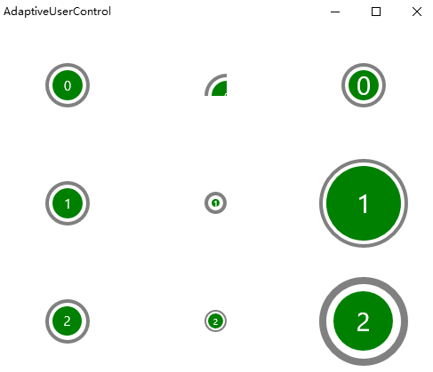
    <Grid>
        <Grid.RowDefinitions>
            <RowDefinition></RowDefinition>
            <RowDefinition></RowDefinition>
            <RowDefinition></RowDefinition>
        </Grid.RowDefinitions>
        <Grid.ColumnDefinitions>
            <ColumnDefinition></ColumnDefinition>
            <ColumnDefinition></ColumnDefinition>
            <ColumnDefinition></ColumnDefinition>
        </Grid.ColumnDefinitions>

        <local:Circle0 ></local:Circle0>
        <local:Circle0 Grid.Column="1" Width="25" Height="25" FontSize="10"></local:Circle0>
        <local:Circle0 Grid.Column="2" Width="100" Height="100" FontSize="30"></local:Circle0>

        <local:Circle1 Grid.Row="1" Width="50" Height="50"></local:Circle1>
        <local:Circle1 Grid.Row="1" Grid.Column="1" Width="25" Height="25" FontSize="10"></local:Circle1>
        <local:Circle1 Grid.Row="1" Grid.Column="2" Width="100" Height="100" FontSize="30"></local:Circle1>

        <local:Circle2 Grid.Row="2" Width="50" Height="50"></local:Circle2>
        <local:Circle2 Grid.Row="2" Grid.Column="1" Width="25" Height="25" FontSize="10"></local:Circle2>
        <local:Circle2 Grid.Row="2" Grid.Column="2" Width="100" Height="100" FontSize="30"></local:Circle2>
    </Grid>
首先由于第一种写法定死了Width和Height,可以看到第一排的圆形在尺寸变化时无法自适应大小,悲剧的被截断或者无法撑开。
第二种写法的问题在于间距被固定,虽然整体可以自动缩放,但间距仍需要通过代码去修正才能保持比例。
第三种自然是最佳做法,无论尺寸如何变化,均可以自适应。
回顾一下之前对Adaptive Ui布局技巧的总结:
- 尽量不要有写死的Width和Height
- 可以有少量的Margin
- 整体为纵向布局的界面(比如手机竖着拿),横向可以有写死的数字,纵向最好按比例。反之亦然。
这里还有几个问题需要说明一下:
- CacheMode="BitmapCache"
堆叠的Shape图形,我们这里是三个Circle,会导致重复的绘制影响性能。不要忘记加上CacheMode="BitmapCache"来告诉系统避免该问题。
MSDN的原文如下:
过度绘制的另一个来源是由许多重叠元素形成的形状。 如果针对包含合成形状的 UIElement,将 CacheMode 设置为 BitmapCache,平台会将该元素作为位图呈现一次,然后每帧使用该位图而不是过度绘制。
- 三种画法的性能差距
我做了一个去除了虚拟化的ListView进行测试,各放置1000个圆形图像。三种画法的性能差距基本一致,没有太大差别,请放心使用。在可以正常虚拟化的ListView中就更没有问题了。
- 还是性能问题
非常遗憾,无论是DrawingVisual和DrawingContext这类底层的高性能的绘图类,还是RadialGradientBrush径向渐变的画刷。一切可以进一步提升性能的方式,在从WPF-》Silverlight-》UWP的演化过程中,尼玛都退化了,木有了!!!就UWP本身而言,不存在更好的绘制方式了,老老实实通过Shape来堆叠图形吧……
最后GitHub:
https://github.com/manupstairs/UWPSamples/tree/master/UWPSamples/AdaptiveUserControl

