【CSS】过渡、动画和变换
1. 使用过渡
过渡效果一般是由浏览器直接改变元素的CSS属性实现的。例如,如果使用:hover选择器,一旦用户将鼠标悬停在元素之上,浏览器就会应用跟选择器关联的属性。
<!DOCTYPE html>
<html lang="en">
<head>
    <meta charset="UTF-8">
    <title>Example</title>
    <style type="text/css">
        p { padding: 5px; border: medium double black; background-color: lightgray; font-family: sans-serif;}
        #banana { font-size: large; border: medium solid green;}
        #banana:hover { font-size: x-large; border: medium solid white; background-color: #1fa6e6; color: white; padding: 4px;}
    </style>
</head>
<body>
        <p>
            There are lots of different kinds of fruit - there are over 500 varieties of <span id="banana">banana</span> alone.
            By the time we add the countless types of apples, oranges, and other well-know fruit, we are faced with thousands of choices.
        </p>
</div>
</body>
</html>
当用户将鼠标悬停在span元素上的时候,浏览器就会响应,直接应用新的属性。变化如下图所示:
CCS过渡属性允许控制应用新属性值的速度。比如可以选择逐渐改变示例中span元素的外观,让鼠标移到单词banana上的效果更和谐。
transition-delay 和 transition-duration 属性指定为CSS时间,是一个数字,单位为ms(毫秒)或者s(秒)。
transition简写属性的格式如下:
transition: <transition-property> <transition-duration> <transition-timing-function> <transition-delay>
修改前面示例的CSS代码如下:
p { padding: 5px; border: medium double black; background-color: lightgray; font-family: sans-serif;}
#banana { font-size: large; border: medium solid green;}
#banana:hover {
    font-size: x-large; border: medium solid white; background-color: #1fa6e6; color: white; padding: 4px;
    transition-delay: 100ms;
    transition-property: background-color,color,padding,font-size,border;
    transition-duration: 500ms;
}
在这个例子中,为样式添加了过渡,是通过#banana:hover 选择器应用的。过渡会在用户将鼠标悬停在span元素上100ms之后开始,持续时间为500ms,过渡应用到 background-color、color、padding、font-size和border属性。下面的效果图展示了这个过渡的渐进过程:
注意这个示例中指定多个属性的方式。过渡属性的值用逗号隔开,这样过渡效果才会同时出现。可以为延迟时间和持续时间指定多个值,它代表的意思是不同的属性在不同的时间点开始过渡,且持续时间也不同。
1.1 创建反向过渡
过渡只有在应用与其关联的样式时才会生效。示例样式中使用了:hover 选择器,这意味着只有用户将鼠标悬停在span元素上才会应用样式。用户一旦将鼠标从span元素上已开,只剩下#banana样式,默认情况下,元素的外观会立刻回到初始状态。
因为这个原因,大多数过渡成对出现:暂时状态的过渡和方向相反的反向过渡。修改前面示例的CCS代码,从而展示如何通过应用另一种过渡样式平滑地返回初始样式。
p { padding: 5px; border: medium double black; background-color: lightgray; font-family: sans-serif;}
#banana {
    font-size: large; border: medium solid green;
    transition-delay: 100ms;
    transition-duration: 500ms;}
#banana:hover {
    font-size: x-large; border: medium solid white; background-color: #1fa6e6; color: white; padding: 4px;
    transition-delay: 100ms;
    transition-property: background-color,color,padding,font-size,border;
    transition-duration: 500ms;
}

1.2 选择中间值的计算方式
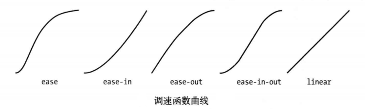
使用过渡时,浏览器需要为每个属性计算初始值和最终值之间的中间值。使用transition-timing-function 属性指定计算中间值的方式,表示为四个点控制的三次贝塞尔曲线。有五种预设曲线可以选择,由下面的值表示:
* ease(默认值)
* linear
* ease-in
* ease-out
* ease-in-out
从下图可以看到这五种曲线,它们展示了中间值随着时间的推移变为最终值的速率。
搞清楚这些值最简单的办法就是在自己的HTML文档中试验。还有另外一个值 cubic-bezier,可用来指定自定义曲线。
修改前面示例的CSS样式如下,展示 transition-timing-function 属性的应用:
p { padding: 5px; border: medium double black; background-color: lightgray; font-family: sans-serif;}
#banana {
    font-size: large; border: medium solid green;
    transition-delay: 10ms;
    transition-duration: 250ms;;
}
#banana:hover {
    font-size: x-large; border: medium solid white; background-color: #1fa6e6; color: white; padding: 4px;
    transition-delay: 100ms;
    transition-property: background-color,color,padding,font-size,border;
    transition-duration: 500ms;
    transition-timing-function: linear;
}
2. 使用动画
CSS动画本质上是增强的过渡。在如何从一种样式过渡到另一种样式的过程中,具有了更多选择、更多控制,以及更多灵活性。
animation 简写属性的格式如下:
animation: <animation-name> <animation-duration> <animation-timing-function> <animation-delay> <animation-iteration-count>
注意,这些属性都不是用来指定要作为动画的CSS属性的。这是因为动画是在两部分定义的。第一部分包含在样式声明中,使用了上面表中列出的属性。它们定义了动画的样式,但并没有定义哪些属性是动画。第二部分使用@key-frames规则窗口,用来定义定义动画的属性。从下面代码中可以看到定义动画的这两部分。
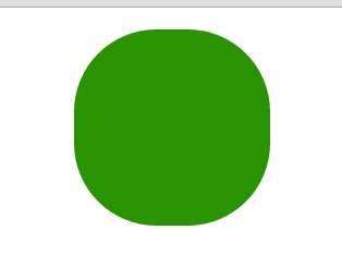
<!DOCTYPE html>
<html lang="en">
<head>
    <meta charset="UTF-8">
    <title>Example</title>
    <style type="text/css">
        #ball{
            width: 180px; height: 180px; background-color:green; margin:20px auto;border-radius: 90px;
            -webkit-animation-delay: 100ms;
            -webkit-animation-duration: 2000ms;
            -webkit-animation-iteration-count: infinite;
            -webkit-animation-timing-function: linear;
            -webkit-animation-name:'GrowQuare';
        }
        @-webkit-keyframes GrowQuare {
            to {
                background-color: yellow;
                border-radius: 0;
            }
        }
    </style>
</head>
<body>
<div id="ball"></div>
</body>
</html>
要明白在这个示例中做了什么,应该仔细研究一下动画的两部分。第一部分是在样式中定义动画属性,是跟#ball选择器一起的。先看看基本属性:选择器样式应用100ms后开始播放动画属性,持续时间2000ms,无限重复播放,中间值使用linear函数计算。除了重复播放动画,这些属性在过渡中都有对应属性。
这些基本的属性并没有指出为哪些CSS属性应用动画。为此,要使用 animation-name 属性给动画属性起个名字,这里叫 GrowsQuare 。这样,就相当于告诉浏览器找一组名为 GrowQuare 的关键帧,然后将这些基本属性的值应用到 @keyframes指定的动画属性上。下面是此例代码中关键帧的声明(这里省略了-webkit前缀):
@-webkit-keyframes GrowQuare {
     to {
         background-color: yellow;
         border-radius: 0;
     }
 }
声明的开始是@keyframes,接着指定了这组关键帧的名字 GrowQuare。声明内部指定了一组要应用的动画效果。to 声明定义了一组设置动画样式的属性,同时也定义了动画结束时这些属性的最终值。动画的初始值来自进行动画处理的元素在应用样式之前的属性值。
此例的效果是一个大小为180像素的圆形,渐变成正方形。其显示效果如下图所示:
2.1 使用关键帧
CSS动画的关键帧机器灵活,非常值得研究。
(1) 设置初始状态
在前面的示例中,要处理为动画的属性的初始值来自元素自身。可以使用from子句指定另一组值。修改前面示例的CSS文件如下:
#ball{
    width: 180px; height: 180px; background-color:green; margin:20px auto;border-radius: 90px;
    -webkit-animation-delay: 1000ms;
    -webkit-animation-duration: 2000ms;
    -webkit-animation-iteration-count: infinite;
    -webkit-animation-timing-function: linear;
    -webkit-animation-name:'GrowQuare';
}
@-webkit-keyframes GrowQuare {
    from {
        background-color: black;
        width: 90px;
        height: 180px;
        border-radius: 45px/90px;
    }
    to {
        background-color: yellow;
        border-radius: 0;
    }
}
在这个例子中修改了动画延迟为1000ms,并为背景色、宽度、高度、圆角边框属性提供了初始值,在to句子中指定的其他属性在动画开始时的初始值来自元素自身。从下面的显示效果可以看出来。最开始是一个绿色的圆形,然后一秒后直接变成一个竖立的黑色椭圆,再经过两秒逐渐改变成黄色的正方形。
(2) 指定中间关键帧
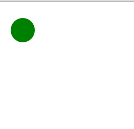
也可以添加其他关键帧定义动画的中间阶段。这是通过添加百分数子句实现的,修改前面示例CSS代码如下:
#ball{
    width: 200px; height: 200px; background-color:green; margin:20px auto;border-radius: 100px;
    -webkit-animation-delay: 1000ms;
    -webkit-animation-duration: 2000ms;
    -webkit-animation-iteration-count: infinite;
    -webkit-animation-timing-function: linear;
    -webkit-animation-name:'GrowQuare';
}
@-webkit-keyframes GrowQuare {
    from {
        background-color: black;
        width: 100px;
        height: 200px;
        border-radius: 50px/100px;
    }
    50% {
        background-color: red;
        width: 50px;height: 100px; border-radius: 25px/50px;margin:70px auto;
    }
    75%{
        background: blue;
        width: 25px;height: 50px; border-radius: 12.5px/25px;margin:95px auto;
    }
    to {
        background-color: yellow;
        border-radius: 0;
    }
}
对于每一个百分数子句,在动画中定义了一个点,这时子句中指定的属性和值会完全应用到样式上。此例中,定义了50%和75子句。
中关键帧有两个用途。一是为属性定义新的变化速率。浏览器会使用animation-timing-function 属性指定的调速函数计算由一个关键帧移动到下一个关键帧需要的中间值,以确保关键帧与关键帧之间流畅地播放。二则是定义属性值,以便创建更为复杂的动画。可以看到此例显示效果如下:

2.2 设置重复方向
动画结束后浏览器可以选择接下来动画以何种方式重复。使用 animation-direction属性指定首先方式。
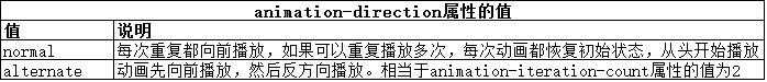
修改前面示例CSS代码如下:
#ball{
    width: 50px; height: 50px; background-color:green;border-radius: 25px;
    -webkit-animation-delay: 100ms;
    -webkit-animation-duration: 2s;
    -webkit-animation-iteration-count: 2;
    -webkit-animation-timing-function: linear;
    -webkit-animation-name:'GrowQuare';
    -webkit-animation-direction: alternate;
}
@-webkit-keyframes GrowQuare {
    50%{
        margin-top: 200px;
    }

    to {
        margin-left:200px;
    }
}
2.3 理解结束状态
CSS动画的一个局限是关键帧为属性定义的值只能在动画中应用。动画结束后,动画元素的外观回到初始状态。
2.4 初始布局时应用动画
跟过渡相比,动画的一个优势是可以将其应用到页面的初始布局。当把 animation-delay 属性的值设为0 (默认值),当页面一旦加载就会自动应用样式,这就意味着浏览器一旦显示HTML就有了动画效果。
PS:使用上诉方法要谨慎。如果要在页面中使用动画,而动画效果不是邀请用户只需某一动作,这种情况更应该慎之又慎。如果确实要使用动画,要保证动画效果缓和一些,不要妨碍用户阅读或者与页面其他部分交互。
2.5 重用关键帧
我们可以对同一组关键帧应用多个动画,从而动画属性配置不同的值。
<!DOCTYPE html>
<html lang="en">
<head>
    <meta charset="UTF-8">
    <title>Example</title>
    <style type="text/css">
        #ball{
            width: 50px; height: 50px; background-color:green;border-radius: 25px;
            -webkit-animation-delay: 100ms;
            -webkit-animation-duration: 2s;
            -webkit-animation-iteration-count: infinite;
            -webkit-animation-timing-function: linear;
            -webkit-animation-name:'GrowQuare';
            -webkit-animation-direction: alternate;
        }
        #ball_second {
            width: 50px; height: 50px; background-color:green;
            -webkit-animation-delay: 100ms;
            -webkit-animation-duration: 2s;
            -webkit-animation-iteration-count: infinite;
            -webkit-animation-timing-function: linear;
            -webkit-animation-name:'GrowQuare';
            -webkit-animation-direction: alternate;
        }
        @-webkit-keyframes GrowQuare {
            to {
                margin-left:200px;
            }
        }
    </style>
</head>
<body>
<div id="ball"></div>
<div id="ball_second"></div>
</body>
</html>
代码中展示了两个样式,它们都使用了GrowQuare 关键帧。效果图如下:
2.6 为多个元素应用多个动画
前面例子的一个变体是为多个元素应用同一个动画。在包含动画细节的样式中,扩展选择器的范围即可实现这一点。
(1)为多个元素应用一个动画
<!DOCTYPE html>
<html lang="en">
<head>
    <meta charset="UTF-8">
    <title>Example</title>
    <style type="text/css">
        #ball, #ball_second {
            width: 50px; height: 50px; background-color:green;border-radius: 25px;
            -webkit-animation-duration: 2s;
            -webkit-animation-iteration-count: infinite;
            -webkit-animation-timing-function: linear;
            -webkit-animation-name:'GrowQuare';
            -webkit-animation-direction: alternate;
        }
        @-webkit-keyframes GrowQuare {
            to {
                margin-left:200px;
            }
        }
    </style>
</head>
<body>
<div id="ball"></div>
<div id="ball_second"></div>
</body>
</html>

(2)为一个元素应用多个关键帧
<!DOCTYPE html>
<html lang="en">
<head>
    <meta charset="UTF-8">
    <title>Example</title>
    <style type="text/css">
        #ball{
            width: 50px; height: 50px; background-color:green;border-radius: 25px;
            -webkit-animation-delay: 500ms;
            -webkit-animation-duration: 2s;
            -webkit-animation-iteration-count: infinite;
            -webkit-animation-timing-function: linear;
            -webkit-animation-name:'Grow1','Grow2';
            -webkit-animation-direction: alternate;
        }
        @-webkit-keyframes Grow1 {
            to {
                margin-left:200px;
            }
        }
        @-webkit-keyframes Grow2 {
            to {
                margin-top:200px;
            }
        }
    </style>
</head>
<body>
<div id="ball"></div>
</body>
</html>

2.7 停止和启动动画
aniamation-play-state 属性可以用来停止和启动动画。如果这个属性的值为paused,动画就会停止。如果换成 playing。动画就会开始播放。
<!DOCTYPE html>
<html lang="en">
<head>
    <meta charset="UTF-8">
    <title>Example</title>
    <style type="text/css">
        #ball {
            width: 50px; height: 50px; background-color:red;border-radius: 25px;
            -webkit-animation-delay: 500ms;
            -webkit-animation-duration: 5s;
            -webkit-animation-direction: alternate;
            -webkit-animation-iteration-count: infinite;;
            -webkit-animation-timing-function: linear;
            -webkit-animation-name:'GrowQuare';
        }
        @-webkit-keyframes GrowQuare {
            to {
                width:200px;
            }
        }
    </style>
</head>
<body>
<div id="ball"></div>
<br />
<div>
    <button>Running</button>
    <button>Paused</button>
</div>
<script>
    var buttons = document.getElementsByTagName("button");
    for(var i = 0; i < buttons.length; i++){
        buttons[i].onclick = function(e){
            document.getElementById("ball").style.webkitAnimationPlayState = e.target.innerHTML;
        }
    }
</script>
</body>
</html>

3. 使用变换
我们可以使用CSS变换为元素应用线性变换,也就是说可以旋转、缩放、倾斜和平移某个元素。

3.1 应用变换
下面代码是一个变换的例子。
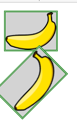
<!DOCTYPE html>
<html lang="en">
<head>
    <meta charset="UTF-8">
    <title>Example</title>
    <style type="text/css">
        img{ border: medium double green; background-color: lightgray;}
        #banana2 {
            transform: rotate(-45deg) scaleX(1.2);
        }
    </style>
</head>
<body>
<p>
<img src="imgs/banana-small.png" alt="small banana" id="banana1"></p>
<p>
<img src="imgs/banana-small.png" alt="small banana" id="banana2"></p>
</body>
</html>
此例中,为#banana2 选择器添加了一个transform 属性声明,指定了两个变换。第一个是旋转-45°(即逆时针旋转45°);第二个是沿x轴进行因子为1.2的缩放。这些变换的效果如下图所示:
3.2 指定元素变换的起点
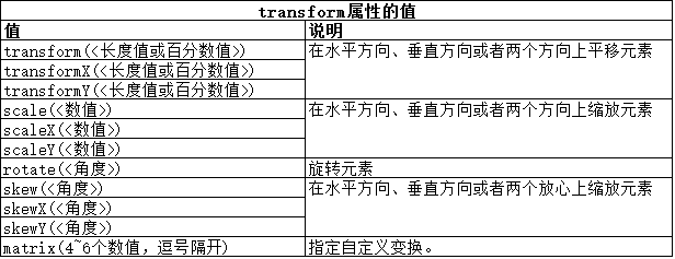
transform-origin属性允许我们指定应用变换的起点。默认情况下,使用元素的中心作为起点,不过,可以使用下表中的值选择其他起点。
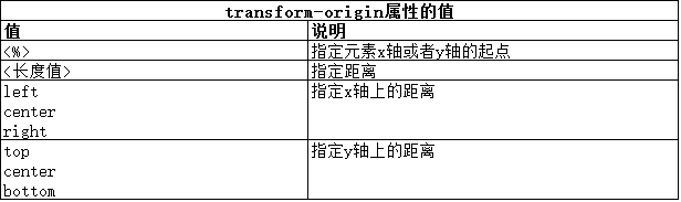
要定义起点,需要为x轴和y轴各定义一个值。如果只提供一个值,另一个值会被认为是中心位置。下面代码展示了 transform-origin属性的用法。
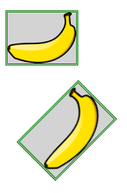
<!DOCTYPE html>
<html lang="en">
<head>
    <meta charset="UTF-8">
    <title>Example</title>
    <style type="text/css">
        img{ border: medium double green; background-color: lightgray;}
        #banana2 {
            transform: rotate(-45deg) scaleX(1.2);
            transform-origin: right top;}
    </style>
</head>
<body>
<p>
<img src="imgs/banana-small.png" alt="small banana" id="banana1"></p>
<p>
<img src="imgs/banana-small.png" alt="small banana" id="banana2"></p>
</body>
</html>
此例中,将变换的起点已到了元素的右上角,从下面的显示效果图可以看到:
3.3 将变换作为动画和过渡处理
我们可以为变换应用动画和过渡,就和其他CSS属性一样。
<!DOCTYPE html>
<html lang="en">
<head>
    <meta charset="UTF-8">
    <title>Example</title>
    <style type="text/css">
        img{ border: medium double green; background-color: lightgray;}
        #banana2:hover {
            transform: rotate(360deg);
            transition-duration: 5s;
        }
    </style>
</head>
<body>
<p>
<img src="imgs/banana-small.png" alt="small banana" id="banana1"></p>
<p>
<img src="imgs/banana-small.png" alt="small banana" id="banana2"></p>
</body>
</html>
此例中,定义了一个过渡,它会经过5秒完成一次360°旋转变换。当用户将鼠标悬停在 #banana2 元素上,就会应用过渡,效果如下图所示: