
创建响应式布局的优秀网格工具集锦《系列五》
在这篇文章中,我们为您呈现了一组优秀的网格工具清单。如果网页设计和开人员采用了正确的工具集,并基于一个灵活的网格架构,以及能够把响应图像应用到到设计之中,那么创建一个具备响应式的网站并不一定是一项艰巨的任务。enjoy!
Susy
Susy is a responsive grid system for Compass. It lets you quick add new media-query breakpoints to your layouts, using their math or your own (with helpers).
GridSet
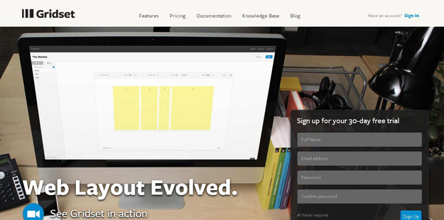
Designing grids with Gridset is as easy as dragging guides in Photoshop or Fireworks. Gridset provides whatever you need: PNGs, a comprehensive cheat sheet and CSS.
Grid
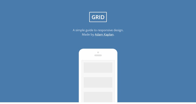
Grid is a simple guide to responsive design. By following those simple steps, you are on the path to responsive web design mastery. Keep practicing and help make the web a better, more useable place.
Grid Designer
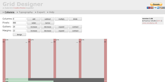
This tool enables you to create a CSS Grid by specifying the number of columns and the widths of the columns, gutters and margins.
Blueprint Grid CSS Generator
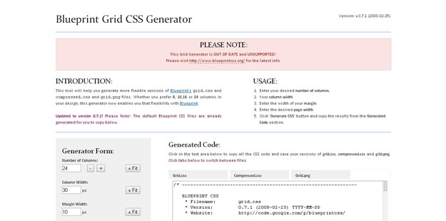
This tool will help you generate more flexible versions of Blueprint’s grid.css andcompressed.css and grid.png files. Whether you prefer 8, 10,16 or 24 columns in your design, this generator now enables you that flexibility with Blueprint.
The Grid System
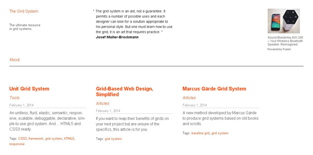
The Grid System is an exceptional tool for creating responsive layouts.
Grid Displayer
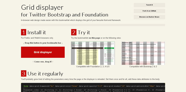
Grid Displayer is a boomarklet that displays the grid of both Twitter Bootstrap (fixed and fluid grid) and Foundation (2.0 and 3.0). It works with Firefox and WebKit browsers.
The Grid
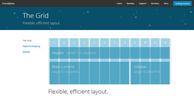
It’s a 12-column flexible grid that can scale out to an arbitrary size (defined by the max-width of the row) that’s also easily nested, so you can build out complicated layouts without creating a lot of custom elements.
您可能感兴趣的相关文章


