
JS组件系列——开源免费图表组件:Chart.js
前言:最近被开源免费得有点上火了,各种组件首先想到的就是是开源否、是否免费、是否和bootstrap风格一致。想着以后做报表肯定要用到图表组件的,于是在Bootstrap中文网上面找到了Chart.js,总的来说,这个组件不能说最好,但是对于一般不太复杂的报表是够用了。今天就来看看它如何使用吧。
一、组件比较以及选用
其实说起报表组件,网上一搜一大把,各种让人眼花缭乱的组件,但貌似比较出名一点的都是收费的。综合来看:
JsChart组件功能强大,能适应各种复杂的需求和业务;Chart.js免费。
FunsionChart界面优美,效果炫,用户体验好;Chart.js免费。
HighChart使用方便,调用简单,开发效率高;Chart.js免费。
如果你说:咱们公司不缺钱,当然是哪个最好用哪个喽。那博主只能说:有钱,任性。至少博主所在的公司是把免费放在选用组件的第一原则的。
chart.js源码:https://github.com/nnnick/Chart.js
chart.js 英文文档:http://www.chartjs.org/docs/
chart.js 中文文档:http://www.bootcss.com/p/chart.js/docs/
二、组件效果展示
上面扯了一大堆没用的,先来一组效果图看看吧。
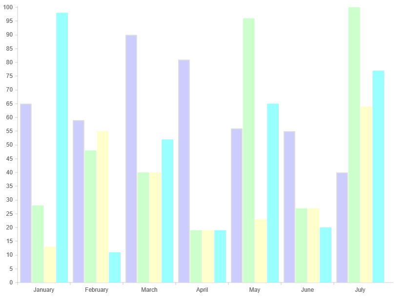
1、柱状图
原始的柱状图
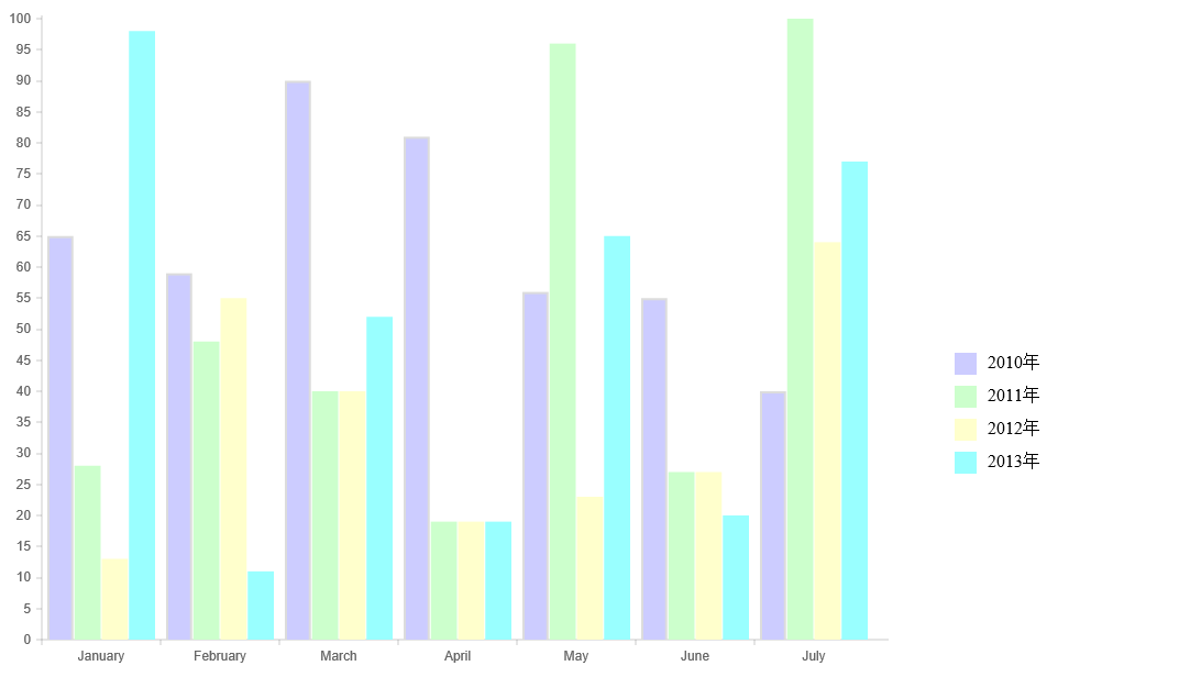
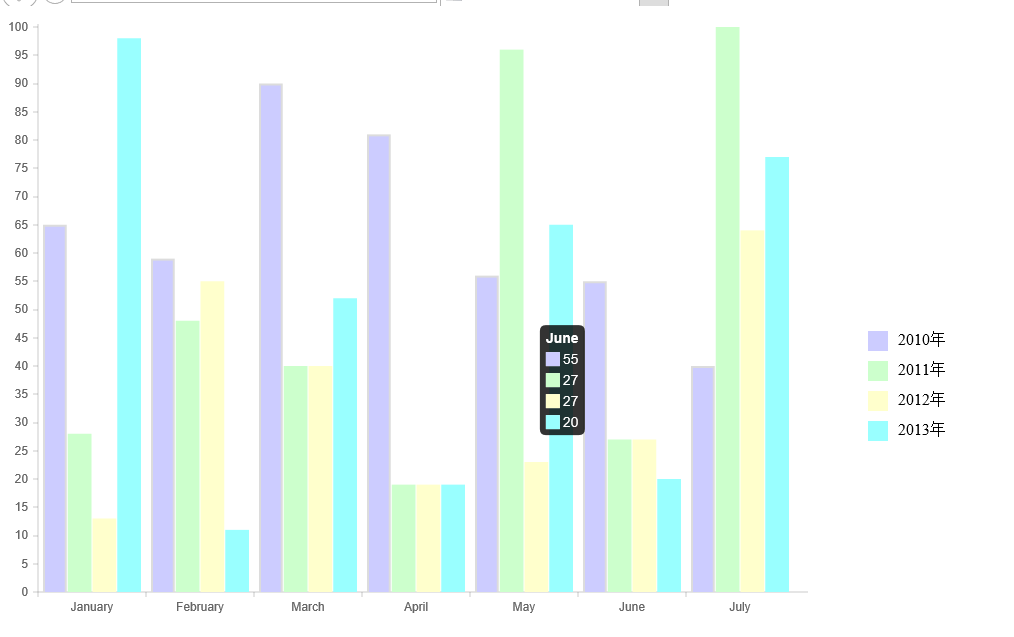
加上图表说明和tooltip的柱状图
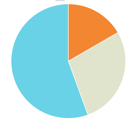
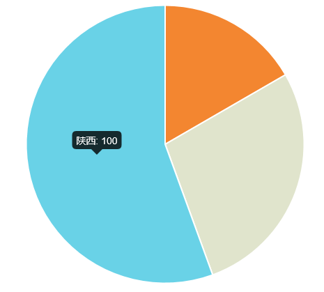
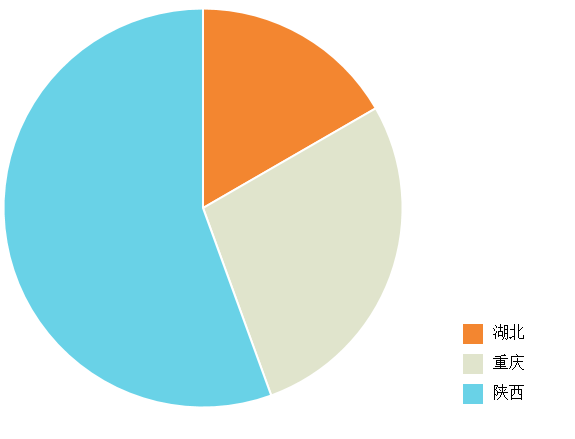
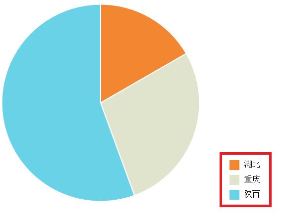
2、饼状图
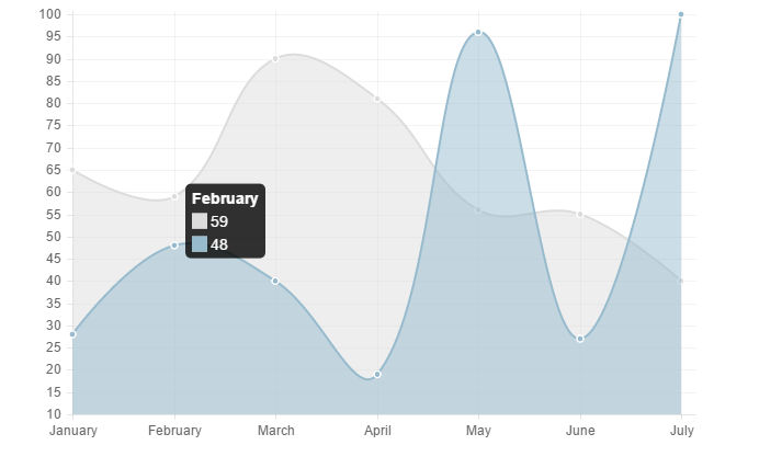
3、曲线图
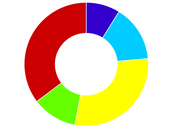
4、环状图
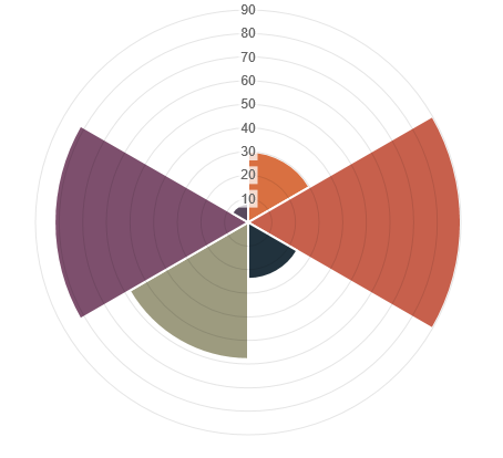
5、极地区域图
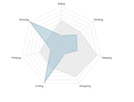
6、雷达图
三、代码示例
关于chart.js的使用代码其实不用多说,文档里面很容易看懂。这里就简单展示一个:
chart.js的原理是使用html5的canvas标签,所以首先它需要一个canvas的标签放在cshtml页面
<script src="~/Scripts/jquery-1.10.2.js"></script>
<script src="~/Content/Chart.js-master/Chart.js"></script>
<canvas id="myChart" width="800" height="600"></canvas>
然后js里面(我们先以柱状图为例来说明)
var data = {
    labels: ["January", "February", "March", "April", "May", "June", "July"],
    datasets: [
        {
            fillColor: "#CCCCFF",
            strokeColor: "rgba(220,220,220,1)",
            label: "2010年",
            data: [65, 59, 90, 81, 56, 55, 40]
        },
        {
            fillColor: "#CCFFCC",
            strokeColor: "#CCFFCC",
            label:"2011年",
            data: [28, 48, 40, 19, 96, 27, 100]
        },
        {
            fillColor: "#FFFFCC",
            strokeColor: "#FFFFCC",
            label: "2012年",
            data: [13, 55, 40, 19, 23, 27, 64]
        },
        {
            fillColor: "#99FFFF",
            strokeColor: "#99FFFF",
            label: "2013年",
            data: [98, 11, 52, 19, 65, 20, 77]
        }
    ]
}

$(function () {
    var ctx = $("#myChart").get(0).getContext("2d");
    var myNewChart = new Chart(ctx);
    myNewChart.Bar(data);
});
如果是做业务需求,一般来说,data的数据是从后台构造成指定格式的json对象然后传递到前端。前端调用的时候只需要简单的两句:
var ctx = $("#myChart").get(0).getContext("2d");
new Chart(ctx).Bar(data);
如果是需要修改它的默认显示参数,则可以指定options
var options = {
    //Boolean - If we show the scale above the chart data
    //是否显示柱状图上面的数据
    scaleOverlay: true,

    //Boolean - If we want to override with a hard coded scale
    scaleOverride: false,

    //** Required if scaleOverride is true **
    //Number - The number of steps in a hard coded scale
    scaleSteps: null,
    //Number - The value jump in the hard coded scale
    scaleStepWidth: 50,
    //Number - The scale starting value
    scaleStartValue: null,

    //String - Colour of the scale line
    //x/y轴坐标线的颜色
    scaleLineColor: "rgba(0,0,0,.1)",

    //Number - Pixel width of the scale line
    //坐标线的宽度
    scaleLineWidth: null,

    //Boolean - Whether to show labels on the scale
    //是否显示label值
    scaleShowLabels: true,

    //Interpolated JS string - can access value
    scaleLabel: "<%=value%>",

    //String - Scale label font declaration for the scale label
    //字体Family
    scaleFontFamily: "'Arial'",

    //Number - Scale label font size in pixels
    //字体大小
    scaleFontSize: 12,

    //String - Scale label font weight style
    //字体样式
    scaleFontStyle: "normal",

    //String - Scale label font colour
    //字体颜色
    scaleFontColor: "#666",

    ///Boolean - Whether grid lines are shown across the chart
    scaleShowGridLines: false,

    //String - Colour of the grid lines
    //网格线颜色
    scaleGridLineColor: "rgba(0,0,0,.05)",

    //Number - Width of the grid lines
    scaleGridLineWidth: 1,

    //Boolean - If there is a stroke on each bar
    barShowStroke: true,

    //Number - Pixel width of the bar stroke
    barStrokeWidth: 2,

    //Number - Spacing between each of the X value sets
    // 柱状块与x值所形成的线(如:x=20这条线)之间的距离
    barValueSpacing: 5,

    //Number - Spacing between data sets within X values
    // 在同一x值内的柱状块之间的间距
    barDatasetSpacing: 1,

    //Boolean - Whether to animate the chart
    animation: true,

    //Number - Number of animation steps
    animationSteps: 60,

    //String - Animation easing effect
    animationEasing: "easeOutQuart",

    //Function - Fires when the animation is complete
    onAnimationComplete: function () {
        var strHtml = "";
        for (var i = 0; i < this.datasets.length; i++) {
            strHtml += "<li><div><span style='background-color:" + this.datasets[i].fillColor + ";'></span><label>" + this.datasets[i].label + "</label></div><div style='clear:both;'></div></li>";
        }
        $("#ul_type").html(strHtml);
    }
}
然后在调用的时候稍作修改:
$(function () {
    var ctx = $("#myChart").get(0).getContext("2d");
    var myNewChart = new Chart(ctx);
    myNewChart.Bar(data, options);
});
这里需要说明的一个地方是:由于使用的是chart.js 1.0.2版本,所以下图右下角的那个说明的块是博主自己在onAnimationComplete这个事件里面通过js加上去的
好像新版的chart.js是自带的这个功能。等待发布!
四、总结
至此,柱状图的使用就说完了。其他图表的用法和这个相似度达到90%,博主就不一一介绍了,待会直接上源码。总的来说,这个组件开源、免费,然后它非常轻量级,不依赖任何的js组件(如果上面的代码中不用jQuery,可以直接用DOM的方法去取),整个js压缩后仅仅4.5K大小。然而由于它的原理是基于html5的,所以对浏览器有一定的要求,并且它对IE7、IE8有降级处理方案,详见Chart.js中文文档。附上源码,有需要看看。

 浙公网安备 33010602011771号