css3盒模型
css2.1盒模型:
当你定义盒子的宽高后;如果添加padding和border值后盒子的宽高会被撑大
盒子的高度=定义的高度+(padding-top + padding-bottom)+(border-top + border-bottom);
盒子的宽度=定义的宽度+(padding-left+ padding-right)+(border-left+ border-right);
css3.0盒模型:
当你定义盒子高度后;如果添加padding和border值后盒子大小不会改变,他会向内容区收缩。
盒子的高度=你定义的高度;盒子的宽度度=你定义的宽度;
用法:
box-sizing:用来控制元素的盒模型解析模式
box-sizing:content-box | border-box | inherit;
默认值是content-box:维持W3C的标准盒模型 也就是css3.0以前的版本布局
border-box:重新定义盒模型组成的模式。
inherit:使元素继承父元素的盒模型模式。
写法(考虑兼容):
-moz-box-sizing: border-box;
--webkit-box-sizing: border-box;
-moz-box-sizing: border-box;
-ms-box-sizing:border-box;
box-sizing: border-box;
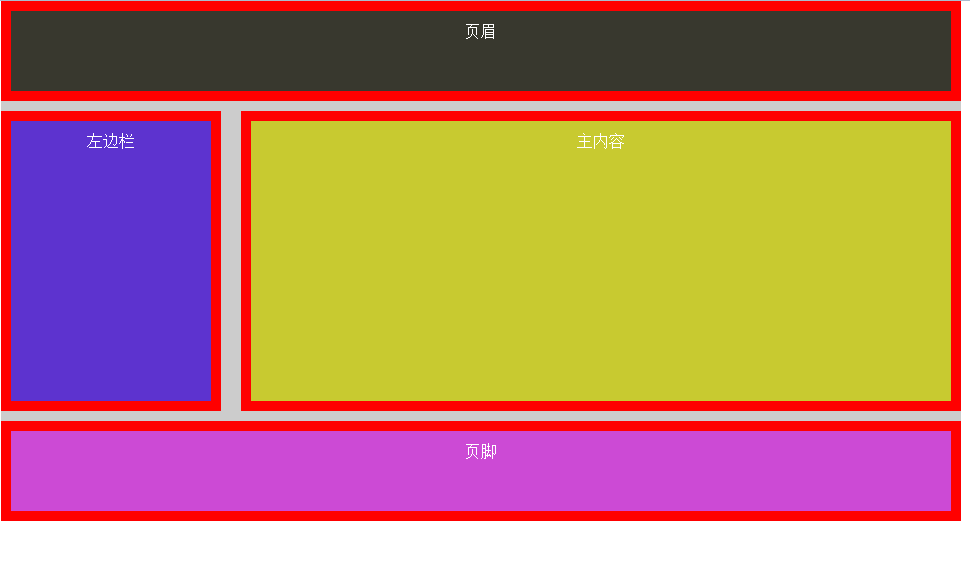
实例:
<!DOCTYPE html>
<html lang="en">
<head>
<meta charset="UTF-8">
<title>css3布局</title>
</head>
<style>
*{margin:0;padding:0;}
.wrapper{
width:960px;
margin:0 auto;
color:#fff;
background:#cccccc;
text-align:center;
-moz-box-sizing: border-box;
--webkit-box-sizing: border-box;
-moz-box-sizing: border-box;
-ms-box-sizing:border-box;
box-sizing: border-box;
}
.header{
background:#38382e;
margin-bottom: 10px;
border:10px solid red;
padding:10px;
width:100%;height:100px;
box-sizing:inherit;
}
.sidebar{
float:left;
width:220px;
margin:0px 20px 10px 0px;
height:300px;
background:#5d33cf;
border:10px solid red;
padding:10px;
box-sizing:inherit;
}
.content{
float:left;
width:720px;
margin-bottom: 10px;
height:300px;
background:#c8ca30;
border:10px solid red;
padding:10px;
box-sizing:inherit;
}
.footer{
clear:both;
width:100%;
height:100px;
background:#cc4ad5;
border:10px solid red;
padding:10px;
box-sizing:inherit;
}
</style>
<body>
<div class="wrapper">
<div class="header">页眉</div>
<div class="sidebar">左边栏</div>
<div class="content">主内容</div>
<div class="footer">页脚</div>
</div>
</body>
</html>
效果: