
思路:1.显示两块图片,2.图片区域(初始隐藏),3.鼠标移入,遮罩显示,此时遮住图片,4.鼠标移出,遮罩恢复初始状态
用到两个css3 属性:transtion ,transform
用法:
1. transition:property duration timing-function delay;
property:变化的属性
duration:属性变化持续的时间
time-function:变化的效果
delay:延迟时间
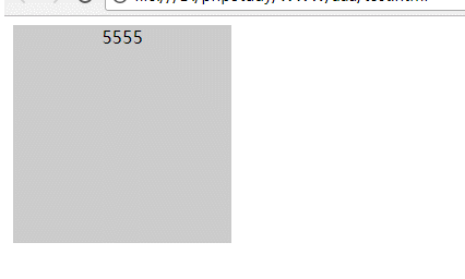
 1 <!DOCTYPE html>
 2 <html lang="en">
 3 <head>
 4     <meta charset="UTF-8">
 5     <meta name="viewport" content="width=device-width, initial-scale=1.0">
 6     <meta http-equiv="X-UA-Compatible" content="ie=edge">
 7     <title>Document</title>
 8     <style>
 9         div {
10             width: 200px;
11             height: 200px;
12             background: #ccc;
13             transition: width 3s;
14         }
15         div:hover {
16             width: 500px;
17         }
18     </style>
19 </head>
20 <body>
21     <div class="nihao"></div>
22 </body>
23 </html>
运行结果:
2. transform:none | transform-functions;
none:不进行转换
transform-functions:包括rotate()----旋转;skew()---------倾斜;scale()-------缩放;translate()------移动
transform的属性包括:rotate() / skew() / scale() / translate() ,分别还有x、y之分,比如:rotateX() 和 rotateY() ,以此类推。
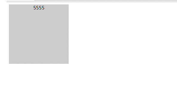
 1 <!DOCTYPE html>
 2 <html lang="en">
 3 <head>
 4     <meta charset="UTF-8">
 5     <meta name="viewport" content="width=device-width, initial-scale=1.0">
 6     <meta http-equiv="X-UA-Compatible" content="ie=edge">
 7     <title>Document</title>
 8     <style>
 9         div {
10             width: 200px;
11             height: 200px;
12             background: #ccc;
13             text-align: center;
14         }
15         div:hover {
16             /* transform: scale(1.5); */
17             transform: translateX(30px);
18             transition: 2s;
19         }
20     </style>
21 </head>
22 <body>
23     <div class="nihao">5555</div>
24 </body>
25 </html>
<!DOCTYPE html>
<html lang="en">
<head>
    <meta charset="UTF-8">
    <meta name="viewport" content="width=device-width, initial-scale=1.0">
    <meta http-equiv="X-UA-Compatible" content="ie=edge">
    <title>Document</title>
    <style>
        div {
            width: 200px;
            height: 200px;
            background: #ccc;
            text-align: center;
        }
        div:hover {
            transform: scale(1.5);
            /* transform: translateX(30px); */
            transition: 2s;
        }
    </style>
</head>
<body>
    <div class="nihao">5555</div>
</body>
</html>
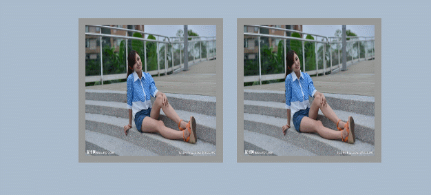
3. 用transtion 和transform 设置遮罩
html 代码:
 1 <!DOCTYPE html>
 2 <html lang="en">
 3 <head>
 4     <meta charset="UTF-8">
 5     <meta name="viewport" content="width=device-width, initial-scale=1.0">
 6     <meta http-equiv="X-UA-Compatible" content="ie=edge">
 7     <title>Document</title>
 8 </head>
 9 <body>
10     <div class="box">
11         <ul>
12             <li>
13                 <img src="img/110.jpg" width="190" height="190" alt="">
14                 <div class="cover">
15                     <a href=""><i></i></a>
16                     <h4>Alice</h4>
17                     <p>来自美国洛杉矶</p>
18                 </div>
19             </li>
20             <li>
21                 <img src="img/110.jpg" width="190" height="190" alt="">
22                 <div class="cover">
23                     <a href=""><i></i></a>
24                     <h4>Alice</h4>
25                     <p>来自美国洛杉矶</p>
26                 </div>
27             </li>
28         </ul>
29     </div>
30 </body>
31 </html>
css 代码:
    <style>
        * {
            margin: 0;
            padding: 0;
        }
        body {
            font-family: "Microsoft yahei", Arial;
            background: #abc;
        }
        .box {
            width: 500px;
            height: 500px;
            margin: 50px auto;
        }
        .box ul li {
            float: left;
            width: 190px;
            height: 190px;
            background: #979797;
            border: solid 10px #979797;
            margin: 10px;
            list-style: none;
            position: relative;
            /* 超出li显示部分进行隐藏 */
            overflow: hidden;
        }
        .box ul li .cover a {
            width: 30px;
            height: 30px;
            background: #ffffff;
            display: block;
            border-radius: 50%;
            line-height: 30px;
            margin: 30px auto;
        }
        .box ul li .cover {
            width: 190px;
            height: 190px;
            background: rgba(255, 39, 42, 0.7);
            position: absolute;
            left: 0;
            top: 0;
            text-align: center;
            color: #ffffff;
            /* 设置旋转元素的基点位置: */
            transform-origin: right bottom;
            -webkit-transform-origin: right bottom;          /*兼容 Safari and Chrome */
            -moz-transform-origin: right bottom;             /*兼容  Firefox 4 */
            -o-transform-origin: right bottom;               /*兼容  Opera */
            /* 旋转90度,这样 */
            transform: rotate(90deg);
            -webkit-transform: rotate(90deg);                /*兼容 Safari and Chrome */
            -moz-transform: rotate(90deg);                   /*兼容  Firefox 4 */
            -o-transform: rotate(90deg);                     /*兼容  Opera */
            /* 对所有属性进行变形 */
            transition: all 0.35s;
            -webkit-transition: all 0.35s;                   /*兼容 Safari and Chrome */
            -moz-transition: all 0.35s;                      /*兼容  Firefox 4 */
            -o-transition: all 0.35s;                        /*兼容  Opera */
        }
        .box ul li .cover p {
            margin-top: 10px;
            font-size: 14px;
        }
        .box ul li:hover .cover {
            /* 鼠标移入时,所有属性旋转到0度 */
            transform: rotate(0deg);
            -webkit-transform: rotate(0deg);                /*兼容 Safari and Chrome */
            -moz-transform: rotate(0deg);                   /*兼容  Firefox 4 */
            -o-transform: rotate(0deg);                     /*兼容  Opera */
        }
    </style>
运行结果:
http://www.cnblogs.com/huanying2015 博客随笔大多数文章均属原创,欢迎转载,但未经作者同意必须保留此段声明,且在文章页面明显位置给出原文连接,否则保留追究法律责任的权利

