

非常酷的jQuery/HTML5图片滑块特效 带弹性菜单
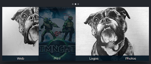
新的一周刚刚开始,当我迷迷糊糊坐在办公桌前时,又不自主的去看了一些jQuery和HTML5的应用插件,今天我们来看一款非常酷的jQuery/HTML5图片滑块特效,这款插件的特点是图片上不错的弹性菜单,鼠标滑过菜单时可以弹出一张半透明的图片。先来看看效果图。
我们可以在这里看到生动的DEMO演示。
当然,我们光看效果是不行的,还是一起来简单地分析一下实现的源码。
首先是使用最简单的HTML代码来构造这个带菜单的图片滑块框架:
<div id="slider-wrapper">
        <div id="dots">
            <ul>
                <li class="active"></li>
                <li></li>
                <li></li>
            </ul>
        </div>
        <div id="arrow-left" class="nav-arrow"></div>
        <div id="image-slider">
            <ul>
                <li class="active-img"><img src="sunset.jpg" alt="" /></li><li><img src="lele.jpg" alt="" /></li><li><img src="logo.jpg" alt="" /></li>
            </ul>
            <div id="nav-bar">
                    <a href="#"><div><img src="thumb-web.jpg" /></div>Web</a><a href="#"><div><img src="thumb-print.jpg" /></div>Print</a><a href="#"><div><img src="thumb-logo.jpg" /></div>Logos</a><a href="#"><div><img src="thumb-photo.jpg" /></div>Photos</a>
            </div>
        </div>
        <div id="arrow-right" class="nav-arrow"></div>
    </div>
下面是CSS3代码,主要是对左右箭头、图片阴影效果的渲染,这里贴一下核心的CSS代码:
.nav-arrow{
        width: 46px;
        height: 343px;
        display: inline-block;
            *display: inline;
            zoom: 1.0;
        cursor: pointer;
    }

    #arrow-left{
        background: url(arrow-left.png) center center no-repeat;
    }

    #arrow-right{
        background: url(arrow-right.png) center center no-repeat;
    }

    #arrow-right:hover, #arrow-left:hover{
        background-color: #1e2225;
    }

    #image-slider{
        width: 923px;
        height: 343px;
        position: relative;
        margin-top: 10px;
        overflow: hidden;
        display: inline-block;
            *display: inline;
            zoom: 1.0;
    }

    #slider-wrapper:before{
        content: '';
        width: 974px;
        height: 52px;
        display: block;
        position: absolute;
        left: 50%;
        margin-left: -487px;
        top: 375px;
        background: url(shadow.png) center center no-repeat;
    }
重点是jQuery代码,下面的jQuery代码就实现了图片的滑块动画以及鼠标滑过菜单时的弹性动画效果:
$(function(){

        var sliderInterval = setInterval(function() {
             nextImg();
        }, 7000);

        $('.nav-arrow').click(function(){
            if($(this).attr('id') == 'arrow-left'){
                prevImg();
            }else{
                nextImg();
            }

            clearInterval(sliderInterval);

        });

        $('#dots li').click(function(){
            var thisIndex = $(this).index()

            if(thisIndex < $('#dots li.active').index()){
                prevDot(thisIndex);
            }else if(thisIndex > $('#dots li.active').index()){
                nextDot(thisIndex);
            }

            $('#dots li.active').removeClass('active');
            $(this).addClass('active');

            clearInterval(sliderInterval);

        });
    })

    function prevImg(){
        var curIndex = $('#image-slider li.active-img').index();

        if(curIndex == 0){
            $('#image-slider li:last-child').addClass('next-img').animate({
                left: 0
            }, function(){
                $('#image-slider li.active-img').removeClass('active-img').css('left', '-923px');
                $('#image-slider li.next-img').attr('class', 'active-img');

                var nextIndex = $('#image-slider li.active-img').index();

                $('#dots li.active').removeClass('active');
                $('#dots li').eq(nextIndex).addClass('active');
            });
        }else{
            $('#image-slider li.active-img').prev().addClass('next-img').animate({
                left: 0
            }, function(){
                $('#image-slider li.active-img').removeClass('active-img').css('left', '-923px');
                $('#image-slider li.next-img').attr('class', 'active-img');

                var nextIndex = $('#image-slider li.active-img').index();

                $('#dots li.active').removeClass('active');
                $('#dots li').eq(nextIndex).addClass('active');
            });
        }
    }

    function nextImg(){
        var curIndex = $('#image-slider li.active-img').index();

        if(curIndex == $('#image-slider li').length - 1){
            $('#image-slider li:first-child').addClass('next-img').css('left', 923).animate({
                left: 0
            }, function(){
                $('#image-slider li.active-img').removeClass('active-img').css('left', '-923px');
                $('#image-slider li.next-img').attr('class', 'active-img');

                var nextIndex = $('#image-slider li.active-img').index();

                $('#dots li.active').removeClass('active');
                $('#dots li').eq(nextIndex).addClass('active');
            });
        }else{
            $('#image-slider li.active-img').next().addClass('next-img').css('left', 923).animate({
                left: 0
            }, function(){
                $('#image-slider li.active-img').removeClass('active-img').css('left', '-923px');
                $('#image-slider li.next-img').attr('class', 'active-img');

                var nextIndex = $('#image-slider li.active-img').index();

                $('#dots li.active').removeClass('active');
                $('#dots li').eq(nextIndex).addClass('active');
            });
        }
    }

    function prevDot(newIndex){
        $('#image-slider li').eq(newIndex).addClass('next-img').animate({
            left: 0
        }, function(){
            $('#image-slider li.active-img').removeClass('active-img').css('left', '-923px');
            $('#image-slider li.next-img').attr('class', 'active-img');
        });
    }

    function nextDot(newIndex){
        $('#image-slider li').eq(newIndex).addClass('next-img').css('left', 923).animate({
            left: 0
        }, function(){
            $('#image-slider li.active-img').removeClass('active-img').css('left', '-923px');
            $('#image-slider li.next-img').attr('class', 'active-img');
        });
    }
非常简洁的JS代码。
最后声明一下,在IE6.7.8中只能看到基本的滑块效果。最后附上源码。下载地址>>

