
CSS绘制简单图形
究竟该用字体图标、图片图标、还是CSS画一个图标?我也不知道。各有千秋吧。本文将介绍如何用css绘制简单的图形,所有测试在chrome58.0完成,如果你不能得到正确结果请到caniuse查一查看看是不是需要什么前缀。
一、基础
<!DOCTYPE html>
<html>
<head>
    <title>basic shapes</title>
    <style type="text/css">
        div{
            box-sizing: border-box;
        }
        .div1{
            width: 100px;
            height: 100px;
            border-top: 50px solid red;
            border-right: 50px solid blue;
            border-bottom: 50px solid yellow;
            border-left: 50px solid green;
        }

        .div2{
            width: 100px;
            height: 100px;
            border-right: 50px solid blue;
            border-bottom: 100px solid yellow;
            border-left: 50px solid green;
        }
        .div3{
            width: 100px;
            height: 100px;
            border-right: 25px solid blue;
            border-bottom: 100px solid yellow;
            border-left: 25px solid green;
        }
    </style>
</head>
<body>
    <div class="div1">div1</div>
    <span>border的神奇之处</span>
    <hr>
    <div class="div2">div2</div>
    <span>黄色三角形,底边100px高100px</span>
    <hr>
    <div class="div3">div3</div>
    <span>黄色的等腰梯形,上底50,下底100,高100</span>
</body>
</html>
上面代码的效果是这样的
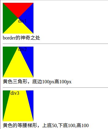
border是如何工作的,你可以从上面的结果自行体会。
二、特殊三角形
<!DOCTYPE html>
<html>
<head>
    <title>三角形</title>
    <style type="text/css">
        div{
            box-sizing: border-box;
            margin:20px;
        }
        .container::after{
            content: "";
            display: block;
            clear: both;
        }
        .div1{
            width: 100px;
            height: 0;
            border-bottom: 100px solid red;
            border-left: 50px solid transparent;
            border-right: 50px solid transparent;
            float: left;
        }
        .div2{
            width: 0;
            height: 100px;
            border-bottom: 50px solid transparent;
            border-left: 100px solid blue;
            border-top: 50px solid transparent;
            float: left;
        }
        .div3{
            width: 100px;
            height: 0;
            border-top: 100px solid yellow;
            border-left: 50px solid transparent;
            border-right: 50px solid transparent;
            float: left;
        }
        .div4{
            width: 0;
            height: 100px;
            border-bottom: 50px solid transparent;
            border-right: 100px solid green;
            border-top: 50px solid transparent;
            float: left;
        }
        .div5{
            width: 100px;
            height: 0;
            border-bottom: 86.6px solid red;
            border-left: 50px solid transparent;
            border-right: 50px solid transparent;
            float: left;
        }
        .div6{
            width: 100px;
            height: 0;
            border-bottom: 100px solid blue;
            /*border-left: 50px solid transparent;*/
            border-right: 100px solid transparent;
            float: left;
        }
        .div7{
            width: 100px;
            height: 0;
            border-bottom: 100px solid blue;
            /*border-left: 50px solid transparent;*/
            border-right: 100px solid transparent;
            float: left;
            transform: rotate(135deg);
            transform-origin: 50% 50%;
        }
    </style>
</head>
<body>
    <div class="container">
        <h4>等腰三角形</h4>
        <div class="div1"></div>
        <div class="div2"></div>
        <div class="div3"></div>
        <div class="div4"></div>
    </div>
    <div class="container">
        <h4>其他特殊三角形</h4>
        <div class="div5">等边</div>
        <div class="div6">直角</div>
        <div class="div7">直角</div>
    </div>
</body>
</html>
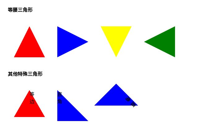
等腰三角形我做了4个方向的,当然你也可以用旋转来做,就像div7那样。制作三角形比较简单,只要对我前面将的基础加以改造就可以了。
三、特殊四边形
<!DOCTYPE html>
<html>
<head>
    <title>四边形</title>
    <style type="text/css">
        div{
            box-sizing: border-box;
            margin:20px;
        }
        .container::after{
            content: "";
            display: block;
            clear: both;
        }
        .div1{
            background: transparent;
            width: 0;
            height: 100px;
            border-bottom: 50px solid transparent;
            border-right: 100px solid green;
            border-top: 50px solid transparent;
            float: left;
            position: relative;
            box-sizing: border-box;

        }
        .div1::after{
            content: "";
            position: absolute;
            top: -50px;
            left: 100px;
            background: transparent;
            width: 0;
            height: 100px;
            border-bottom: 50px solid transparent;
            border-left: 100px solid green;
            border-top: 50px solid transparent;
            float: left;
            position: relative;
            box-sizing: border-box;
        }

        .div2{
            background: transparent;
            width: 80px;
            height: 0;
            border-bottom: 50px solid green;
            border-right: 40px solid transparent;
            border-left: 40px solid transparent;
            float: left;
            position: relative;
            box-sizing: border-box;
            margin-left: 100px;
        }
        .div2::after{
            content: "";
            position: absolute;
            top: 50px;
            left: -40px;
            width: 80px;
            height: 0;
            border-top: 50px solid green;
            border-right: 40px solid transparent;
            border-left: 40px solid transparent;
            box-sizing: border-box;
        }
        .div5{
            width: 100px;
            height: 0;
            border-bottom: 100px solid green;
            border-left: 25px solid transparent;
            border-right: 25px solid transparent;
            float: left;
        }
        .div6{
            width: 100px;
            height: 0;
            border-bottom: 100px solid green;
            border-right: 40px solid transparent;
            float: left;
        }
        .div7{
            width: 100px;
            height: 100px;
            background: green;
            transform: skew(30deg,0);
            float: left;
        }
    </style>
</head>
<body>
    <div class="container">
        <h4>菱形</h4>
        <div class="div1"></div>
        <div class="div2"></div>
    </div>
    <div class="container">
        <h4>梯形和平行四边形</h4>
        <div class="div5">等腰</div>
        <div class="div6">直角</div>
        <div class="div7">平行四边形</div>
    </div>
</body>
</html>

四、圆和椭圆
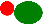
<!DOCTYPE html>
<html>
<head>
    <title>圆和椭圆</title>
    <style type="text/css">
        .div1{
            width: 50px;
            height: 50px;
            border-radius: 25px;
            box-sizing: border-box;
            background: red;
            float: left;
        }
        .div2 {
            width: 100px;
            height: 80px;
            background: green;
            border-radius: 50px / 40px;
            float: left;
        }
    </style>
</head>
<body>
    <div class="div1"></div>
    <div class="div2"></div>
</body>
</html>
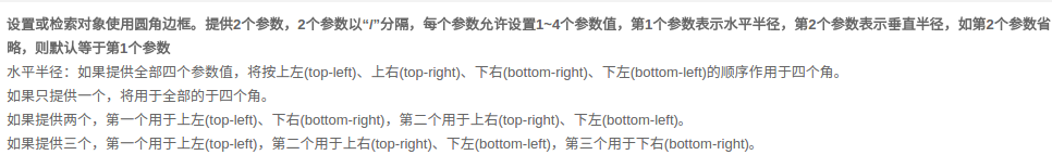
科普一下:http://www.css88.com/book/css/properties/border/border-radius.htm
以前都只用一个参参数的,所以写博客可以帮助查漏补缺。
五、复杂一点的图形
1、正多边形
<!DOCTYPE html>
<html>
<head>
    <title>正多边形</title>
    <style type="text/css">
        .five {
            top: 50px;
            position: relative;
            width: 54px;
            border-width: 50px 18px 0;
            border-style: solid;
            border-color: red transparent;
        }
        .five::before {
            content: "";
            position: absolute;
            height: 0;
            width: 0;
            top: -85px;
            left: -18px;
            border-width: 0 45px 35px;
            border-style: solid;
            border-color: transparent transparent green;
        }
        .six{
            width: 100px;
            height: 0px;
            border-width:0px 18.59px 60px;
            border-style: solid;
            border-color: transparent transparent red;
            margin-top: 60px;
            position: relative;
        }
        .six::after{
            content: "";
            width: 100px;
            height: 0px;
            border-width:60px 18.59px 0px;
            border-style: solid;
            border-color: green transparent transparent;
            position: absolute;
            top: 60px;
            left: -18.59px;
        }
    </style>
</head>
<body>
    <div class="five"></div>
    <div class="six"></div>
</body>
</html>

正五边形是借鉴的大神的(不知道是不是正的,我没算),思路是做一个梯形,然后拼接一个三角形,正六边形是我根据他的思路用两个梯形拼接的,如果我没有计算错误这应该是一个正六边形(怎么有点不像呢),计算目的是保证,腰和短底长相等。我刻意用不同颜色表示了拆分情况,便于理解。正 八变形怎么做?只需要拆解成两个梯形和一个矩形就好做了。正n边形怎么做,也是把它看作基本图形的组合,只不过可能单靠两个伪元素已经不够用了。
2、大大的爱心送给你
.aixin{
            border-width: 200px 150px 0;
            border-style: solid;;
            border-color: red transparent;
            width: 0px;
            position: relative;
            top: 200px;
            left: 100px;
        }
        .aixin::before{
            content: "";
            width: 180px;
            height: 180px;
            display: block;
            border-radius: 90px;
            background: red;
            position: absolute;
            top: -357px;
            left: -180px;
        }
        .aixin:after{
            content: "";
            width: 180px;
            height: 180px;
            display: block;
            border-radius: 90px;
            background: red;
            position: absolute;
            top: -357px;
            left: 0;
        }

数据没算,调整出来的。人要实心啊,搞个空心太不像话了,你自己去弄吧。两个圈圈加个三角形就可以了,原来爱这么简单。
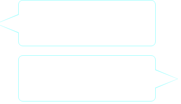
3、对话框
<!DOCTYPE html>
<html>
<head>
    <title>对话框</title>
    <style type="text/css">
        .div1{
            width: 300px;
            height: 100px;
            border: 1px solid #97FFFF;
            position: relative;
            left: 100px;
            border-radius: 10px;
        }
        .div1::after,.div1::before{
            content: "";

            display: block;
            width: 0;
            height: 0;
            border-style: solid;
            border-color:transparent #97FFFF transparent transparent;
            position: absolute;
            top: 30px;
            left: -50px;
        }
        .div1::after{
            border-width: 21px 50px 21px 0;
        }
        .div1::before{
            top: 31px;
            border-width: 20px 50px 20px 0;
            border-color: transparent white transparent transparent;
            z-index: 1000;
            left: -49px;
        }

        .div2{
            width: 300px;
            height: 100px;
            border: 1px solid #97FFFF;
            position: relative;
            left: 100px;
            border-radius: 10px;
            margin-top: 20px;
        }
        .div2::after,.div2::before{
            content: "";

            display: block;
            width: 0;
            height: 0;
            border-style: solid;
            border-color:transparent transparent transparent #97FFFF;
            position: absolute;
            top: 30px;
            left: 300px;
        }
        .div2::after{
            border-width: 21px 0px 21px 50px;
        }
        .div2::before{
            top: 31px;
            border-width: 20px 0px 20px 50px;
            border-color: transparent transparent transparent white;
            z-index: 1000;
            left: 299px;
        }

    </style>
</head>
<body>
    <div class="div1">
    </div>


    <div class="div2"></div>

</body>
</html>
六、小结一下
用CSS还是画出来很多东西的,对于稍微复杂点的图形用拼接或者裁剪的方法实现,有时可能会需要一些简单计算。本文所提到的只是九牛一毛,早有一些朋友做出了许多非常炫酷的图形,你可以去搜搜看。就写到这里,留几个大神的作品,以备不时只需。
参考:

