CSS背景处理
背景样式
背景颜色
如果想让一个区域具有纯色的背景,可以使用background-color进行设置,背景颜色可以是rgb,rgba,#16网页色。
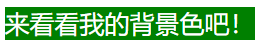


<!DOCTYPE html>
<html lang="en">

<head>
    <meta charset="UTF-8">
    <meta name="viewport" content="width=device-width, initial-scale=1.0">
    <style>

        span{
            background-color: green;
            color: white;
        }

    </style>
    <title>Document</title>
</head>
<body>

    <span>来看看我的背景色吧!</span>

</body>
</html>
背景图片
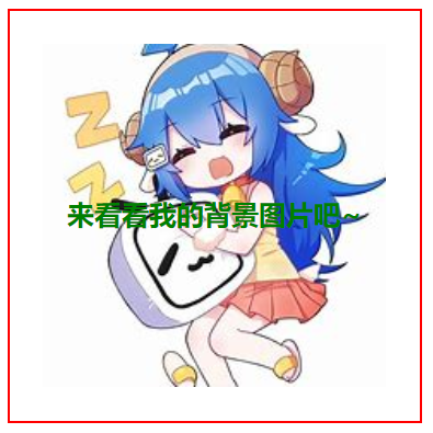
如果想加入背景图片,请使用background-image:url();进行设置。
请注意:背景图片默认不会改变原本盒子的大小。与在盒子中插入<img>是不同的。

<!DOCTYPE html>
<html lang="en">

<head>
    <meta charset="UTF-8">
    <meta name="viewport" content="width=device-width, initial-scale=1.0">
    <style>

        div{
            background-image: url("./33.jpg");
            color: green;
            font-weight: 700;
            height: 200px;
            width: 200px;
            text-align: center;
            line-height: 200px;
            border: solid 1px red;
            padding: 20px;
        }


    </style>
    <title>Document</title>
</head>
<body>

    <div>来看看我的背景图片吧~</div>

</body>
</html>
背景剪裁
我们可以将背景设置为盒子的某一区域,比如content区域或者padding区域以及border区域。
请使用background-clip来进行指定。
| 选项 | 说明 |
|---|---|
| border-box | 包括边框 |
| padding-box | 不含边框,包括内边距 |
| content-box | 内容区域 |
<!DOCTYPE html>
<html lang="en">

<head>
    <meta charset="UTF-8">
    <meta name="viewport" content="width=device-width, initial-scale=1.0">
    <style>

        div{
            background-image: url("./33.jpg");
            color: green;
            font-weight: 700;
            height: 200px;
            width: 200px;
            text-align: center;
            line-height: 200px;
            border: solid 1px red;
            padding: 20px;
            /* 背景图片为content区域 */
            background-clip: content-box;
        }


    </style>
    <title>Document</title>
</head>
<body>

    <div>来看看我的背景图片吧~</div>

</body>
</html>
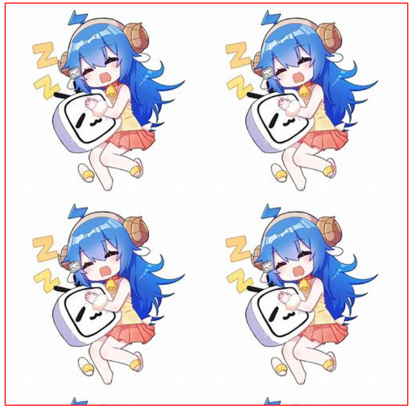
背景重复
如果背景图太小,那么默认会进行重复行为,如下所示。但是我们可以使用background-repeat为它指定如何重复。
| 选项 | 说明 |
|---|---|
| repeat | 水平、垂直重复 |
| repeat-x | 水平重复 |
| repeat-y | 垂直重复 |
| no-repeat | 不重复 |
| space | 背景图片对称均匀分布 |
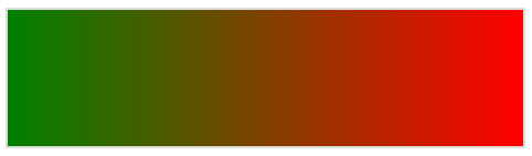
不指定,默认repea:
指定为no-repeat:
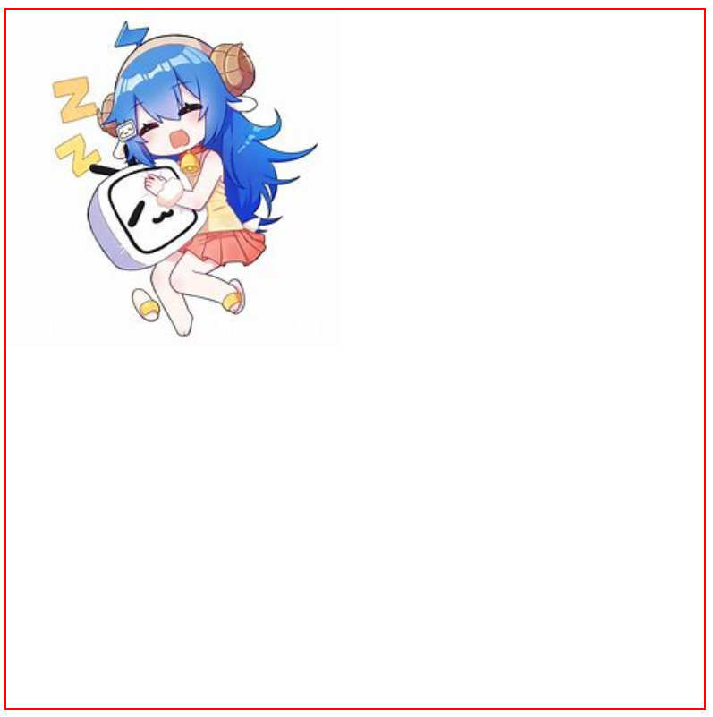
<!DOCTYPE html>
<html lang="en">

<head>
    <meta charset="UTF-8">
    <meta name="viewport" content="width=device-width, initial-scale=1.0">
    <style>

        div{
            background-image: url("./33.jpg");
            color: green;
            font-weight: 700;
            height: 500px;
            width: 500px;
            text-align: center;
            line-height: 200px;
            border: solid 1px red;
            /* 不重复产生图片 */
            background-repeat: no-repeat;
        }


    </style>
    <title>Document</title>
</head>
<body>

    <div></div>

</body>
</html>
背景滚动
我们可以使用background-attachment为背景指定到底是跟随滚动条滚动还是在一个固定的位置不滚动。默认是scroll,即跟随滚动条滚动的。
| 选项 | 说明 |
|---|---|
| scroll | 背景滚动 |
| fixed | 背景固定 |
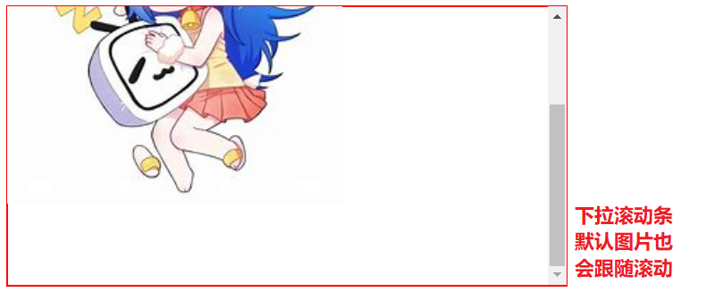
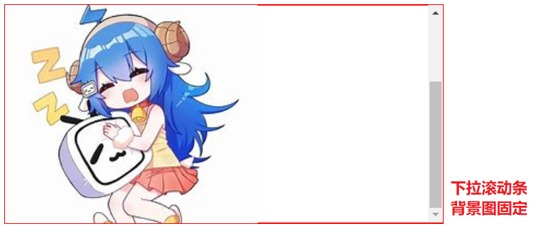
<!DOCTYPE html>
<html lang="en">

<head>
    <meta charset="UTF-8">
    <meta name="viewport" content="width=device-width, initial-scale=1.0">
    <style>

        main{
            /* 主容器要小于子容器才会出现滚动条 */
            overflow: auto;
            border: solid 1px red;
            height: 200px;
            width: 400px;
        }
        div{
            background-image: url("./33.jpg");
            height: 300px;
            width: 300px;
            /* 不重复产生图片 */
            background-repeat: no-repeat;
            /* 子容器背景图固定 */
            background-attachment: fixed;
        }


    </style>
    <title>Document</title>
</head>
<body>
    <main>
        <div>文本在此</div>
    </main>


</body>
</html>
背景位置
我们可以使用background-position设置背景图片的水平、垂直定位。
| 选项 | 说明 |
|---|---|
| left | 左对齐 |
| right | 右对齐 |
| center | 居中对齐 |
| top | 顶端对齐 |
| bottom | 底部对齐 |
只设置
center为水平,垂直居中。设置
left center则为水平居左,垂直居中。设置
right center则为水平居右,垂直居中。设置
center left则为水平居中,垂直居左。设置
center right则为水平居中,垂直居右。
当然,我们也可以使用%来为它进行设置,%50为居中。
<!DOCTYPE html>
<html lang="en">

<head>
    <meta charset="UTF-8">
    <meta name="viewport" content="width=device-width, initial-scale=1.0">
    <style>

        div{
            background-image: url("./33.jpg");
            height: 500px;
            width: 500px;
            border: solid 1px red;
            /* 不重复产生图片 */
            background-repeat: no-repeat;
            /* 水平居左,垂直居中 */
            background-position:0% 50%;
        }


    </style>
    <title>Document</title>
</head>
<body>

    <div></div>

</body>
</html>
背景尺寸
我们可以使用background-size来设置背景尺寸,单位可以是单词,%,px,em以及rem。
当使用单词设置的时候一个词就可以搞定,而其他设置时需要两个单位,第一个为背景高度,第二个为背景宽度。
| 选项 | 说明 |
|---|---|
| cover | 背景完全覆盖,可能会有背景溢出 |
| contain | 图片不溢出的放在容器中,可能会漏出部分区域 |
指定数值定义宽高尺寸
background-size: 50% 100%;
或
background-size: 200px 200px;
宽度固定高度自动(这个常用)
background-size: 50% auto;

<!DOCTYPE html>
<html lang="en">

<head>
    <meta charset="UTF-8">
    <meta name="viewport" content="width=device-width, initial-scale=1.0">
    <style>

        div{
            background-image: url("./33.jpg");
            height: 200px;
            width: 200px;
            border: solid 1px red;
            background-repeat: no-repeat;
            /* 水平居左,垂直居中 */
            background-position:0% 50%;
            /* 背景自动铺满整个盒子 */
            background-size:cover;
        }


    </style>
    <title>Document</title>
</head>
<body>

    <div></div>

</body>
</html>
简写
我们可以直接使用background来进行简写。
推荐顺序:颜色,地址,是否重复,背景裁剪,背景尺寸或是否跟随滚动
如:
background:red url(./33.jpg) no-repeat border-box center;
多个背景
我们可以使用background-image: url(路径), url(路径);来一次指定多个背景。
就如同上面一样,我们一次给他定义了2个背景一个红色,一个图片。
背景阴影
我们可以使用 box-shadow 对盒子元素设置阴影,参数为 水平偏移,垂直偏移,模糊度,颜色 构成。
<!DOCTYPE html>
<html lang="en">

<head>
    <meta charset="UTF-8">
    <meta name="viewport" content="width=device-width, initial-scale=1.0">
    <style>

        div{
            height: 100px;
            width: 100px;
            border: solid 1px #ddd;
            box-shadow: 10px 10px 5px rgba(100, 100, 100, .5);
        }


    </style>
    <title>Document</title>
</head>
<body>

    <div></div>

</body>
</html>
颜色渐变
线性渐变
渐变一般都是在背景颜色中进行使用,格式为background: linear-gradient(方向, 颜色, 颜色, ...);。
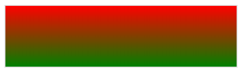
/* 红色到绿色,可以看到是线性的渐变 */
background: linear-gradient(red, green);
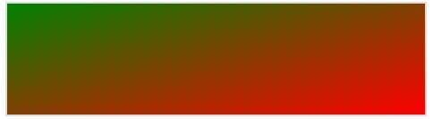
使用度数deg可以改变渐变角度,如果为负数则代表相反方向。
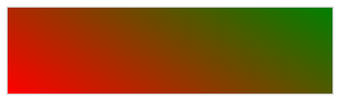
/* 倾斜30°,红色到绿色 */
background: linear-gradient(30deg, red, green);
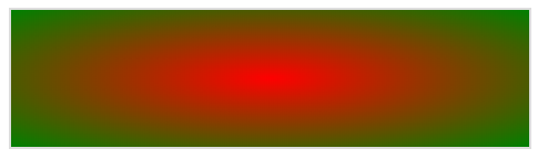
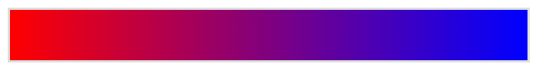
我们可以使用to 方向1 方向2指定渐变的方向,注意:不能用度数deg同时使用
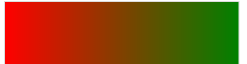
/* 向右渐变 ,红色到绿色 */
background: linear-gradient(to right, red, green)
/* 向左渐变 ,红色到绿色 */
background: linear-gradient(to left, red, green)
/* 向左上渐变 ,红色到绿色 */
background: linear-gradient(to left top, red, green)
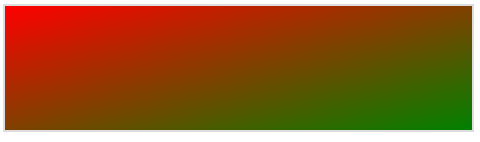
/* 向右下渐变 ,红色到绿色 */
background: linear-gradient(to right bottom, red, green)
同时,我们可以设置多颜色渐变。
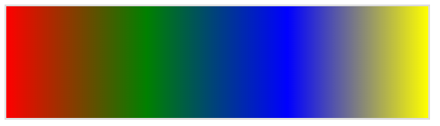
/* 向右渐变 ,红色到绿色到蓝色到黄色 */
background: linear-gradient(to right, red, green, blue, yellow)
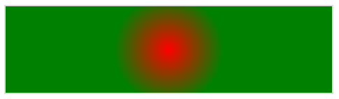
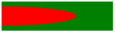
径向渐变
格式为background: radial-gradient(方向, 宽度, 颜色, 颜色, ...);。
/* 红色到绿色,可以看到是径向的渐变 */
background: radial-gradient(red, green);
我们可以设置渐变色的宽度。
/* 红色到绿色,设置宽度 */
background: radial-gradient(50px 50px,red, green);
我们可以使用at 方向1 方向2来进行渐变方向控制。
/* 红色到绿色,渐变方向为右上,由于设置了宽度,效果并不美观。*/
background: radial-gradient(at right top ,red 200px, green 20px);
/* 红色到绿色,渐变方向为左下,由于设置了宽度,效果并不美观。*/
background: radial-gradient(at left bottom ,red 200px, green 20px);
/* 红色到绿色,渐变方向为左侧向中心,由于设置了宽度,效果并不美观。*/
background: radial-gradient(at left center ,red 200px, green 20px);
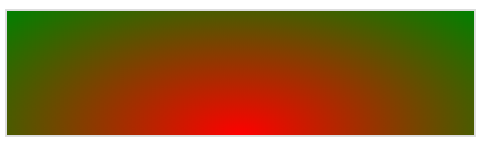
/* 红色到绿色,渐变方向为底部向中心,由于未设置宽度,效果好一些了*/
background: radial-gradient(at bottom center ,red, green);
        }
我们依然可以设置很多颜色来进行渐变。
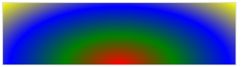
/* 红色到绿色到蓝色到黄色,渐变方向为底部向中心,由于未设置宽度,效果好一些了*/
background: radial-gradient(at bottom center ,red, green ,blue ,yellow);
        }
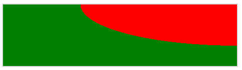
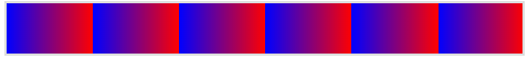
标识位
当未指定标识位时,颜色的渐变很均匀。一旦指定了标识位,就会发生突变。
未设置标识位:
单方设置了标识位:
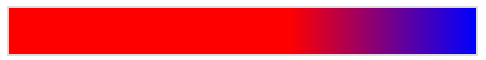
background: linear-gradient(90deg, red 60%, blue);
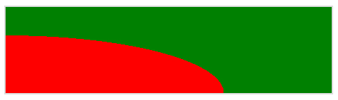
双方设置了标识位:
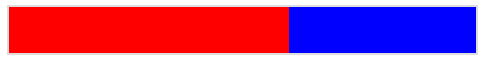
background: linear-gradient(90deg, red 60%, blue 40%);
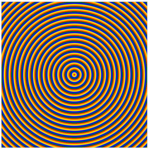
使用径向标识位绘制太阳
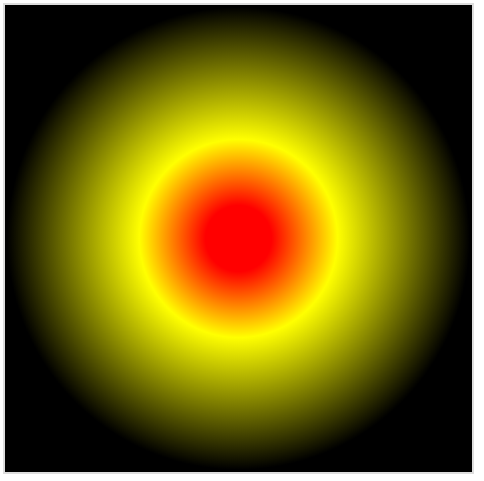
<!DOCTYPE html>
<html lang="en">

<head>
    <meta charset="UTF-8">
    <meta name="viewport" content="width=device-width, initial-scale=1.0">
    <style>

        div{
            height: 300px;
            width: 300px;
            border: solid 1px #ddd;
            background: radial-gradient(red 10%,yellow 30%,black 70%)
        }


    </style>
    <title>Document</title>
</head>
<body>

    <div></div>

</body>
</html>
中间点阈值
所谓中间点阈值,指的就是两个颜色渐变的时候,从哪个点开始让一个颜色渐变到另一个颜色。
比如这个示例,红色标识位为60%,蓝色标识位为40%,渐变的中间点阈值就只能变成0了。
再比如这个示例,单方设置了标识位,那么它的阈值就是由系统产生的,所以我们才能看见它渐变的效果。
怎么设置中间点阈值呢?看下面这段代码。
/* 0%就是中间点阈值,当设置为0后那么红色变蓝色会由0%的位置开始 */
background: linear-gradient(90deg, red ,0%, blue);
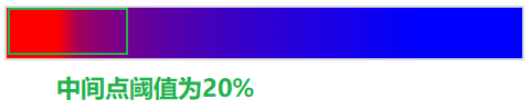
/* 我们的中间点阈值是20%,先是红色占了10%,那么可观测范围中中间点阈值也就只有10%了,所以上图的渐变区域为10% */
background: linear-gradient(90deg, red 10% ,20%, blue 80%);
线性渐变重复
要想使用线性渐变重复,请使用repeating-linear-gradient。
/* 一个格子为 75px */
background: repeating-linear-gradient(90deg, blue, 25px, red 50px);
如果我们想要生硬的颜色,我们还需要再随便加一个颜色充当过渡。
background: repeating-linear-gradient(90deg, blue, 25px, yellow 25px, 25px, red 50px);
径向渐变重复
要想使用线性渐变重复,请使用repeating-radial-gradient。
background: repeating-radial-gradient(20px 20px, red 0%, yellow 20%, blue 30%, green 50%);

