
幽灵按钮的实现
幽灵按钮是2014年开始出现的,在当时可是一种”新趋势“。目前大量应用于国外网站,国内相对少一些,但效果是令人十分舒服。
现在或许有点过时了,但是对于我这种新手,用它来练练手还是不错的。
那么先温故一下,什么是幽灵按钮
幽灵按钮,也就是Ghost Buttons,是一个透明的按钮,通常是矩形或者圆角矩形,仅保留基本的形制,使用细线来标识边界;按钮内的文字通常使用纤细的非衬线体字体的纯文本,来指明按钮功能。
幽灵按钮有时候也被称为“空按钮”,通常会被设计得比普通的按钮更大一些。而它们之所以被命名为“幽灵”,是应为这种按钮如同鬼魂一样透明,但是独特的造型会立刻吸引用户的注意力——正如同故事中鬼魂一样抓人眼球。
虽然你可能在大量的网站中看到幽灵按钮,但是并非所有的网站都和幽灵按钮相得益彰。真正适合幽灵按钮的是那些使用极简风和扁平风的网站和APP,使用大图背景的网站也与之非常搭。
幽灵按钮的使用实例
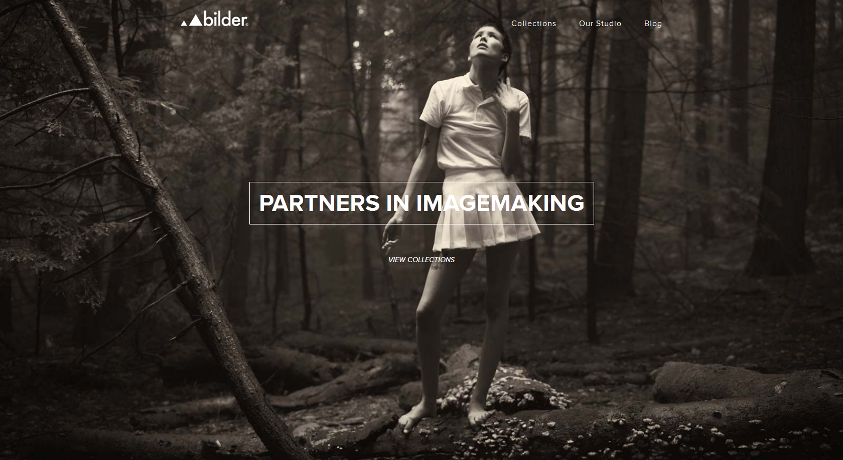
第一个例子就是 Bilderphoto.com,典型的大图背景设计。
幽灵按钮置于网站正中央,吸引用户去点击,以发现更多的内容。但是在我看来,幽灵按钮并没有得到很好的安置。为了对比度,幽灵按钮的边框和文字均使用了白色,可是背景中的女孩也是一身白,这使得按钮中的单词“imagemaking”并不完全符合对比度的需求,影响了可读性。当然,积极的一面在于,你可以通过刷新看到其他的图片。

接下来的这张图片来自于UnionRoom的网站,这是一家网页设计和开发公司。
比起简单设置一个图片背景,他们选择了更有逼格的方式——使用半色调的视频来作为背景。他们的服务展示是通过网页中的这套扁平风的动效和界面来实现的。如果你想对他们的服务了解更多的话,点击底部的幽灵按钮就可以了。
不同于上一个例子,UnionRoom的网站背景色调更暗,使得内容显得更加突出。这个幽灵按钮符合它该有的所有特色,不突兀也不多余,合理和均衡。
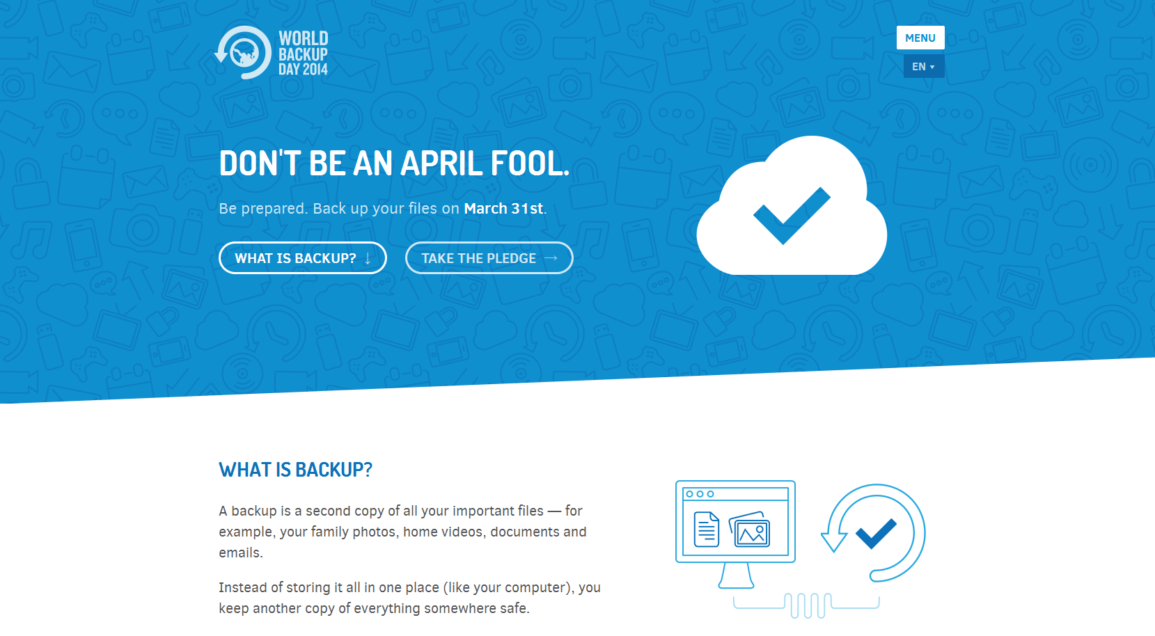
最后这个案例是worldbackupday.com,使用了典型的扁平化设计。
我用的是www.iuvo.si/的幽灵按钮类型来做的,具体的可以上它的网站看交互效果:

首先我去千库网随便找了3个png的图片充当那3个图片。然后抠下了那个小箭头。
首先进行了基本的布局,用一个大的container包围着3个小box,然后每个小box里面放一个图片和一个按钮。基本html结果如下:
 1 <!DOCTYPE html>
 2 <html>
 3 <meta charset="utf-8">
 4 <link rel="stylesheet" href="style.css">
 5 <head>
 6     <title>幽灵按钮小组件</title>
 7 </head>
 8 <body>
 9 <div id="container">
10     <div class="box box-mission">
11         <span class="icon"></span>
12         <a href="#">
13
14             mission
15         </a>
16     </div>
17     <div class="box box-play">
18         <span class="icon"></span>
19         <a href="#">
20
21             play
22         </a>
23     </div>
24     <div class="box box-touch">
25         <span class="icon"></span>
26         <a href="#">
27
28             touch
29         </a>
30     </div>
31 </div>
32 </body>
33 </html>
此时我们如果对布局不熟悉的话,我们可以给相应的块添加背景颜色,将基本布局做好之后再把background改为图片。
布局完之后重点就来了!!!
怎么做微交互呢?
首先我们需要做的是,当鼠标移入box块里面的上面那个块,也就是我们的图片区域时,我们让这个区域进行放大和旋转。
此时就要用到transform里面的scale(放大)和rotate(旋转)的属性了。注意rotate的单位是deg,也就是度。还需要注意的是,在各种浏览器下的兼容性,chrome下要加前缀-webkt-,firefox要加前缀-moz-,opera下要加前缀-o-。还需要用到transition,用来平滑的过渡效果,也是,需要做兼容性处理。
然后就是按钮的线条移动效果,这个相对复杂一些。
首先我们要在a标签内,添加4个span标签,用来做线,
1             <span class="top"></span>
2             <span class="bottom"></span>
3             <span class="left"></span>
4             <span class="right"></span>
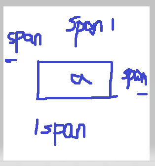
先把a标签添加相对布局,4个span标签设置宽高,背景色,然后绝对定位到a标签的4个边框线上。注意:0px是没办法定位到边框线上的,0px只能定位到内容的最上方,也就是边框的下方,要定位到边框线上,大小应该是负的边框线的宽度。然后朝4个方向进行一定的位移差(设置绝对定位的left、top、bottom、right)。最后设置为如下状态:
然后将左右的span的宽度设置为0,上下的span的高度设置为0;
然后当鼠标移入a标签时,4条线相应的移回到4个边框线上,并且宽度或者高度变回原来边框线的宽度或者高度。
这里也需要用到transition属性。可以平滑的过渡这个效果。切记兼容性。
以下是相应的css代码:
  1 *{
  2     margin:0px;
  3     padding:0px;
  4 }
  5 body{
  6     background: linear-gradient(to bottom,#4A7F68,#02020c);
  7
  8 }
  9 @media screen and (min-width:1000px){
 10     #container{
 11     width:1000px;
 12     height:400px;
 13     margin:60px auto;
 14
 15     }
 16 }
 17 @media screen and (min-width:768px) and (max-width:1000px){
 18     #container{
 19     width:768px;
 20     height:400px;
 21     margin:60px auto;
 22
 23     }
 24 }
 25 @media screen and (max-width:768px){
 26     #container{
 27     width:300px;
 28     height:400px;
 29     margin:60px auto;
 30
 31     }
 32 }
 33 #container .box{
 34     width:300px;
 35     height: 300px;
 36     display: inline-block;
 37     margin-left:22px;
 38     margin-top:22px;
 39 }
 40 #container .box .icon{
 41     width:200px;
 42     height:160px;
 43     display: block;
 44     margin:20px auto;
 45     transition: transform 0.2s ease;
 46     -webkit-transition: transform 0.2s ease;
 47     -o-transition: transform 0.2s ease;
 48     -moz-transition: transform 0.2s ease;
 49 }
 50 #container .box-mission .icon{
 51     background:url("img/mission.png") 0px -24px  no-repeat;
 52     background-size:200px auto;
 53 }
 54 #container .box-play .icon{
 55     background:url("img/play.png") 0px -24px  no-repeat;
 56     background-size:200px auto;
 57 }
 58 #container .box-touch .icon{
 59     background:url("img/touch.png") 0px -24px  no-repeat;
 60     background-size:200px auto;
 61 }
 62 #container .box .icon:hover{
 63     transform:scale(1.2) rotate(360deg);
 64     -webkit-transform:scale(1.2) rotate(360deg);
 65     -o-transform:scale(1.2) rotate(360deg);
 66     -moz-transform:scale(1.2) rotate(360deg);
 67 }
 68 #container .box a{
 69     width:220px;
 70     height:55px;
 71     line-height: 55px;
 72     border:2px solid rgba(255,255,255,0.6);
 73     display:block;
 74     margin: 40px auto;
 75     text-decoration: none;
 76     color:#2ecc71;
 77     font-family: "微软雅黑";
 78     font-size: 20px;
 79     padding-left:40px;
 80     background:url("img/jiantou.png") no-repeat 190px center;
 81     transition: 0.2s ease;
 82     position:relative;
 83 }
 84 #container .box a .top{
 85     width:0px;
 86     height:2px;
 87     position:absolute;
 88     top:-2px;
 89     left:-60%;
 90     background-color: white;
 91     transition: 0.2s ease;
 92     -webkit-transition: 0.2s ease;
 93     -o-transition: 0.2s ease;
 94     -moz-transition: 0.2s ease;
 95 }
 96 #container .box a .bottom{
 97     width:0px;
 98     height:2px;
 99     position:absolute;
100     bottom:-2px;
101     right:-60%;
102     background-color: white;
103     transition: 0.2s ease;
104     -webkit-transition: 0.2s ease;
105     -o-transition: 0.2s ease;
106     -moz-transition: 0.2s ease;
107 }
108 #container .box a .left{
109     width:2px;
110     height:0px;
111     position:absolute;
112     left:-2px;
113     bottom:-160%;
114     background-color: white;
115     transition: 0.2s ease;
116     -webkit-transition: 0.2s ease;
117     -o-transition: 0.2s ease;
118     -moz-transition: 0.2s ease;
119 }
120 #container .box a .right{
121     width:2px;
122     height:0px;
123     position:absolute;
124     right:-2px;
125     top:-160%;
126     background-color: white;
127     transition: 0.2s ease;
128     -webkit-transition: 0.2s ease;
129     -o-transition: 0.2s ease;
130     -moz-transition: 0.2s ease;
131 }
132 #container .box a:hover{
133     background:url("img/jiantou.png") no-repeat 200px center;
134 }
135 #container .box a:hover .top{
136     left:-2px;
137     width:262px;
138 }
139 #container .box a:hover .bottom{
140     right:-2px;
141     width:262px;
142 }
143 #container .box a:hover .left{
144     bottom:-2px;
145     height:57px;
146 }
147 #container .box a:hover .right{
148     top:-2px;
149     height:57px;
150 }
效果图:

交互效果就不展示了。感兴趣的可以去原网站观看。

